Design System
Product Design
User Testing
Creating the new Progress stepper component
Introducing a new progress stepper component to provide a consistent, accessible way for users to track their progress through multi-step flows across products.

My role
Lead Product Designer
The team
-
Product Manager
-
Accessibility Specialist
-
React (Web) and Flutter (App) Engineers
-
Content Designer
Background
As part of an evolving brand direction focused on a more refined and modern visual identity, the design team was tasked with introducing a new subdued aqua color palette into the existing design system. This initiative aimed to align digital products with updated brand aesthetics while maintaining accessibility and consistency across platforms. The new palette was carefully integrated to complement existing color schemes, support a wide range of UI components, and ensure a cohesive user experience in line with the brand’s refreshed visual language.
Project goals
01
Flexibility
Support flexibility and scalability, allowing the component to adapt to a range of use cases and layouts such as horizontal, vertical, or responsive step flows while remaining easy to implement and align with evolving product needs.
02
Consistency and maintainability
Drive consistency across products by providing a unified, reusable component that can sit on all our surfaces and reduce design and development time. Ensuring a cohesive user experience that leverages existing tokens and components from the design system for easier adoption and maintainability.
03
Accessibility
Ensure all users, including those using assistive technologies, can clearly understand and navigate multi-step flows. Creating a more inclusive and usable experience for everyone.
04
Documentation
The component needs to have documentation on our design system guidance site, where designers (product and content) and developers can refer to for correct usage.
Discovery
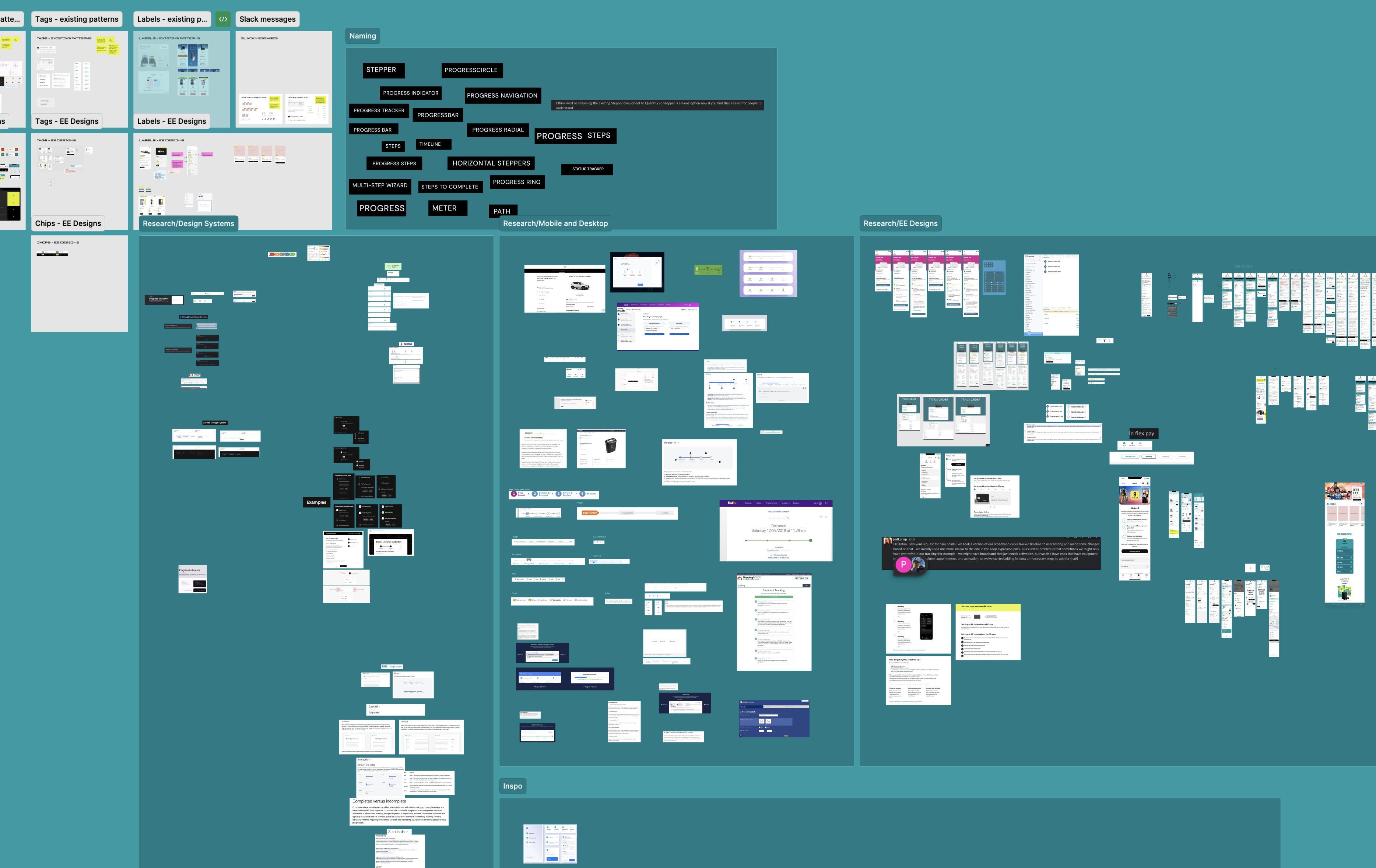
What has been created by the design community so far?
I started by asking the design community in Slack channels to share their existing work, where they had used and created ‘progress stepper like’ components. I then compiled them into a file to spot common themes, feartures and use cases
Who is it for?
Product designer
Goals and behaviours
-
Wants to streamline his design process and reduce repetitive tasks.
-
Aims to maintain consistency across different projects and journeys.
-
Actively seeks new design resources and tools to enhance his workflow.
-
Frequently collaborates with developers to ensure the feasibility of his
Pain points
-
Finding a comprehensive design system that covers a wide range of Ul elements.
-
Spending excessive time on recreating components or styles for different projects.
-
Struggling to keep track of design updates and versions.
-
Dealing with inconsistencies and conflicts between her design files and the final implementation.
Developer
Goals and behaviours
-
Seeks a well-documented design system that provides clear guidelines for front-end development.
-
Wants to expedite the implementation process by using pre-built Ul components.
-
Aims to maintain consistency in the visual appearance and behaviour of the Ul elements.
-
Actively contributes to open-source projects and appreciates collaborative development.
Pain points
-
Spending time recreating common Ul components instead of focusing on complex functionality.
-
Struggling to bridge the gap between design files and front-end implementation.
-
Dealing with inconsistent or incomplete design specifications.
-
Difficulty in finding up-to-date resources and design assets for different projects.
Product manager
Goals and behaviours
-
Seeks a design system that can be easily adopted by his team, minimising onboarding time.
-
Wants to enable cross-functional collaboration by providing a shared design language.
-
Aims to maintain consistency and brand integrity across different products.
-
Actively looks for ways to improve the development process and increase overall productivity.
Pain points
-
Wasting time aligning design and development teams due to inconsistent design assets.
-
Difficulty in tracking design changes and managing version control.
-
Struggling to ensure consistent user experiences across various digital touchpoint.
-
Challenging to balance customisation needs with maintaining a cohesive design system.
Giving the component a name
The proposed colour that had been put forward by brand and the agency is a blend of our ‘Fog’ surface colour (Source/Grey/01) and Primary brand colour (Source/Aqua/05).
Information on the specific blend wasn’t available to us, so we had to get as close to #DEE7E8 as we could ourselves.
However this was an opportunity to refine it and propose a more appropriate colour to be used in all of our digital journy’s on web and app.
Design exploration
Off the back of my research and discovery I began work on creating some designs. Drawing inspiratino heavily
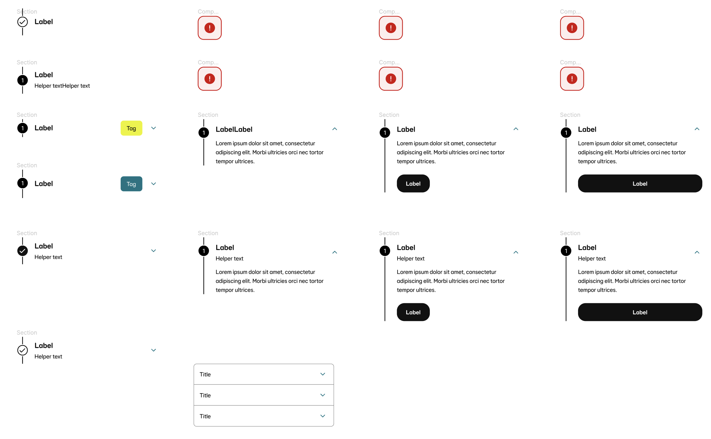
Refinement: Two seprate componets
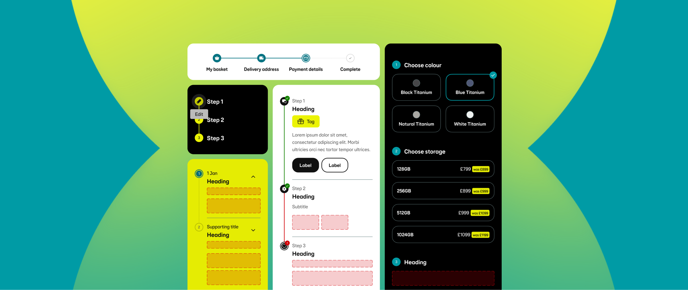
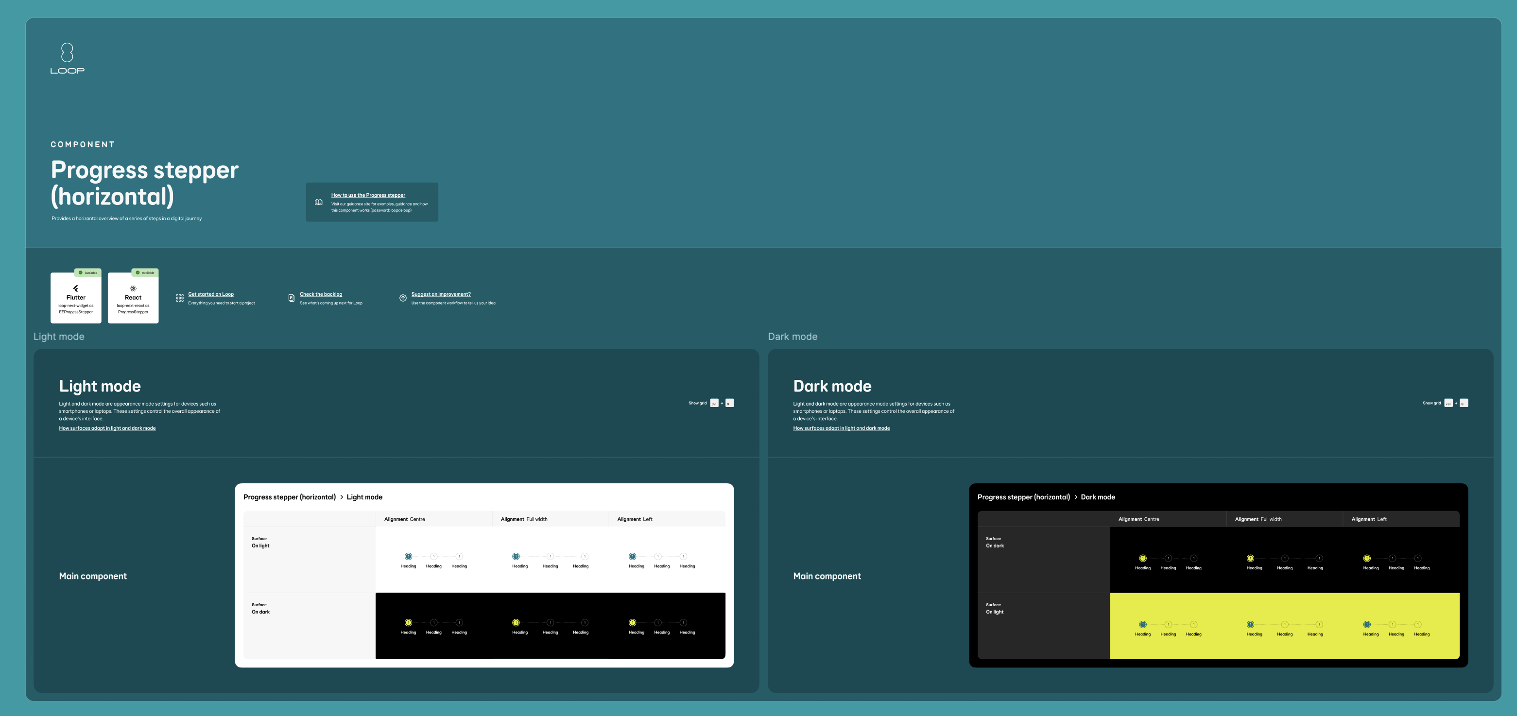
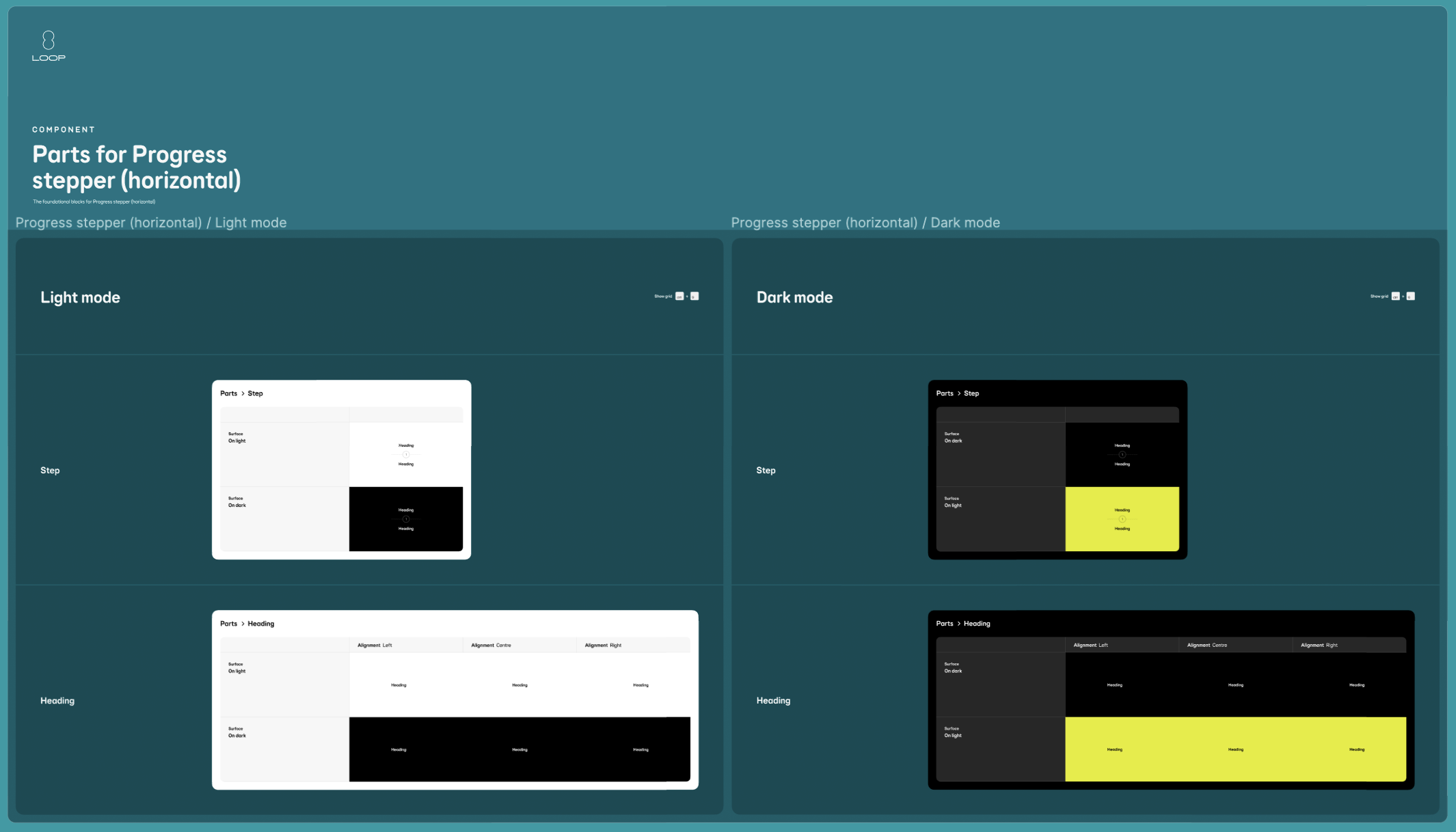
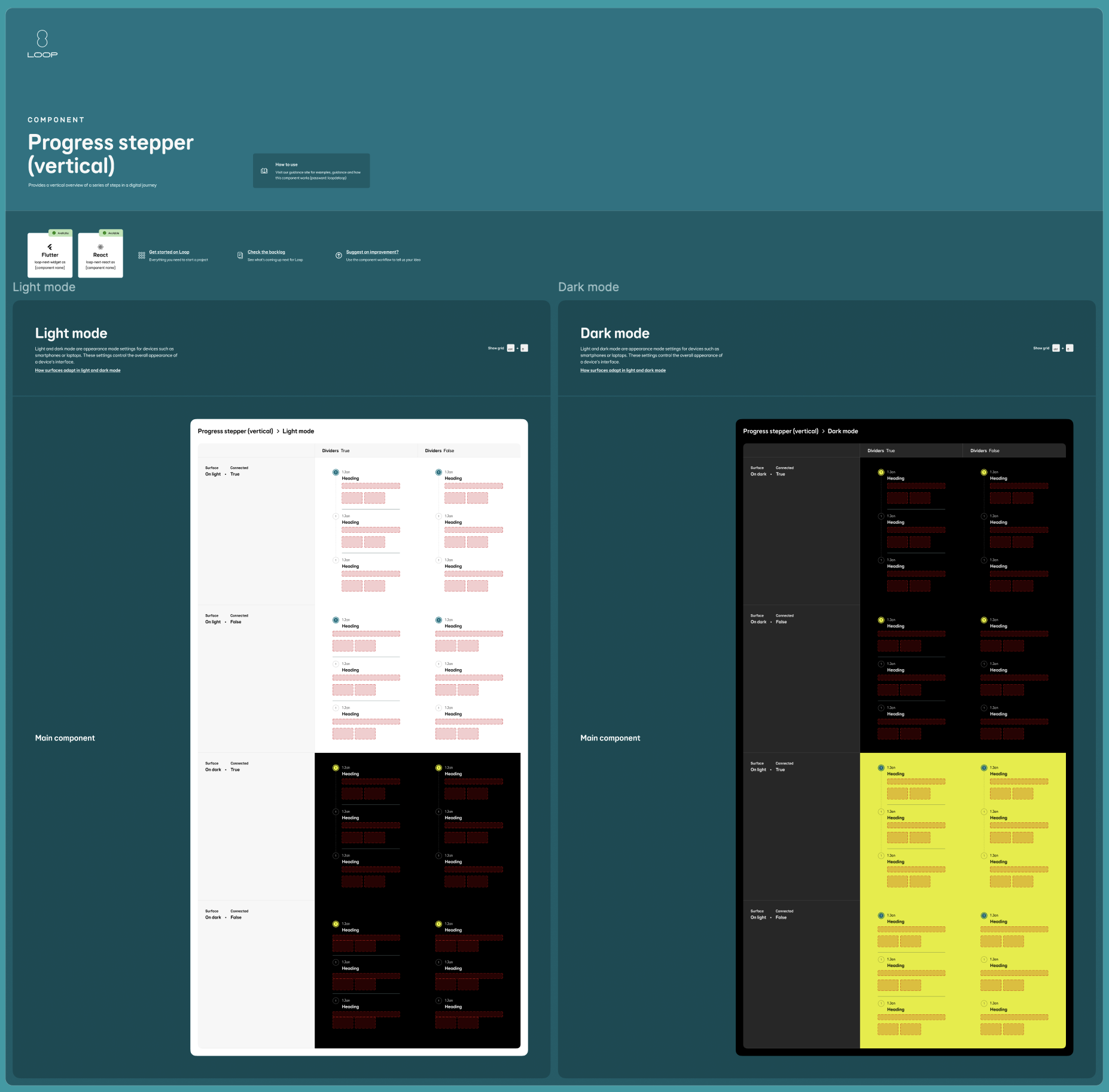
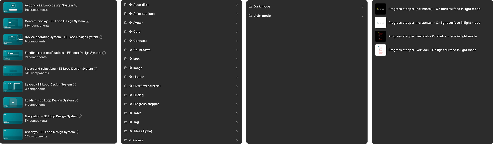
After my design exploration I focussed on creating two separate components:
-
Progress stepper (horizontal)
-
Progress stepper (vertical)
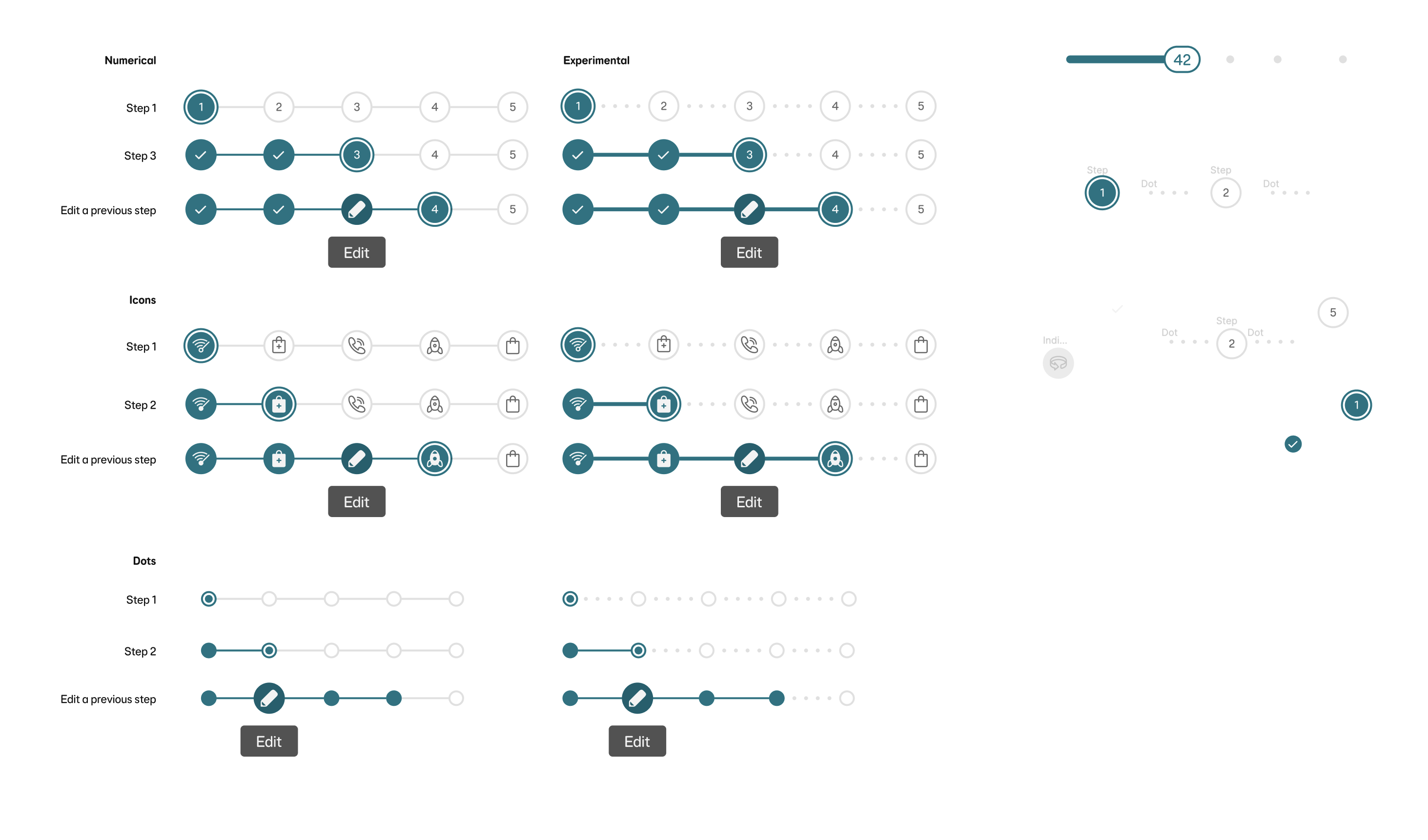
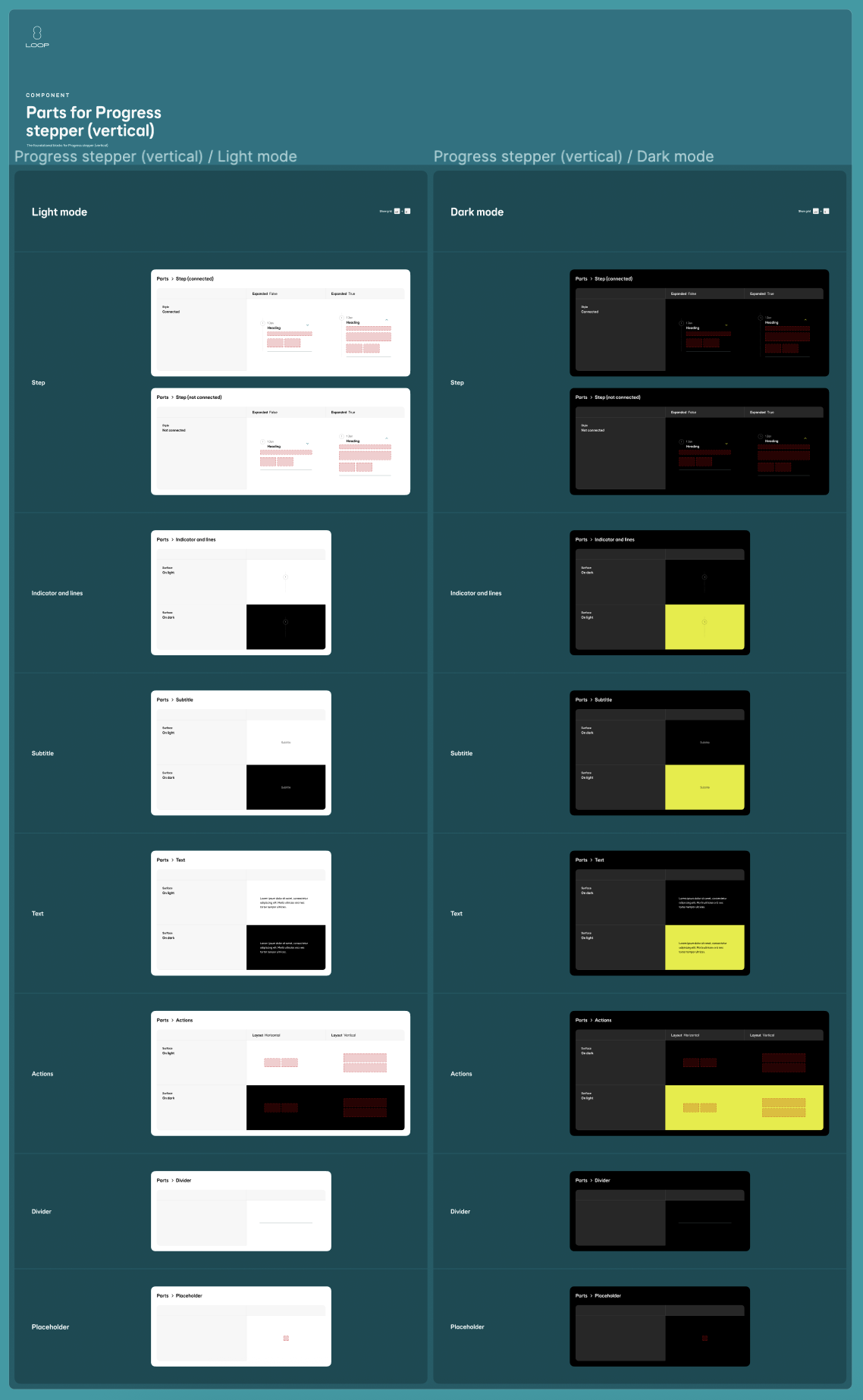
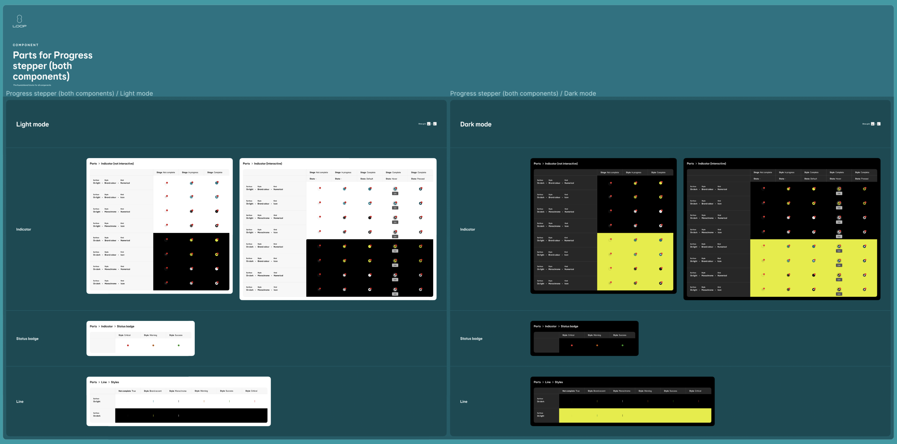
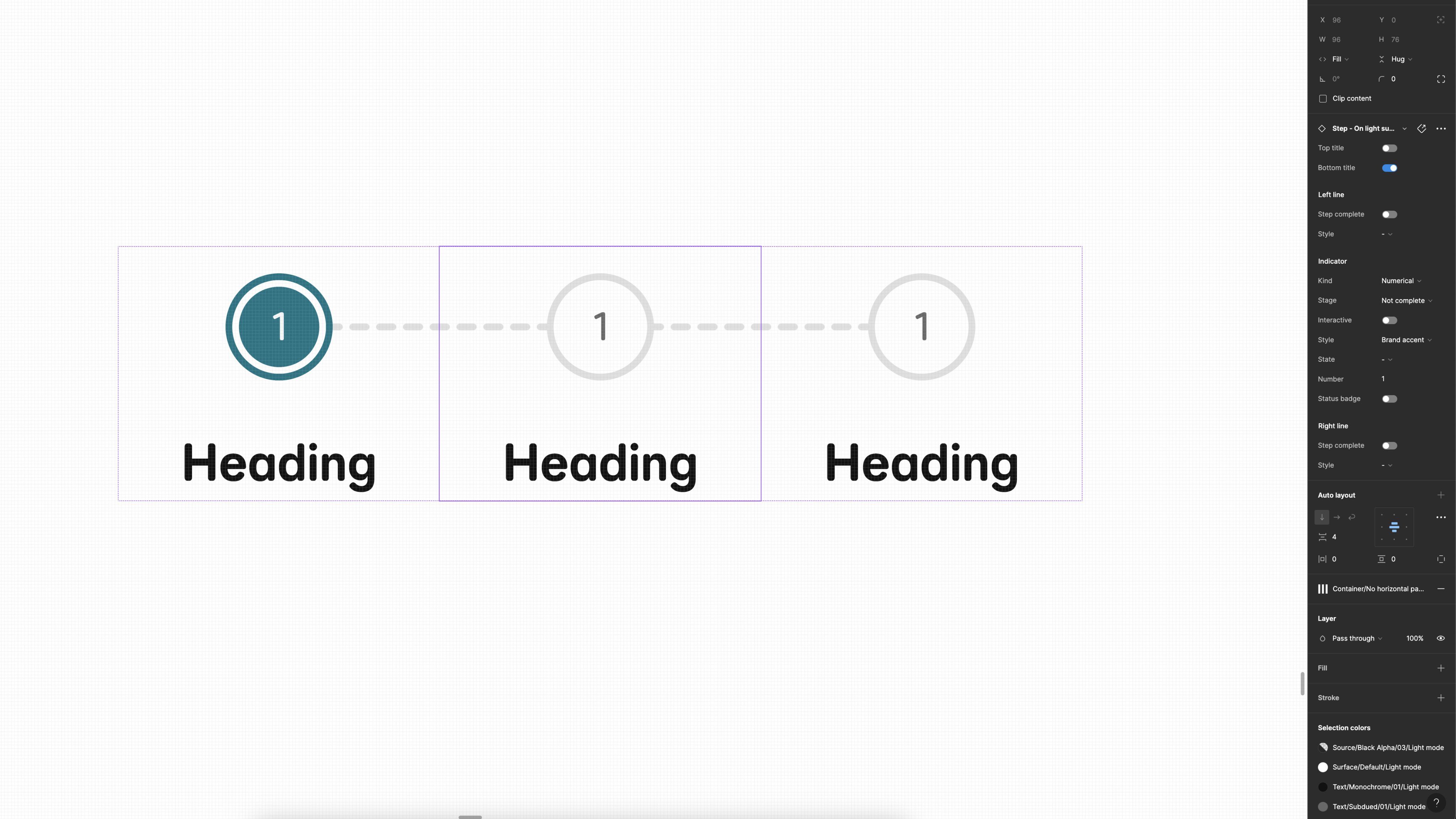
Both components used the same ‘Parts’ (building blocks) where possible, however were configured in different ways.
User testing
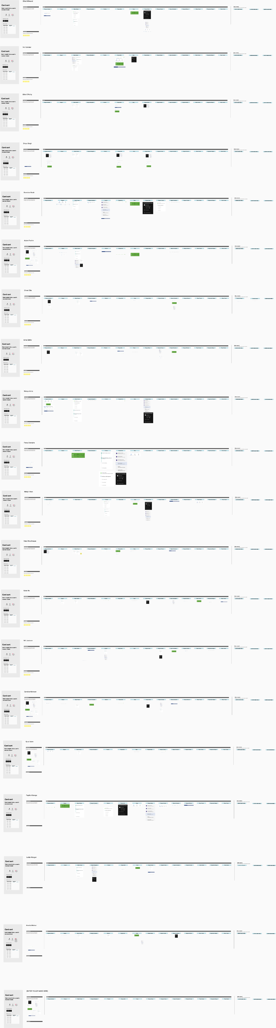
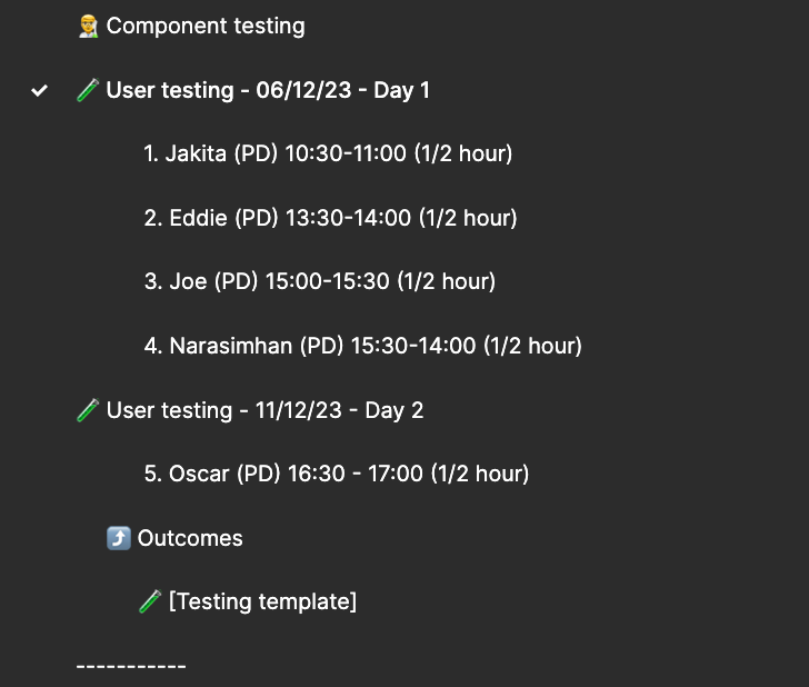
Now that I had two components that was in a usable state, I set up 5 moderated user testing sessions over two days, involving 5 product designers across the business.
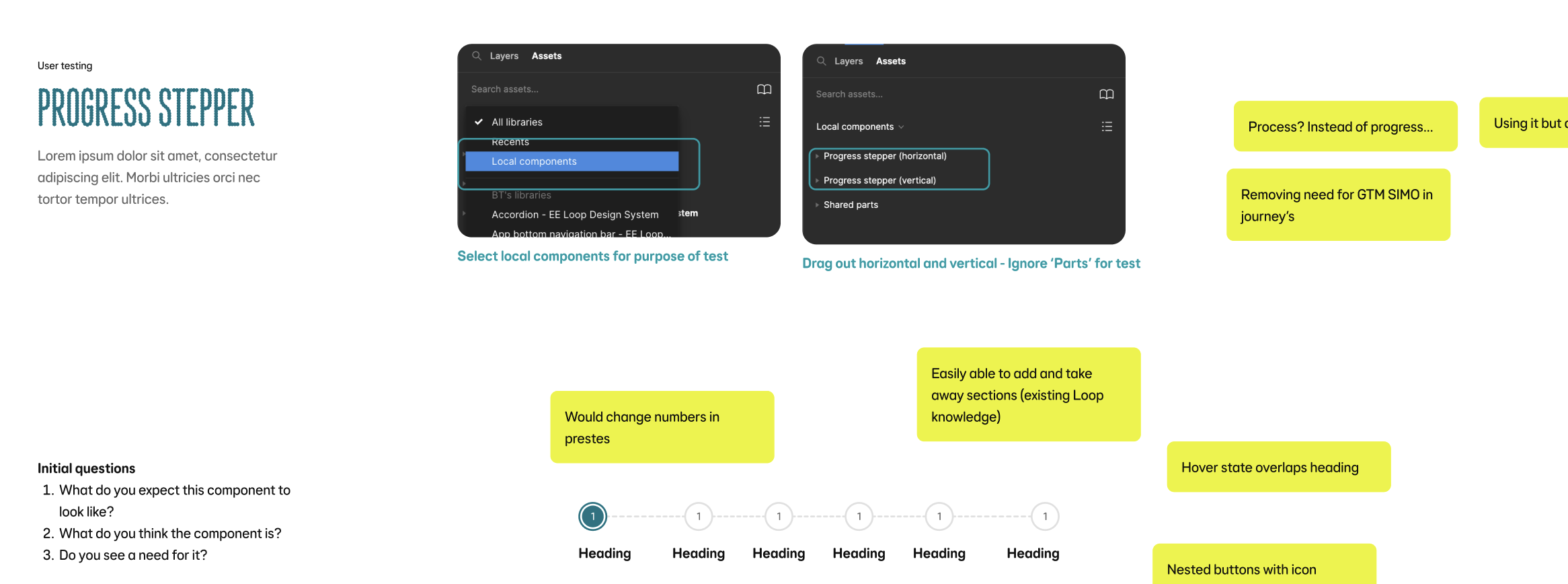
In these sessions (1/2 hour each) I invited the designers into a Figma file with some tasks to complete. I did not have the two components in the file yet, as I asked them to go ahead and find them in the assets panel.
The sessions were done over Teams screen share and included questions such as:
-
How to find both of the components - What is your expectations of the naming? (etc)
-
Thoughts on the property names?
-
Tasks to add and remove things e.g:
-
Can you add some actions
-
How would you add an extra section
-
How would you change the style of a connecting line or indicator
-
How would you change the style of a connecting line or indicator
-
Make an indicator interactive/not interactive
-
Etc...
-
How did you find using the component and do you see a use for it in your squad work?
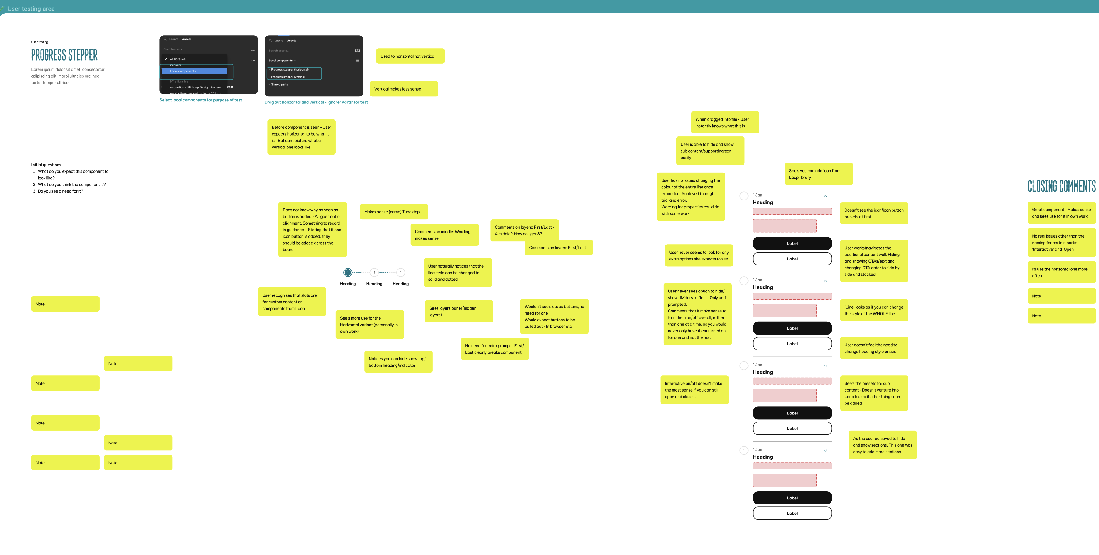
User testing findings
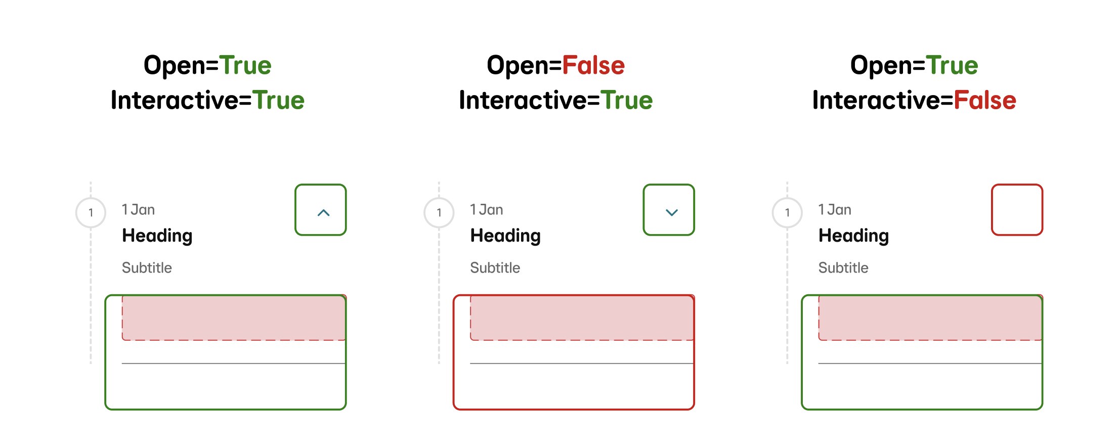
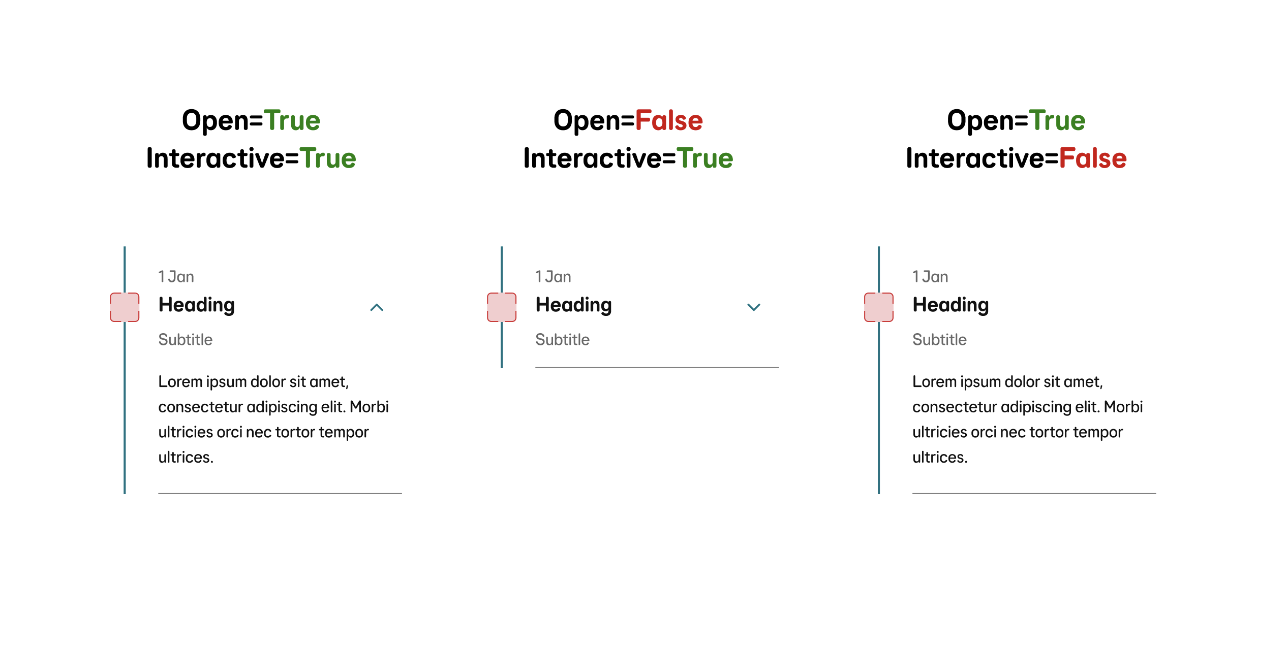
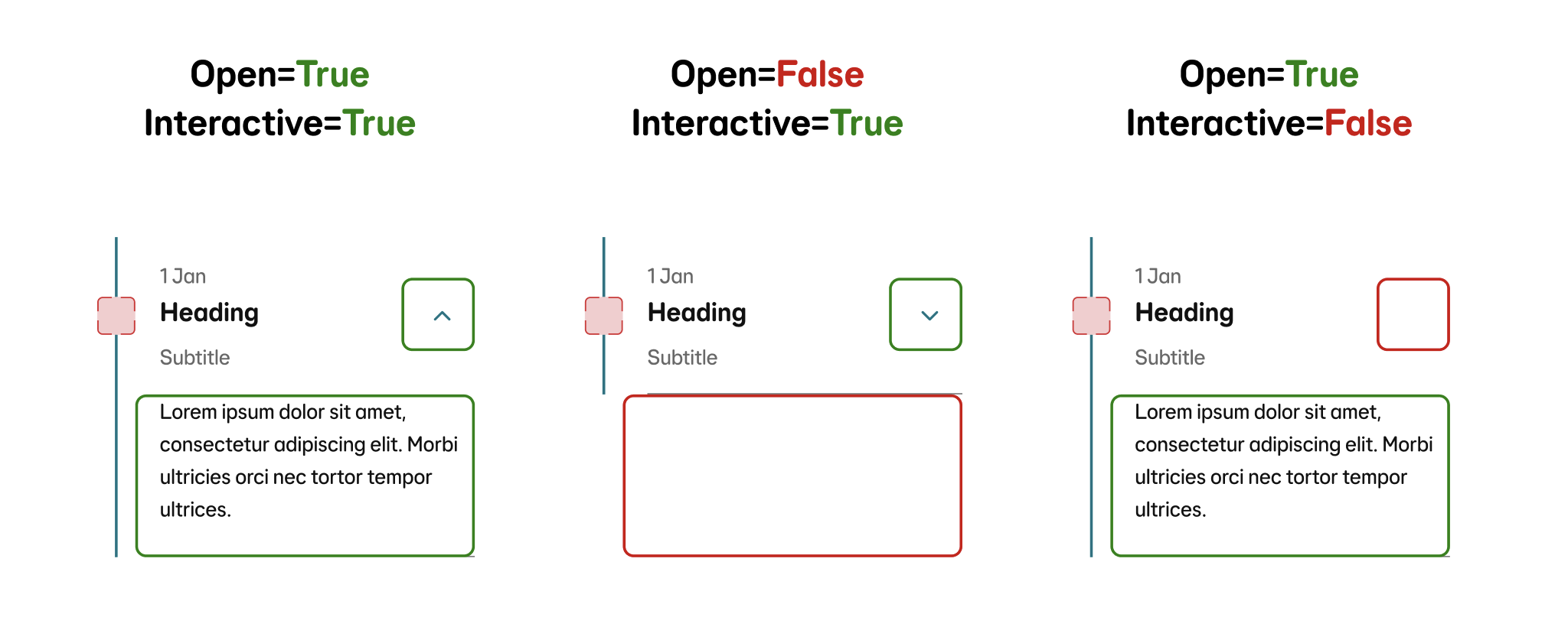
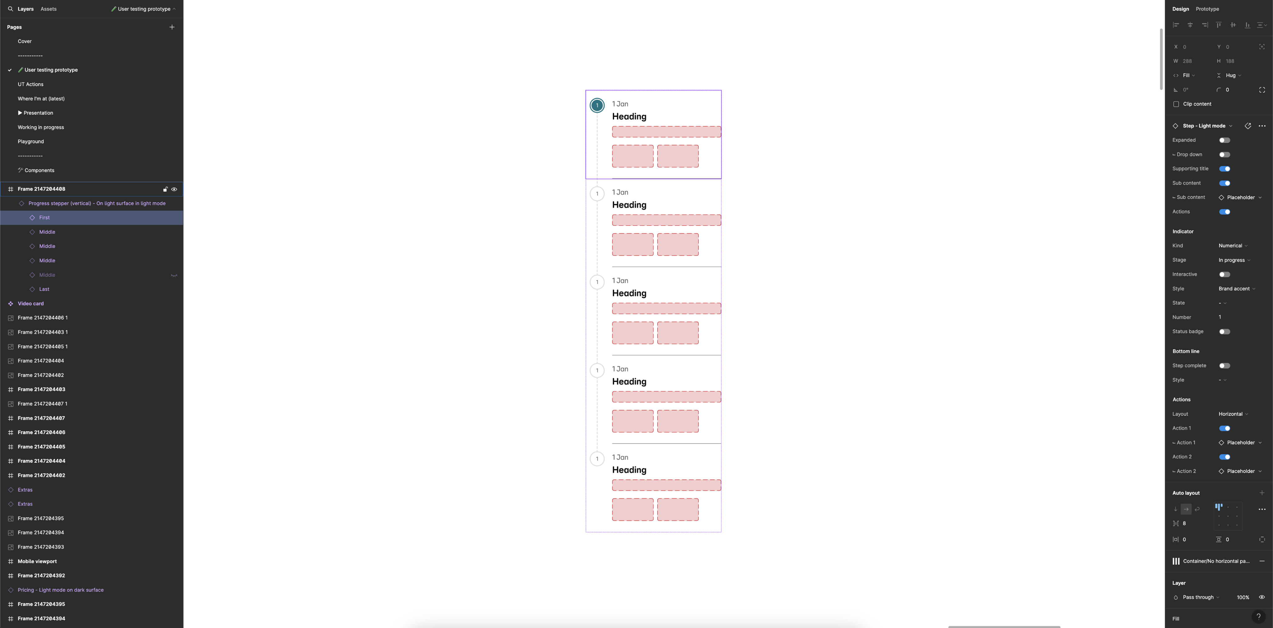
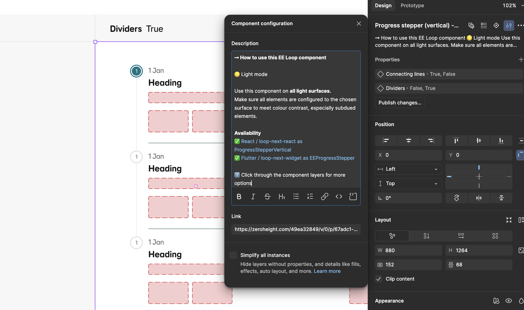
Overall the components tested well, however there was one common issue with the vertical component. I had doubled up on the ‘interactive’ property name:
-
Section: Interactive (boolean)
-
Indicator: Interactive (boolean)
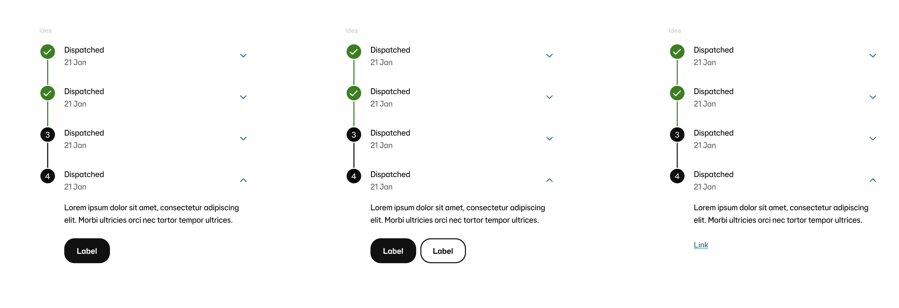
So each section of the vertical progress stepper had two boolean properties to do with interactivity. Making the indicator interactive meant the user can click on it and it would go to that particular step - meaning the content on the page could change depending on what step you have selected. E.g: Go from ‘Card details’ back to ‘View basket’.
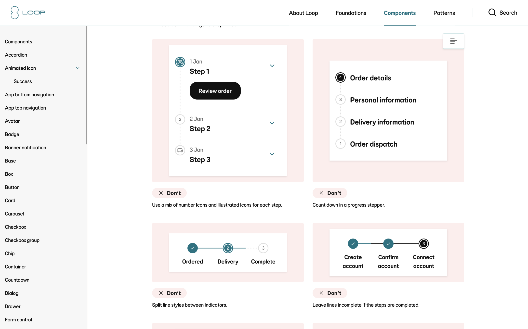
The conflicting interactive property was the ‘drop down’. This allowed the user to ‘expand’ the content in a particular section by taping a chevron icon button. This could be a ‘show/read more’ which would expand the text area for example. This was an optional property which could be turned off and on, and it is advised you don’t hide any important information in a drop down. Therefore you’d ‘show additional content’ but ‘hide interactivity’.
Design refinement
A 10 step subdued aqua colour palette named aqua-subdued, was handed off to dev through Tokens Studio. I uploaded the light and dark mode palettes and replaced all the useage tokens (in through the Figma plugin and sent the merge request to React and Flutter. This automatically
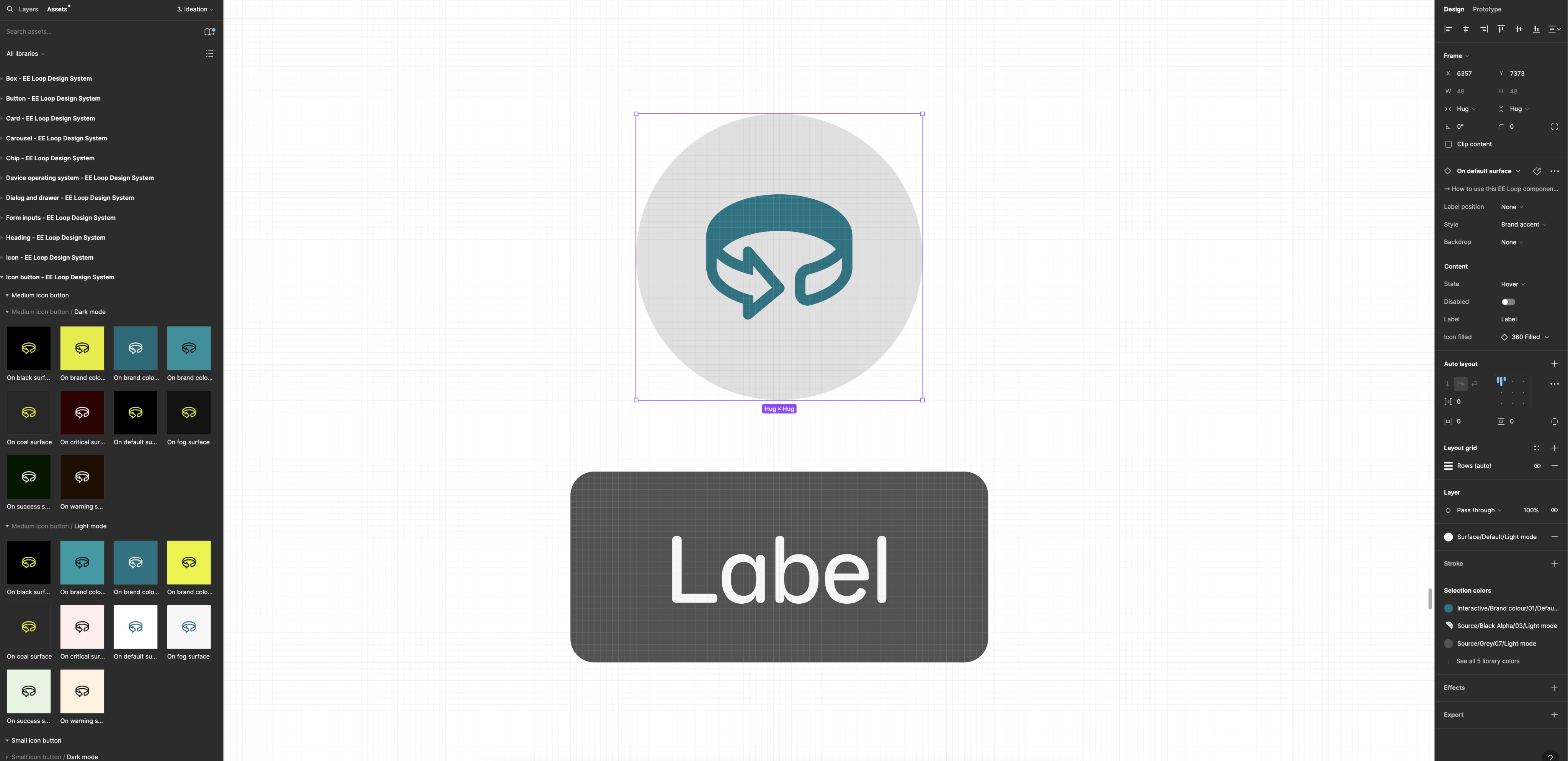
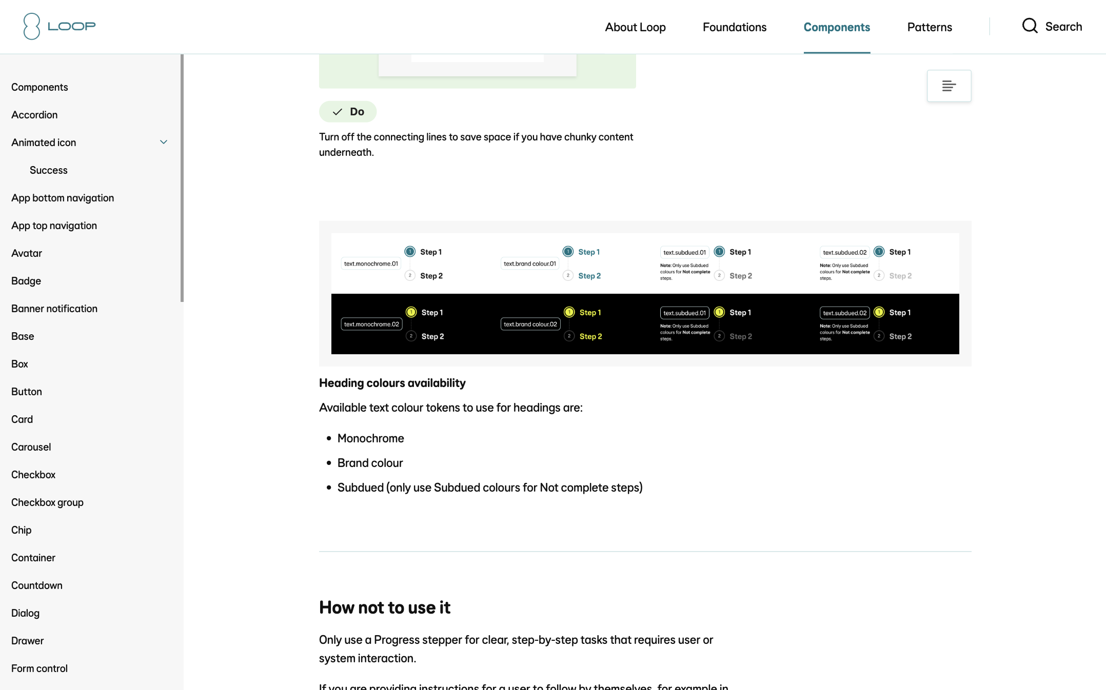
The palette ranges from light (step 1) to dark (step 10) and is structured as design tokens in Tokens Studio for Figma. Each colour step is named consistently (e.g. aqua-subdued.1, aqua-subdued.2, ..., aqua-subdued.10) and includes metadata like HEX values, type (color), and optional usage notes (e.g. for backgrounds, text, or buttons). The tokens have been contrast-checked to meet WCAG AA/AAA standards. Steps 3–5 are ideal for light backgrounds, steps 6–8 for UI components like buttons or cards, and steps 9–10 for text or borders on light backgrounds. The full token set is exported via Tokens Studio in JSON format (tokens-aqua-subdued.json) for easy integration into your codebase using tools like Style Dictionary, CSS variables, or Tailwind config. Designers and developers can sync directly through Tokens Studio for ongoing updates.
Dev handover and build
I created a specification document for the React and Flutter engineers along with walking them through the design, properties and highlighting what tokens were used.
Once built, we now had two consistent components across three platforms: Figma, React and Flutter (React=Web, and Flutter=App with light and dark mode).
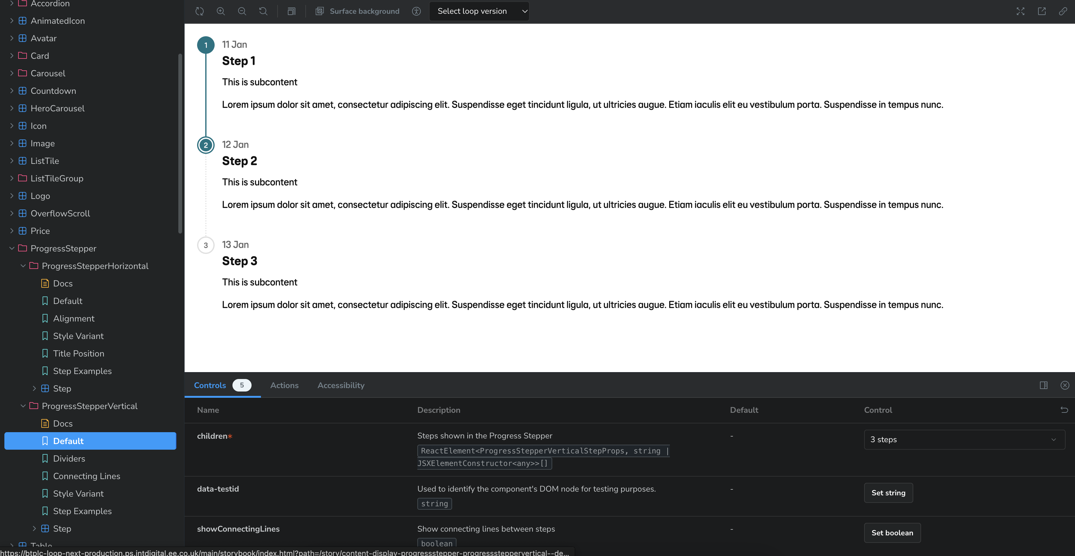
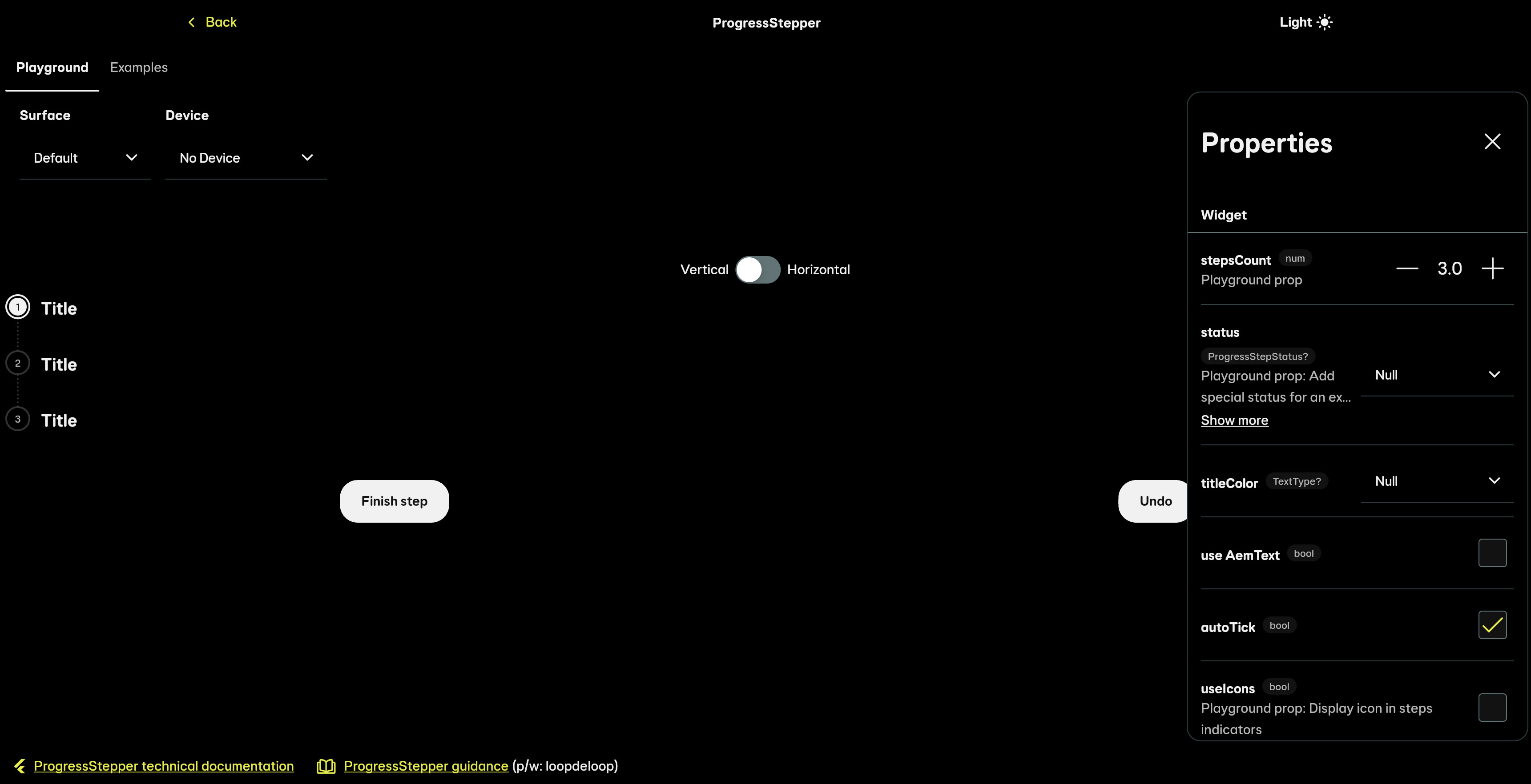
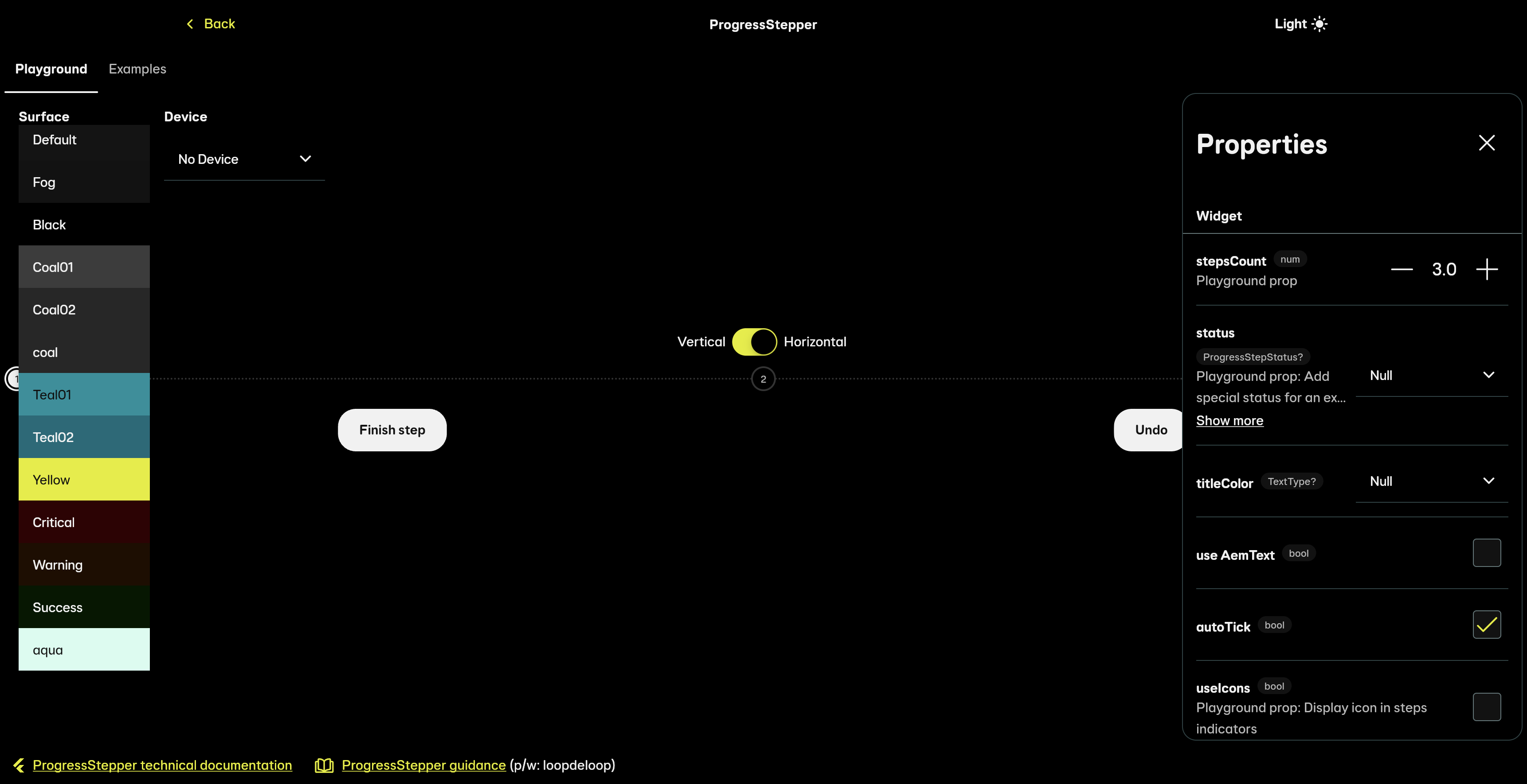
Product designers, content designers and anyone who wanted to could now log in to the React Storybook and Flutter Playground to play around with the components and configure them in many different ways. This especially useful to use if a designer was unsure how far a component could flex in live.
Often Figma allows designers to flex components too much, so by adding these links in the component documentation in Figma - we were able to encourage designers to experiment outside of Figma.
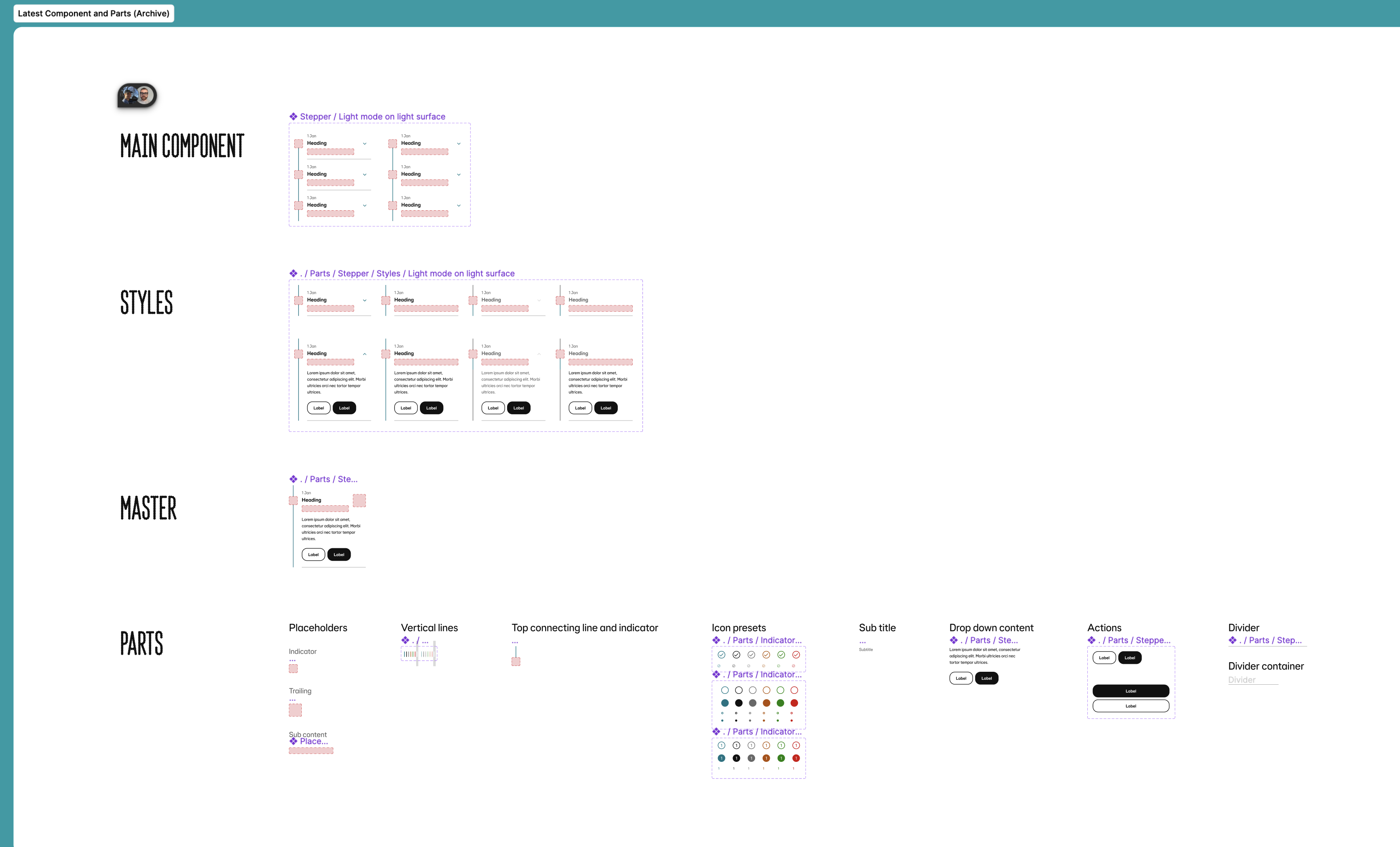
Guidance documentation
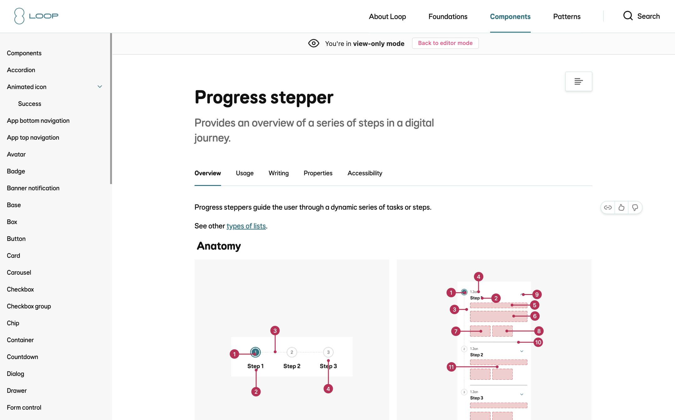
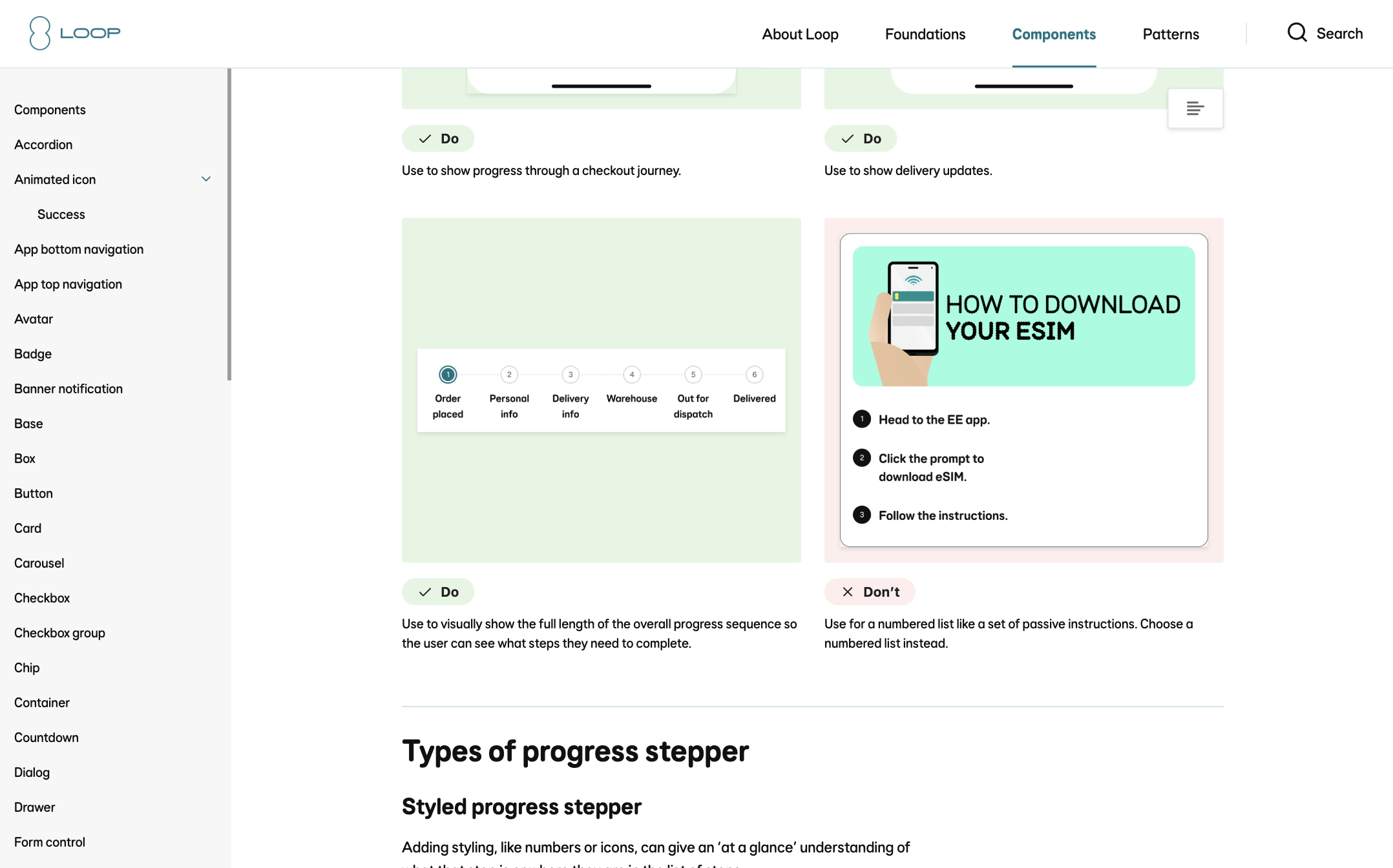
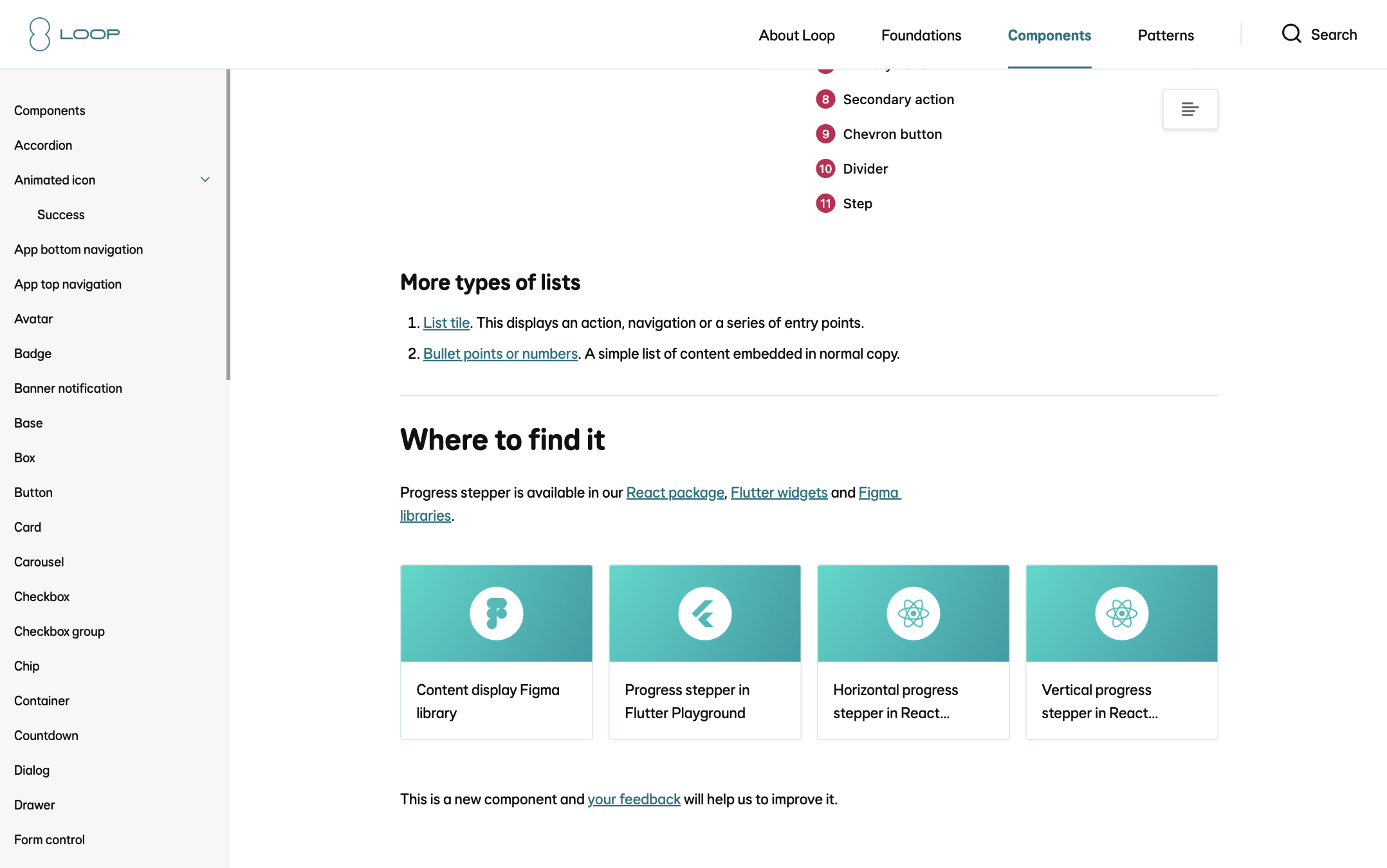
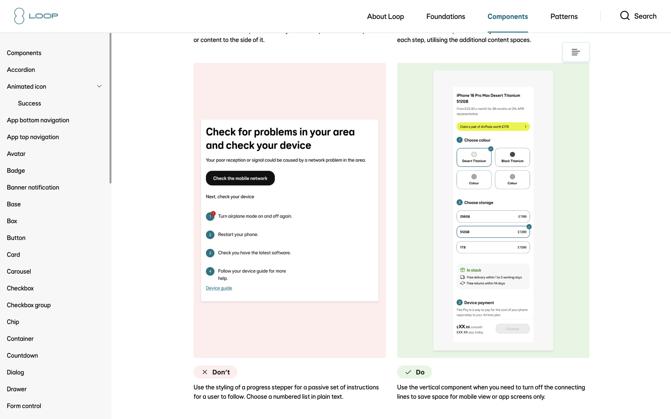
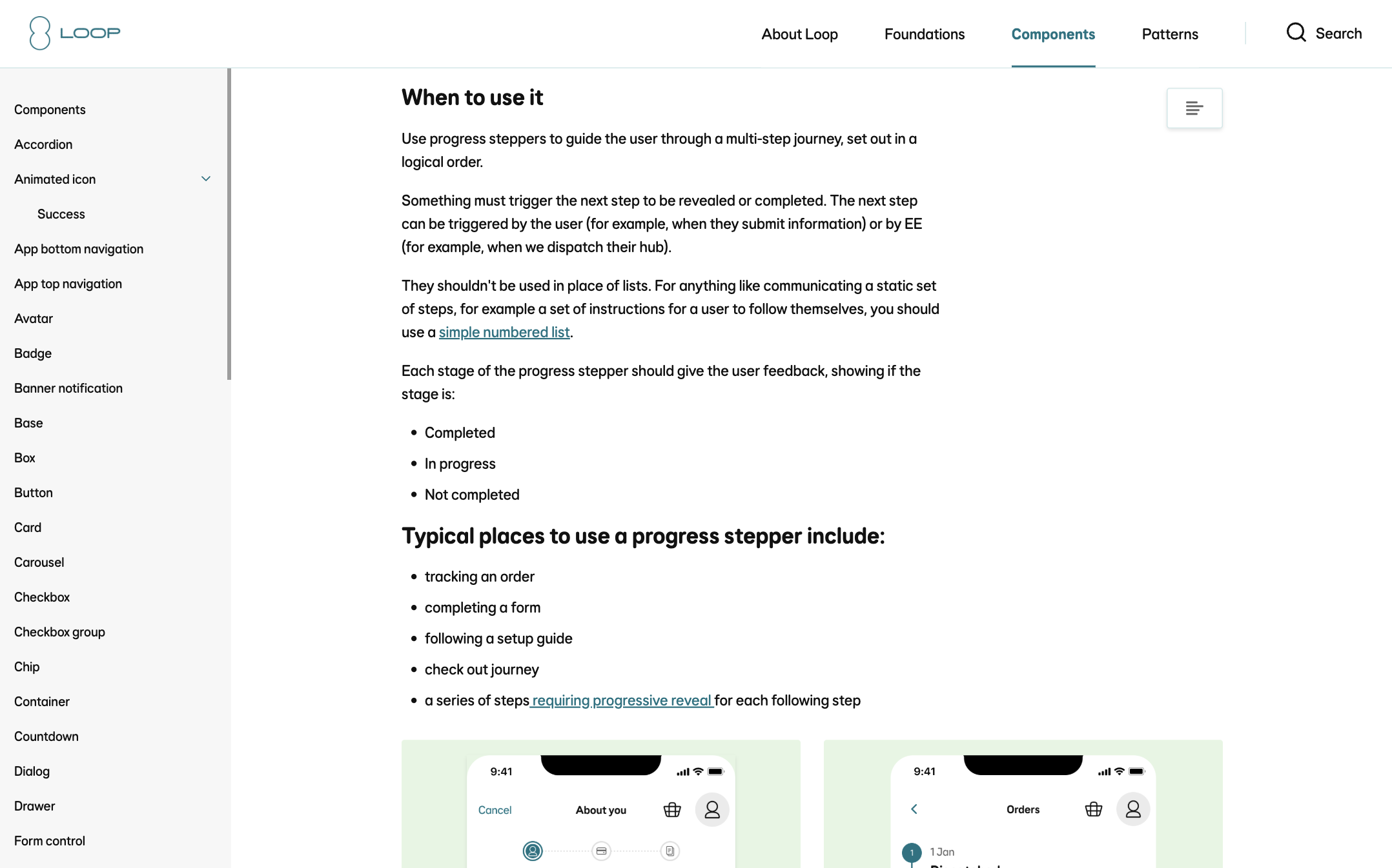
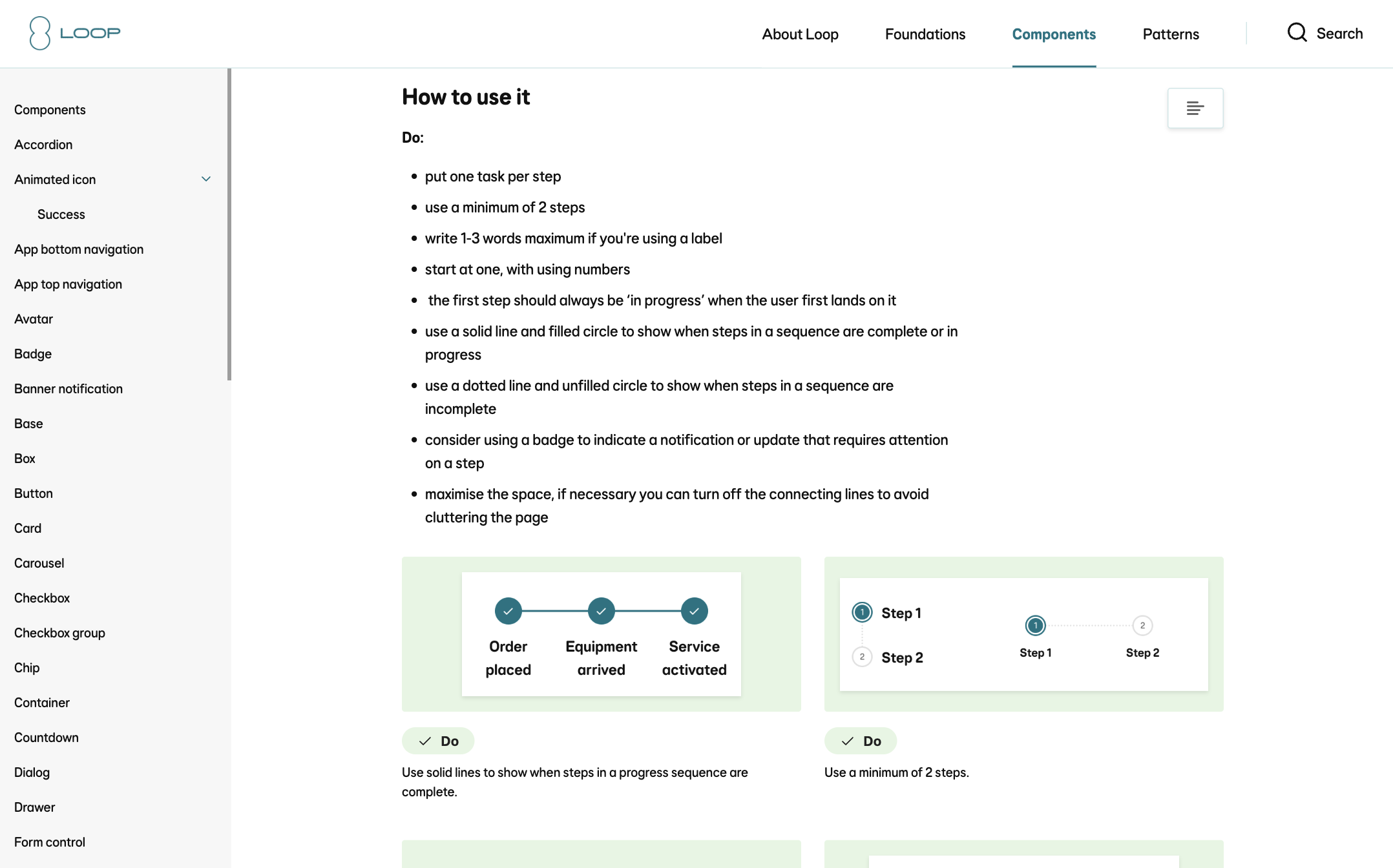
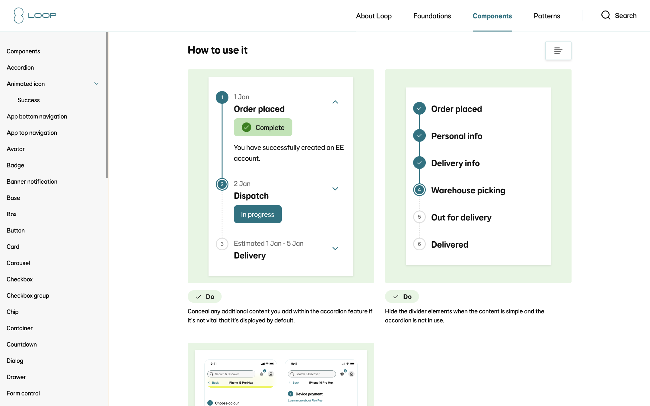
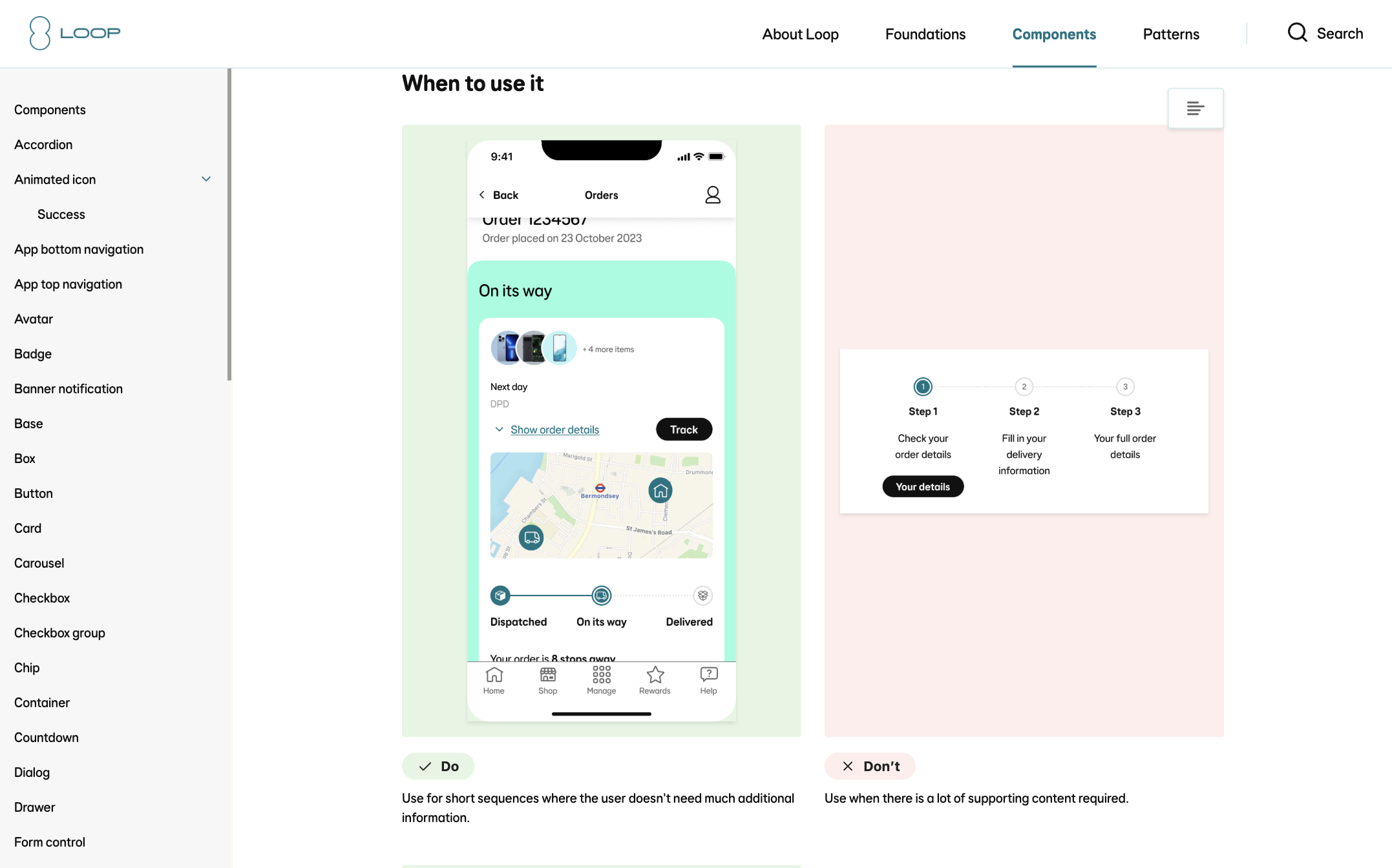
All documentation is stored on our guidance site (Zeroheight) and contains all links to the component across the three platforms. Below is a few screenshots of the guidance me and the content designer created.
In our design system we only release a component when it is available across Figma, React, Flutter and Guidance. The same goes for any updates we make in the future.


Design System
Product Design
User Testing
Creating the new Progress stepper component
My role
Lead Product Designer
The team
-
Product Manager
-
Accessibility Specialist
-
React (Web) and Flutter (App) Engineers
-
Content Designer
Background
As part of an evolving brand direction focused on a more refined and modern visual identity, the design team was tasked with introducing a new subdued aqua color palette into the existing design system. This initiative aimed to align digital products with updated brand aesthetics while maintaining accessibility and consistency across platforms. The new palette was carefully integrated to complement existing color schemes, support a wide range of UI components, and ensure a cohesive user experience in line with the brand’s refreshed visual language.
Project goals
01
Flexibility
Support flexibility and scalability, allowing the component to adapt to a range of use cases and layouts such as horizontal, vertical, or responsive step flows while remaining easy to implement and align with evolving product needs.
02
Consistency and maintainability
Drive consistency across products by providing a unified, reusable component that can sit on all our surfaces and reduce design and development time. Ensuring a cohesive user experience that leverages existing tokens and components from the design system for easier adoption and maintainability.
03
Accessibility
Ensure all users, including those using assistive technologies, can clearly understand and navigate multi-step flows. Creating a more inclusive and usable experience for everyone.
04
Documentation
The component needs to have documentation on our design system guidance site, where designers (product and content) and developers can refer to for correct usage.
Discovery
What has been created by the design community so far?
I started by asking the design community in Slack channels to share their existing work, where they had used and created ‘progress stepper like’ components. I then compiled them into a file to spot common themes, feartures and use cases
After my design exploration I focussed on creating two separate components:
-
Progress stepper (horizontal)
-
Progress stepper (vertical)
Both components used the same ‘Parts’ (building blocks) where possible, however were configured in different ways.
Who is it for?
Product designer
Goals and behaviours
-
Wants to streamline his design process and reduce repetitive tasks.
-
Aims to maintain consistency across different projects and journeys.
-
Actively seeks new design resources and tools to enhance his workflow.
-
Frequently collaborates with developers to ensure the feasibility of his
Pain points
-
Finding a comprehensive design system that covers a wide range of Ul elements.
-
Spending excessive time on recreating components or styles for different projects.
-
Struggling to keep track of design updates and versions.
-
Dealing with inconsistencies and conflicts between her design files and the final implementation.
Developer
Goals and behaviours
-
Seeks a well-documented design system that provides clear guidelines for front-end development.
-
Wants to expedite the implementation process by using pre-built Ul components.
-
Aims to maintain consistency in the visual appearance and behaviour of the Ul elements.
-
Actively contributes to open-source projects and appreciates collaborative development.
Pain points
-
Spending time recreating common Ul components instead of focusing on complex functionality.
-
Struggling to bridge the gap between design files and front-end implementation.
-
Dealing with inconsistent or incomplete design specifications.
-
Difficulty in finding up-to-date resources and design assets for different projects.
Product manager
Goals and behaviours
-
Seeks a design system that can be easily adopted by his team, minimising onboarding time.
-
Wants to enable cross-functional collaboration by providing a shared design language.
-
Aims to maintain consistency and brand integrity across different products.
-
Actively looks for ways to improve the development process and increase overall productivity.
Pain points
-
Wasting time aligning design and development teams due to inconsistent design assets.
-
Difficulty in tracking design changes and managing version control.
-
Struggling to ensure consistent user experiences across various digital touchpoint.
-
Challenging to balance customisation needs with maintaining a cohesive design system.
Giving the component a name
The proposed colour that had been put forward by brand and the agency is a blend of our ‘Fog’ surface colour (Source/Grey/01) and Primary brand colour (Source/Aqua/05).
Information on the specific blend wasn’t available to us, so we had to get as close to #DEE7E8 as we could ourselves.
However this was an opportunity to refine it and propose a more appropriate colour to be used in all of our digital journy’s on web and app.
Design exploration
Off the back of my research and discovery I began work on creating some designs. Drawing inspiratino heavily
Refinement: Two seprate componets
After my design exploration I focussed on creating two separate components:
-
Progress stepper (horizontal)
-
Progress stepper (vertical)
Both components used the same ‘Parts’ (building blocks) where possible, however were configured in different ways.
User testing
Now that I had two components that was in a usable state, I set up 5 moderated user testing sessions over two days, involving 5 product designers across the business.
In these sessions (1/2 hour each) I invited the designers into a Figma file with some tasks to complete. I did not have the two components in the file yet, as I asked them to go ahead and find them in the assets panel.
The sessions were done over Teams screen share and included questions such as:
-
How to find both of the components - What is your expectations of the naming? (etc)
-
Thoughts on the property names?
-
Tasks to add and remove things e.g:
-
Can you add some actions
-
How would you add an extra section
-
How would you change the style of a connecting line or indicator
-
How would you change the style of a connecting line or indicator
-
Make an indicator interactive/not interactive
-
Etc...
-
How did you find using the component and do you see a use for it in your squad work?
User testing findings
Overall the components tested well, however there was one common issue with the vertical component. I had doubled up on the ‘interactive’ property name:
-
Section: Interactive (boolean)
-
Indicator: Interactive (boolean)
So each section of the vertical progress stepper had two boolean properties to do with interactivity. Making the indicator interactive meant the user can click on it and it would go to that particular step - meaning the content on the page could change depending on what step you have selected. E.g: Go from ‘Card details’ back to ‘View basket’.
The conflicting interactive property was the ‘drop down’. This allowed the user to ‘expand’ the content in a particular section by taping a chevron icon button. This could be a ‘show/read more’ which would expand the text area for example. This was an optional property which could be turned off and on, and it is advised you don’t hide any important information in a drop down. Therefore you’d ‘show additional content’ but ‘hide interactivity’.
Design refinement
A 10 step subdued aqua colour palette named aqua-subdued, was handed off to dev through Tokens Studio. I uploaded the light and dark mode palettes and replaced all the useage tokens (in through the Figma plugin and sent the merge request to React and Flutter. This automatically
The palette ranges from light (step 1) to dark (step 10) and is structured as design tokens in Tokens Studio for Figma. Each colour step is named consistently (e.g. aqua-subdued.1, aqua-subdued.2, ..., aqua-subdued.10) and includes metadata like HEX values, type (color), and optional usage notes (e.g. for backgrounds, text, or buttons). The tokens have been contrast-checked to meet WCAG AA/AAA standards. Steps 3–5 are ideal for light backgrounds, steps 6–8 for UI components like buttons or cards, and steps 9–10 for text or borders on light backgrounds. The full token set is exported via Tokens Studio in JSON format (tokens-aqua-subdued.json) for easy integration into your codebase using tools like Style Dictionary, CSS variables, or Tailwind config. Designers and developers can sync directly through Tokens Studio for ongoing updates.
Dev handover and build
I created a specification document for the React and Flutter engineers along with walking them through the design, properties and highlighting what tokens were used.
Once built, we now had two consistent components across three platforms: Figma, React and Flutter (React=Web, and Flutter=App with light and dark mode).
Product designers, content designers and anyone who wanted to could now log in to the React Storybook and Flutter Playground to play around with the components and configure them in many different ways. This especially useful to use if a designer was unsure how far a component could flex in live.
Often Figma allows designers to flex components too much, so by adding these links in the component documentation in Figma - we were able to encourage designers to experiment outside of Figma.
Guidance documentation
All documentation is stored on our guidance site (Zeroheight) and contains all links to the component across the three platforms. Below is a few screenshots of the guidance me and the content designer created.
In our design system we only release a component when it is available across Figma, React, Flutter and Guidance. The same goes for any updates we make in the future.
Design System
Product Design
User Testing
Creating the new Progress stepper component
Introducing a new progress stepper component to provide a consistent, accessible way for users to track their progress through multi-step flows across products.
My role
Lead Product Designer
The team
-
Product Manager
-
Accessibility Specialist
-
React (Web) and Flutter (App) Engineers
-
Content Designer
Background
As part of an evolving brand direction focused on a more refined and modern visual identity, the design team was tasked with introducing a new subdued aqua color palette into the existing design system. This initiative aimed to align digital products with updated brand aesthetics while maintaining accessibility and consistency across platforms. The new palette was carefully integrated to complement existing color schemes, support a wide range of UI components, and ensure a cohesive user experience in line with the brand’s refreshed visual language.
Project goals
01
Flexibility
Support flexibility and scalability, allowing the component to adapt to a range of use cases and layouts such as horizontal, vertical, or responsive step flows while remaining easy to implement and align with evolving product needs.
02
Consistency and maintainability
Drive consistency across products by providing a unified, reusable component that can sit on all our surfaces and reduce design and development time. Ensuring a cohesive user experience that leverages existing tokens and components from the design system for easier adoption and maintainability.
03
Accessibility
Ensure all users, including those using assistive technologies, can clearly understand and navigate multi-step flows. Creating a more inclusive and usable experience for everyone.
04
Documentation
The component needs to have documentation on our design system guidance site, where designers (product and content) and developers can refer to for correct usage.
Discovery
What has been created by the design community so far?
I started by asking the design community in Slack channels to share their existing work, where they had used and created ‘progress stepper like’ components. I then compiled them into a file to spot common themes, feartures and use cases
Who is it for?
Product designer
Goals and behaviours
-
Wants to streamline his design process and reduce repetitive tasks.
-
Aims to maintain consistency across different projects and journeys.
-
Actively seeks new design resources and tools to enhance his workflow.
-
Frequently collaborates with developers to ensure the feasibility of his
Pain points
-
Finding a comprehensive design system that covers a wide range of Ul elements.
-
Spending excessive time on recreating components or styles for different projects.
-
Struggling to keep track of design updates and versions.
-
Dealing with inconsistencies and conflicts between her design files and the final implementation.
Developer
Goals and behaviours
-
Seeks a well-documented design system that provides clear guidelines for front-end development.
-
Wants to expedite the implementation process by using pre-built Ul components.
-
Aims to maintain consistency in the visual appearance and behaviour of the Ul elements.
-
Actively contributes to open-source projects and appreciates collaborative development.
Pain points
-
Spending time recreating common Ul components instead of focusing on complex functionality.
-
Struggling to bridge the gap between design files and front-end implementation.
-
Dealing with inconsistent or incomplete design specifications.
-
Difficulty in finding up-to-date resources and design assets for different projects.
Product manager
Goals and behaviours
-
Seeks a design system that can be easily adopted by his team, minimising onboarding time.
-
Wants to enable cross-functional collaboration by providing a shared design language.
-
Aims to maintain consistency and brand integrity across different products.
-
Actively looks for ways to improve the development process and increase overall productivity.
Pain points
-
Wasting time aligning design and development teams due to inconsistent design assets.
-
Difficulty in tracking design changes and managing version control.
-
Struggling to ensure consistent user experiences across various digital touchpoint.
-
Challenging to balance customisation needs with maintaining a cohesive design system.
Giving the component a name
The proposed colour that had been put forward by brand and the agency is a blend of our ‘Fog’ surface colour (Source/Grey/01) and Primary brand colour (Source/Aqua/05).
Information on the specific blend wasn’t available to us, so we had to get as close to #DEE7E8 as we could ourselves.
However this was an opportunity to refine it and propose a more appropriate colour to be used in all of our digital journy’s on web and app.
Design exploration
Off the back of my research and discovery I began work on creating some designs. Drawing inspiratino heavily
Refinement: Two seprate componets
After my design exploration I focussed on creating two separate components:
-
Progress stepper (horizontal)
-
Progress stepper (vertical)
Both components used the same ‘Parts’ (building blocks) where possible, however were configured in different ways.
User testing
Now that I had two components that was in a usable state, I set up 5 moderated user testing sessions over two days, involving 5 product designers across the business.
In these sessions (1/2 hour each) I invited the designers into a Figma file with some tasks to complete. I did not have the two components in the file yet, as I asked them to go ahead and find them in the assets panel.
The sessions were done over Teams screen share and included questions such as:
-
How to find both of the components - What is your expectations of the naming? (etc)
-
Thoughts on the property names?
-
Tasks to add and remove things e.g:
-
Can you add some actions
-
How would you add an extra section
-
How would you change the style of a connecting line or indicator
-
How would you change the style of a connecting line or indicator
-
Make an indicator interactive/not interactive
-
Etc...
-
How did you find using the component and do you see a use for it in your squad work?
User testing findings
Overall the components tested well, however there was one common issue with the vertical component. I had doubled up on the ‘interactive’ property name:
-
Section: Interactive (boolean)
-
Indicator: Interactive (boolean)
So each section of the vertical progress stepper had two boolean properties to do with interactivity. Making the indicator interactive meant the user can click on it and it would go to that particular step - meaning the content on the page could change depending on what step you have selected. E.g: Go from ‘Card details’ back to ‘View basket’.
The conflicting interactive property was the ‘drop down’. This allowed the user to ‘expand’ the content in a particular section by taping a chevron icon button. This could be a ‘show/read more’ which would expand the text area for example. This was an optional property which could be turned off and on, and it is advised you don’t hide any important information in a drop down. Therefore you’d ‘show additional content’ but ‘hide interactivity’.
Design refinement
A 10 step subdued aqua colour palette named aqua-subdued, was handed off to dev through Tokens Studio. I uploaded the light and dark mode palettes and replaced all the useage tokens (in through the Figma plugin and sent the merge request to React and Flutter. This automatically
The palette ranges from light (step 1) to dark (step 10) and is structured as design tokens in Tokens Studio for Figma. Each colour step is named consistently (e.g. aqua-subdued.1, aqua-subdued.2, ..., aqua-subdued.10) and includes metadata like HEX values, type (color), and optional usage notes (e.g. for backgrounds, text, or buttons). The tokens have been contrast-checked to meet WCAG AA/AAA standards. Steps 3–5 are ideal for light backgrounds, steps 6–8 for UI components like buttons or cards, and steps 9–10 for text or borders on light backgrounds. The full token set is exported via Tokens Studio in JSON format (tokens-aqua-subdued.json) for easy integration into your codebase using tools like Style Dictionary, CSS variables, or Tailwind config. Designers and developers can sync directly through Tokens Studio for ongoing updates.
Dev handover and build
I created a specification document for the React and Flutter engineers along with walking them through the design, properties and highlighting what tokens were used.
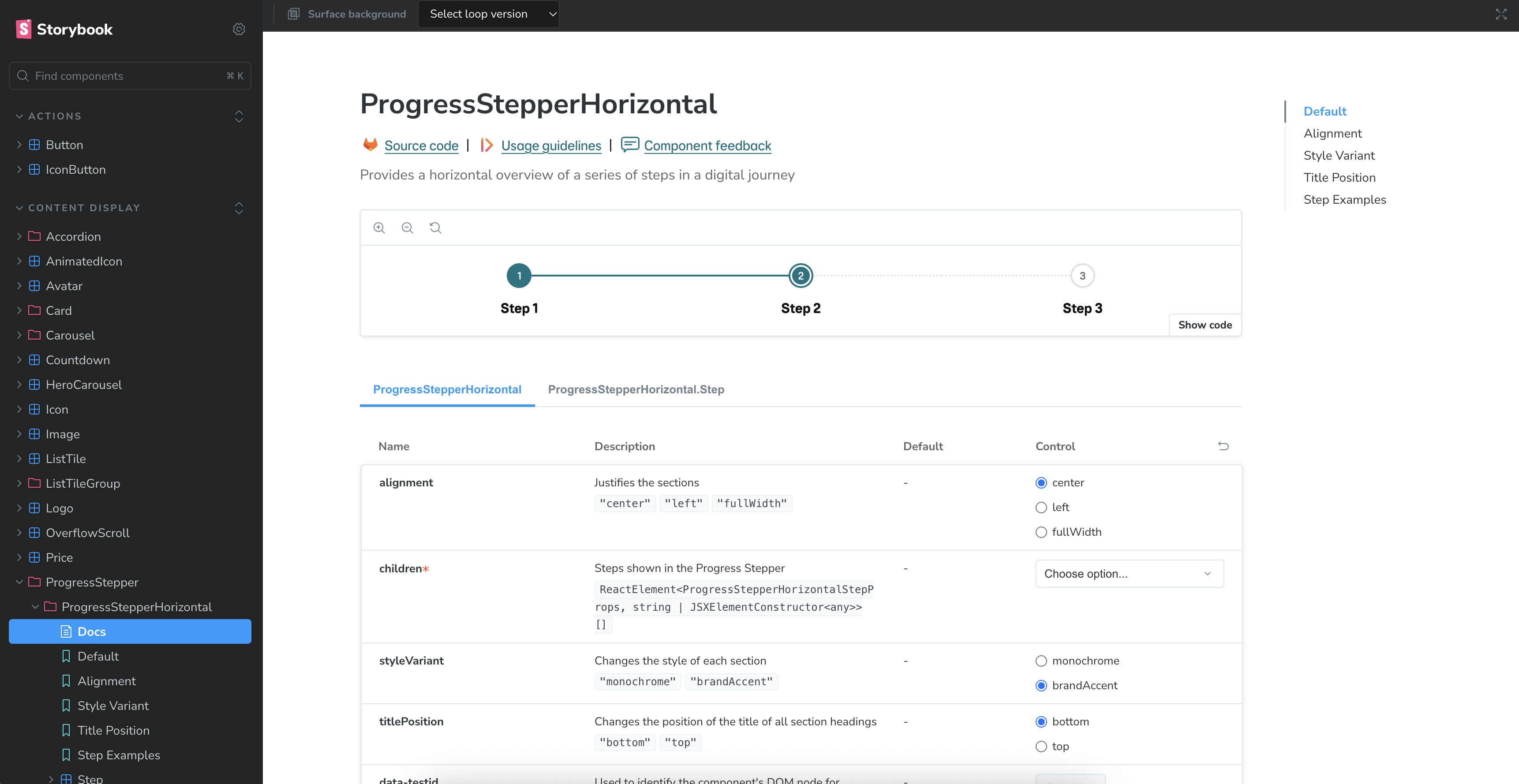
Once built, we now had two consistent components across three platforms: Figma, React and Flutter (React=Web, and Flutter=App with light and dark mode).
Product designers, content designers and anyone who wanted to could now log in to the React Storybook and Flutter Playground to play around with the components and configure them in many different ways. This especially useful to use if a designer was unsure how far a component could flex in live.
Often Figma allows designers to flex components too much, so by adding these links in the component documentation in Figma - we were able to encourage designers to experiment outside of Figma.
Guidance documentation
All documentation is stored on our guidance site (Zeroheight) and contains all links to the component across the three platforms. Below is a few screenshots of the guidance me and the content designer created.
In our design system we only release a component when it is available across Figma, React, Flutter and Guidance. The same goes for any updates we make in the future.


Design System
Product Design
User Testing
Creating the new Progress stepper component
Introducing a new progress stepper component to provide a consistent, accessible way for users to track their progress through multi-step flows across products.
My role
Lead Product Designer
The team
-
Product Manager
-
Accessibility Specialist
-
React (Web) and Flutter (App) Engineers
-
Content Designer
Background
As part of an evolving brand direction focused on a more refined and modern visual identity, the design team was tasked with introducing a new subdued aqua color palette into the existing design system. This initiative aimed to align digital products with updated brand aesthetics while maintaining accessibility and consistency across platforms. The new palette was carefully integrated to complement existing color schemes, support a wide range of UI components, and ensure a cohesive user experience in line with the brand’s refreshed visual language.
Project goals
01
Flexibility
Support flexibility and scalability, allowing the component to adapt to a range of use cases and layouts such as horizontal, vertical, or responsive step flows while remaining easy to implement and align with evolving product needs.
02
Consistency and maintainability
Drive consistency across products by providing a unified, reusable component that can sit on all our surfaces and reduce design and development time. Ensuring a cohesive user experience that leverages existing tokens and components from the design system for easier adoption and maintainability.
03
Accessibility
Ensure all users, including those using assistive technologies, can clearly understand and navigate multi-step flows. Creating a more inclusive and usable experience for everyone.
04
Documentation
The component needs to have documentation on our design system guidance site, where designers (product and content) and developers can refer to for correct usage.
Discovery
What has been created by the design community so far?
I started by asking the design community in Slack channels to share their existing work, where they had used and created ‘progress stepper like’ components. I then compiled them into a file to spot common themes, feartures and use cases
Who is it for?
Product designer
Goals and behaviours
-
Wants to streamline his design process and reduce repetitive tasks.
-
Aims to maintain consistency across different projects and journeys.
-
Actively seeks new design resources and tools to enhance his workflow.
-
Frequently collaborates with developers to ensure the feasibility of his
Pain points
-
Finding a comprehensive design system that covers a wide range of Ul elements.
-
Spending excessive time on recreating components or styles for different projects.
-
Struggling to keep track of design updates and versions.
-
Dealing with inconsistencies and conflicts between her design files and the final implementation.
Developer
Goals and behaviours
-
Seeks a well-documented design system that provides clear guidelines for front-end development.
-
Wants to expedite the implementation process by using pre-built Ul components.
-
Aims to maintain consistency in the visual appearance and behaviour of the Ul elements.
-
Actively contributes to open-source projects and appreciates collaborative development.
Pain points
-
Spending time recreating common Ul components instead of focusing on complex functionality.
-
Struggling to bridge the gap between design files and front-end implementation.
-
Dealing with inconsistent or incomplete design specifications.
-
Difficulty in finding up-to-date resources and design assets for different projects.
Product manager
Goals and behaviours
-
Seeks a design system that can be easily adopted by his team, minimising onboarding time.
-
Wants to enable cross-functional collaboration by providing a shared design language.
-
Aims to maintain consistency and brand integrity across different products.
-
Actively looks for ways to improve the development process and increase overall productivity.
Pain points
-
Wasting time aligning design and development teams due to inconsistent design assets.
-
Difficulty in tracking design changes and managing version control.
-
Struggling to ensure consistent user experiences across various digital touchpoint.
-
Challenging to balance customisation needs with maintaining a cohesive design system.
Giving the component a name
The proposed colour that had been put forward by brand and the agency is a blend of our ‘Fog’ surface colour (Source/Grey/01) and Primary brand colour (Source/Aqua/05).
Information on the specific blend wasn’t available to us, so we had to get as close to #DEE7E8 as we could ourselves.
However this was an opportunity to refine it and propose a more appropriate colour to be used in all of our digital journy’s on web and app.
Design exploration
Off the back of my research and discovery I began work on creating some designs. Drawing inspiratino heavily
User testing
Now that I had two components that was in a usable state, I set up 5 moderated user testing sessions over two days, involving 5 product designers across the business.
In these sessions (1/2 hour each) I invited the designers into a Figma file with some tasks to complete. I did not have the two components in the file yet, as I asked them to go ahead and find them in the assets panel.
The sessions were done over Teams screen share and included questions such as:
-
How to find both of the components - What is your expectations of the naming? (etc)
-
Thoughts on the property names?
-
Tasks to add and remove things e.g:
-
Can you add some actions
-
How would you add an extra section
-
How would you change the style of a connecting line or indicator
-
How would you change the style of a connecting line or indicator
-
Make an indicator interactive/not interactive
-
Etc...
-
How did you find using the component and do you see a use for it in your squad work?
User testing findings
Overall the components tested well, however there was one common issue with the vertical component. I had doubled up on the ‘interactive’ property name:
-
Section: Interactive (boolean)
-
Indicator: Interactive (boolean)
So each section of the vertical progress stepper had two boolean properties to do with interactivity. Making the indicator interactive meant the user can click on it and it would go to that particular step - meaning the content on the page could change depending on what step you have selected. E.g: Go from ‘Card details’ back to ‘View basket’.
The conflicting interactive property was the ‘drop down’. This allowed the user to ‘expand’ the content in a particular section by taping a chevron icon button. This could be a ‘show/read more’ which would expand the text area for example. This was an optional property which could be turned off and on, and it is advised you don’t hide any important information in a drop down. Therefore you’d ‘show additional content’ but ‘hide interactivity’.
Refinement: Two seprate componets
After my design exploration I focussed on creating two separate components:
-
Progress stepper (horizontal)
-
Progress stepper (vertical)
Both components used the same ‘Parts’ (building blocks) where possible, however were configured in different ways.
Dev handover and build
I created a specification document for the React and Flutter engineers along with walking them through the design, properties and highlighting what tokens were used.
Once built, we now had two consistent components across three platforms: Figma, React and Flutter (React=Web, and Flutter=App with light and dark mode).
Product designers, content designers and anyone who wanted to could now log in to the React Storybook and Flutter Playground to play around with the components and configure them in many different ways. This especially useful to use if a designer was unsure how far a component could flex in live.
Often Figma allows designers to flex components too much, so by adding these links in the component documentation in Figma - we were able to encourage designers to experiment outside of Figma.
Design refinement
A 10 step subdued aqua colour palette named aqua-subdued, was handed off to dev through Tokens Studio. I uploaded the light and dark mode palettes and replaced all the useage tokens (in through the Figma plugin and sent the merge request to React and Flutter. This automatically
The palette ranges from light (step 1) to dark (step 10) and is structured as design tokens in Tokens Studio for Figma. Each colour step is named consistently (e.g. aqua-subdued.1, aqua-subdued.2, ..., aqua-subdued.10) and includes metadata like HEX values, type (color), and optional usage notes (e.g. for backgrounds, text, or buttons). The tokens have been contrast-checked to meet WCAG AA/AAA standards. Steps 3–5 are ideal for light backgrounds, steps 6–8 for UI components like buttons or cards, and steps 9–10 for text or borders on light backgrounds. The full token set is exported via Tokens Studio in JSON format (tokens-aqua-subdued.json) for easy integration into your codebase using tools like Style Dictionary, CSS variables, or Tailwind config. Designers and developers can sync directly through Tokens Studio for ongoing updates.
Guidance documentation
All documentation is stored on our guidance site (Zeroheight) and contains all links to the component across the three platforms. Below is a few screenshots of the guidance me and the content designer created.
In our design system we only release a component when it is available across Figma, React, Flutter and Guidance. The same goes for any updates we make in the future.
Design System
Product Design
User Testing
Creating the new Progress stepper component
Introducing a new progress stepper component to provide a consistent, accessible way for users to track their progress through multi-step flows across products.
My role
Lead Product Designer
The team
-
Product Manager
-
Accessibility Specialist
-
React (Web) and Flutter (App) Engineers
-
Content Designer
Background
As our products evolved to support more complex, multi-step user journeys such as onboarding, checkout, and form-based workflows. We identified an increasing need for a consistent way to visually communicate progress.
Previously, teams had been designing their own solutions or relying on outdated patterns, leading to inconsistencies in user experience and accessibility across platforms.
To address this gap, we needed a new progress stepper component for the design system, aiming to standardise how progress is displayed, improve usability, and reduce design and development overhead for teams implementing multi-step flows.
Project goals
01
Flexibility
Support flexibility and scalability, allowing the component to adapt to a range of use cases and layouts such as horizontal, vertical, or responsive step flows while remaining easy to implement and align with evolving product needs.
02
Consistency and maintainability
Drive consistency across products by providing a unified, reusable component that can sit on all our surfaces and reduce design and development time. Ensuring a cohesive user experience that leverages existing tokens and components from the design system for easier adoption and maintainability.
03
Accessibility
Ensure all users, including those using assistive technologies, can clearly understand and navigate multi-step flows. Creating a more inclusive and usable experience for everyone.
04
Documentation
The component needs to have documentation on our design system guidance site, where designers (product and content) and developers can refer to for correct usage.
Discovery
What has been created by the design community so far?
I started by asking the design community in Slack channels to share their existing work, where they had used and created ‘progress stepper like’ components. I then compiled them into a file to document common themes, features and use cases.
Who is it for?
Product designer
Goals and behaviours
-
Wants to streamline his design process and reduce repetitive tasks.
-
Aims to maintain consistency across different projects and journeys.
-
Actively seeks new design resources and tools to enhance his workflow.
-
Frequently collaborates with developers to ensure the feasibility of his
Pain points
-
Finding a comprehensive design system that covers a wide range of Ul elements.
-
Spending excessive time on recreating components or styles for different projects.
-
Struggling to keep track of design updates and versions.
-
Dealing with inconsistencies and conflicts between her design files and the final implementation.
Developer
Goals and behaviours
-
Seeks a well-documented design system that provides clear guidelines for front-end development.
-
Wants to expedite the implementation process by using pre-built Ul components.
-
Aims to maintain consistency in the visual appearance and behaviour of the Ul elements.
-
Actively contributes to open-source projects and appreciates collaborative development.
Pain points
-
Spending time recreating common Ul components instead of focusing on complex functionality.
-
Struggling to bridge the gap between design files and front-end implementation.
-
Dealing with inconsistent or incomplete design specifications.
-
Difficulty in finding up-to-date resources and design assets for different projects.
Product manager
Goals and behaviours
-
Seeks a design system that can be easily adopted by his team, minimising onboarding time.
-
Wants to enable cross-functional collaboration by providing a shared design language.
-
Aims to maintain consistency and brand integrity across different products.
-
Actively looks for ways to improve the development process and increase overall productivity.
Pain points
-
Wasting time aligning design and development teams due to inconsistent design assets.
-
Difficulty in tracking design changes and managing version control.
-
Struggling to ensure consistent user experiences across various digital touchpoint.
-
Challenging to balance customisation needs with maintaining a cohesive design system.
Giving the component a name
At this stage the component only had a work in progress name of ‘Progress indicator’. With all our components we prefer to ask the design community what they think our components should be named, as it improves search ability - and our designers are our users.
To get started with this I set up a public Mural board and shared the link in various Slack channels involving product designers, content designers and React/Flutter engineers.
In this Mural board I added some images of ‘progress indicators’ (vertical and horizontal layout variations) from different apps and websites, as well as some of the ones I found from our own community. Next to these I added some blank post it notes for everyone to write their suggestions and thoughts in - along with their name and role.
I left this to populate over the space of around a week and evaluated common themes and names. It was clear that ‘Progress stepper’ was a popular choice and made the most sense to everyone.
Design exploration
Off the back of my research and discovery I began work on creating some designs. Drawing inspiration heavily from what I’d seen in the community, using existing colour tokens an text/heading styles. I also used existing components from our library to flesh out the component with instance swaps and preferred values.
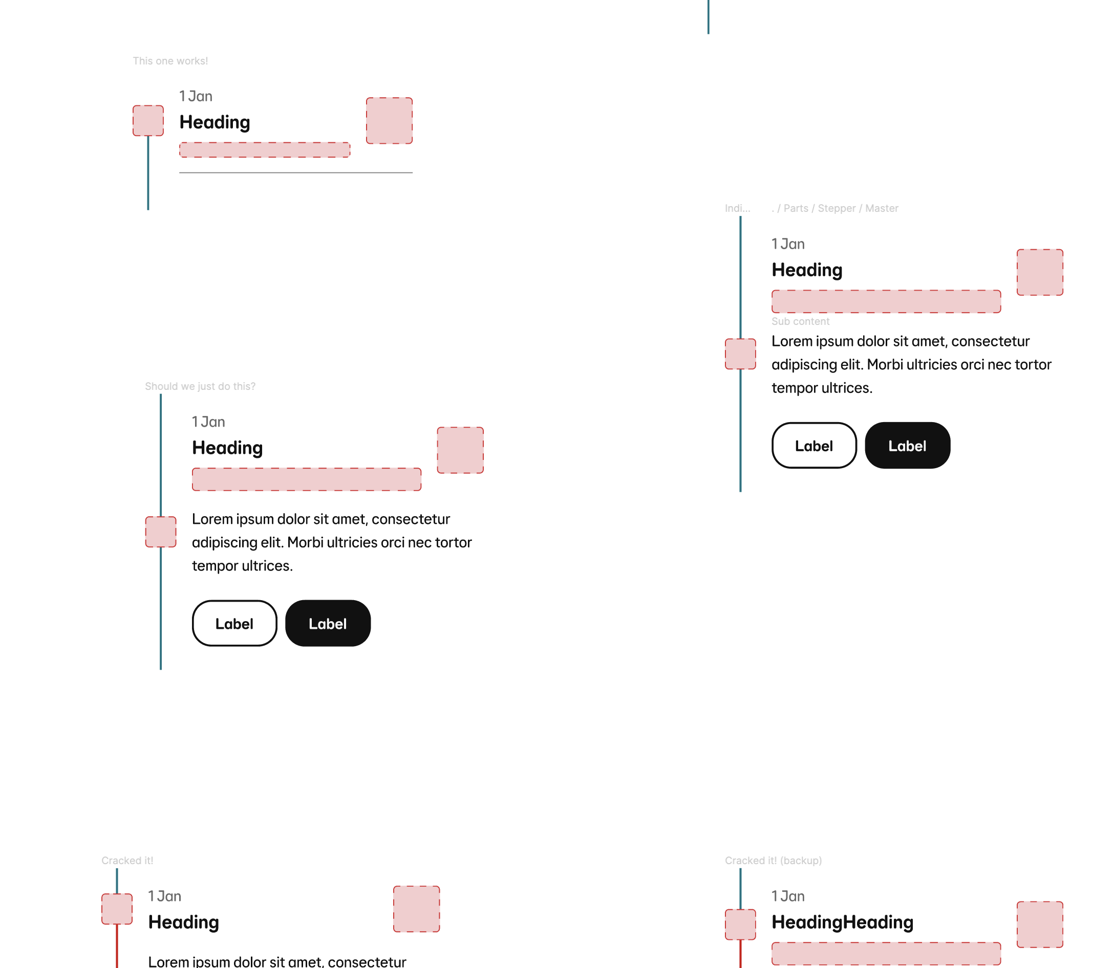
During this stage it became clear that this component needed to become two separate components. The vertical and horizontal components had two very different jobs that required very different properties. Of course we could force both components to both sit with in one variant set - however we don’t want a component to loose the majority of its configurations (e.g heading etc) to be lost when switching between variants.
Two separate components
After my design exploration I focussed on creating two separate components:
-
Progress stepper (horizontal)
-
Progress stepper (vertical)
Both components used the same ‘Parts’ (building blocks) where possible, however were configured in different ways.
User testing
Now that I had two components that was in a usable state, I set up 5 moderated user testing sessions over two days, involving 5 product designers across the business.
In these sessions (1/2 hour each) I invited the designers into a Figma file with some tasks to complete. I did not have the two components in the file yet, as I asked them to go ahead and find them in the assets panel.
The sessions were done over Teams screen share and included questions such as:
-
How to find both of the components - What is your expectations of the naming? (etc)
-
Thoughts on the property names?
-
Tasks to add and remove things e.g:
-
Can you add some actions
-
How would you add an extra section
-
How would you change the style of a connecting line or indicator
-
How would you change the style of a connecting line or indicator
-
Make an indicator interactive/not interactive
-
Etc...
-
How did you find using the component and do you see a use for it in your squad work?
User testing findings
Overall the components tested well, however there was one common issue with the vertical component. I had doubled up on the ‘interactive’ property name:
-
Section: Interactive (boolean)
-
Indicator: Interactive (boolean)
So each section of the vertical progress stepper had two boolean properties to do with interactivity. Making the indicator interactive meant the user can click on it and it would go to that particular step - meaning the content on the page could change depending on what step you have selected. E.g: Go from ‘Card details’ back to ‘View basket’.
The conflicting interactive property was the ‘drop down’. This allowed the user to ‘expand’ the content in a particular section by taping a chevron icon button. This could be a ‘show/read more’ which would expand the text area for example. This was an optional property which could be turned off and on, and it is advised you don’t hide any important information in a drop down. Therefore you’d ‘show additional content’ but ‘hide interactivity’.
Design refinement
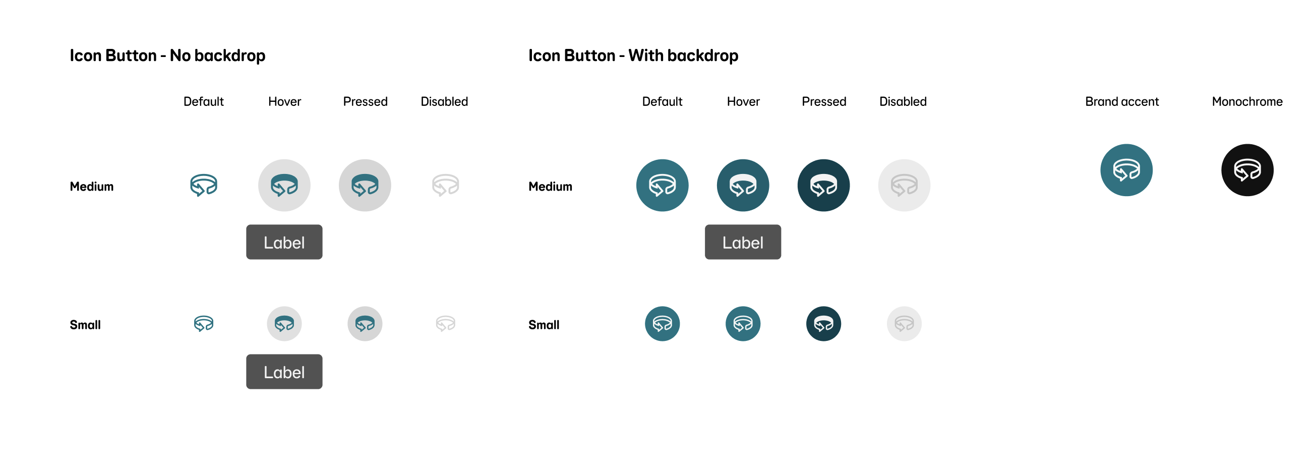
During this project there was something that didn’t go to plan, and that was the use of aqua subdued in Chip.
Dev handover and build
I created a specification document for the React and Flutter engineers along with walking them through the design, properties and highlighting what tokens were used.
Once built, we now had two consistent components across three platforms: Figma, React and Flutter (React=Web, and Flutter=App with light and dark mode).
Product designers, content designers and anyone who wanted to could now log in to the React Storybook and Flutter Playground to play around with the components and configure them in many different ways. This especially useful to use if a designer was unsure how far a component could flex in live.
Often Figma allows designers to flex components too much, so by adding these links in the component documentation in Figma - we were able to encourage designers to experiment outside of Figma.
Guidance documentation
All documentation is stored on our guidance site (Zeroheight) and contains all links to the component across the three platforms. Below is a few screenshots of the guidance me and the content designer created.
In our design system we only release a component when it is available across Figma, React, Flutter and Guidance. The same goes for any updates we make in the future.