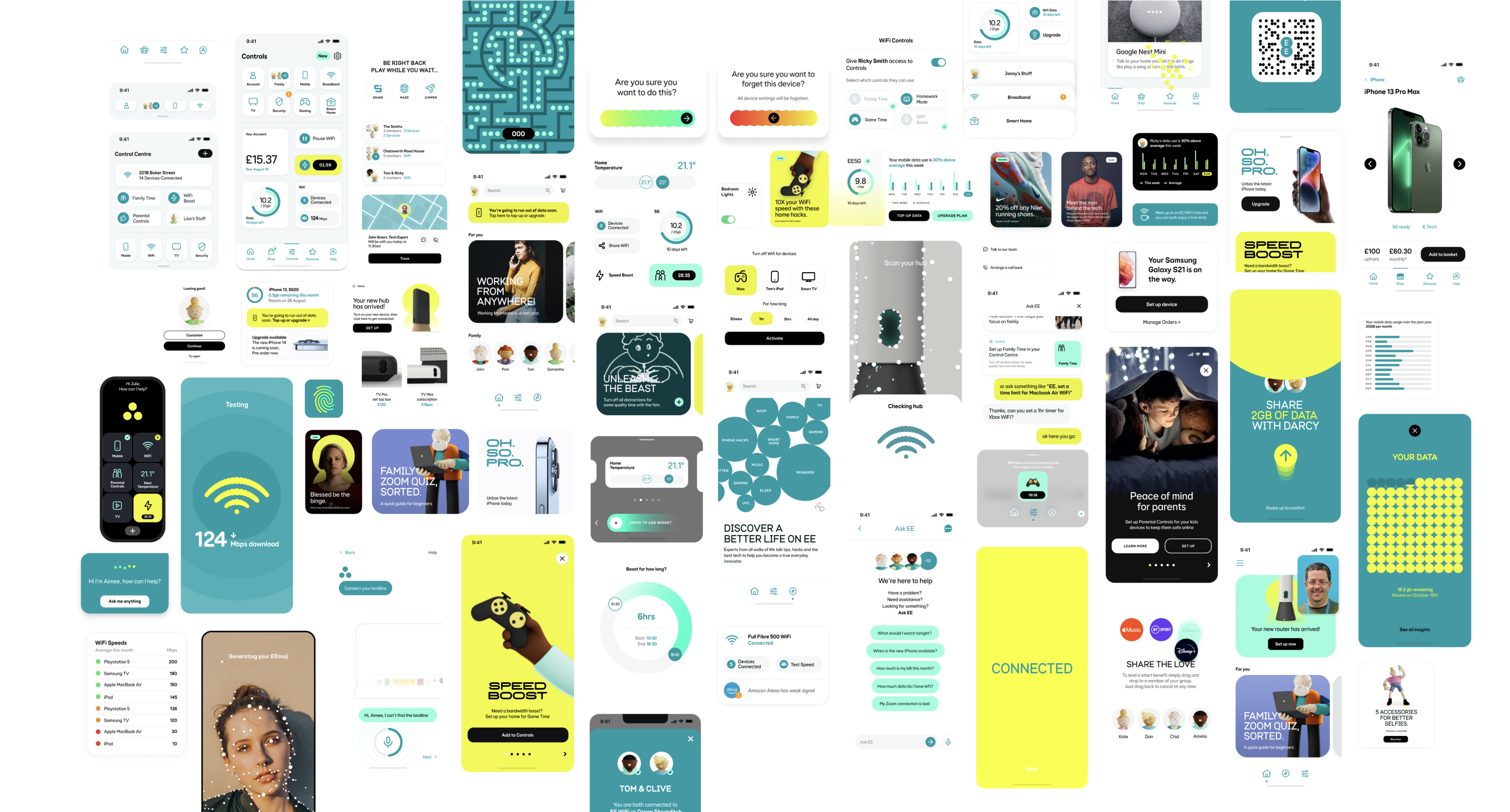
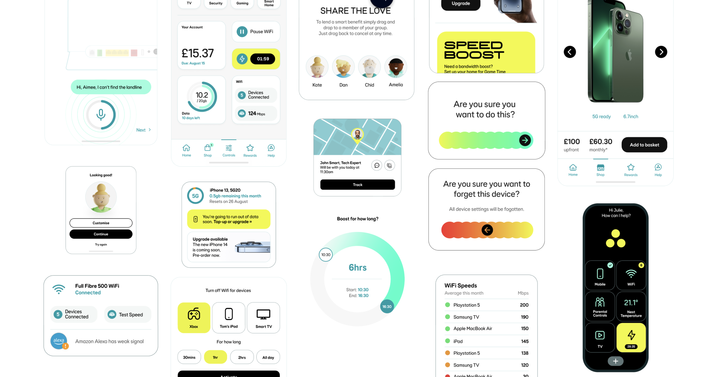
Design System
Brand
Introducing aqua subdued to the EE design system
Based on updated brand direction, a new subdued aqua colour palette has been added to the design system.

My role
Lead Product Designer
The team
-
Product Manager
-
Brand
-
Accessibility Specialist
-
Principal Product Designer
-
Third Party Design Agency
Background
As part of an evolving brand direction focused on a more refined and modern visual identity, the design team was tasked with introducing a new subdued aqua color palette into the existing design system. This initiative aimed to align digital products with updated brand aesthetics while maintaining accessibility and consistency across platforms. The new palette was carefully integrated to complement existing color schemes, support a wide range of UI components, and ensure a cohesive user experience in line with the brand’s refreshed visual language.
Project goals
01
Propencity to call
We have only been briefed to introduce one new colour. However to make it more scalable and funtional we need tp
02
Update all our components that use subdued interactive and subdued border tokens
The ask from brand was that this new colour should be used sparingly. It should only replace compnents that currentlt
03
Customer staisfaction
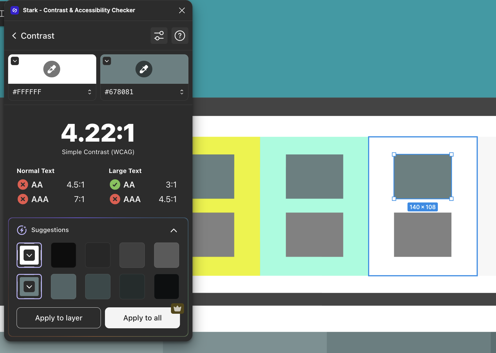
Currently the proposed colour does not meet our accessibility standards for UI elements (3:1). This must meet contrast.
04
Customer staisfaction
As this was going to be a big change for our design system, we needed to clearly communicate this update to our design community (our users). And any guidance that goes along with it.
Discovery
Identifying what components use Border/Subdued/01 + 02
Components that currently use Border/Subdued/01 and Border/Subdued/02 tokens:
-
Accordion: Border/Subdued/02. Used for dividers and to encapsulate Accordion group.
-
Banner notification (information variant): Border/Subdued/01.
-
Card (contained variant): Border/Subdued/01. As Card contains interactive elements such as Button and Icon button, the outer border does not need to meet contrast.
-
Countdown: Border/Subdued/01. Used for the borders of the
-
List tile (and List tile group): Border/Subdued/01. Used for dividers.
-
Progress stepper (vertical): Border/Subdued/02. Used as optional dividers to separate content when sections are heavily populated next to each other.
-
Quantity selector (border variant): Border/Subdued/02. Quantity selector already contains two interactive elements - Icon button.
-
Table: Border/Subdued/02. Used for rows and columns borders.
-
Tiles: Border/Subdued/01. If contains interactive elements. If the tile is entirely interactive then a interactive token needs to be used.
-
Toast notification: Border/Subdued/02. Used for container border. Does not need to be interactive as it contains an action.
Indentifying what components use Interactive/Subdued (Default, Hover, Pressed and Disabled)
Components that currently use Interactive/Subdued/Default, Hover, Pressed and Disabled tokens:
-
Card (contained/fully interactive variant: Interactive/Subdued. Used for outer container border.
-
Checkbox: Interactive/Subdued. Used for checkbox container border.
-
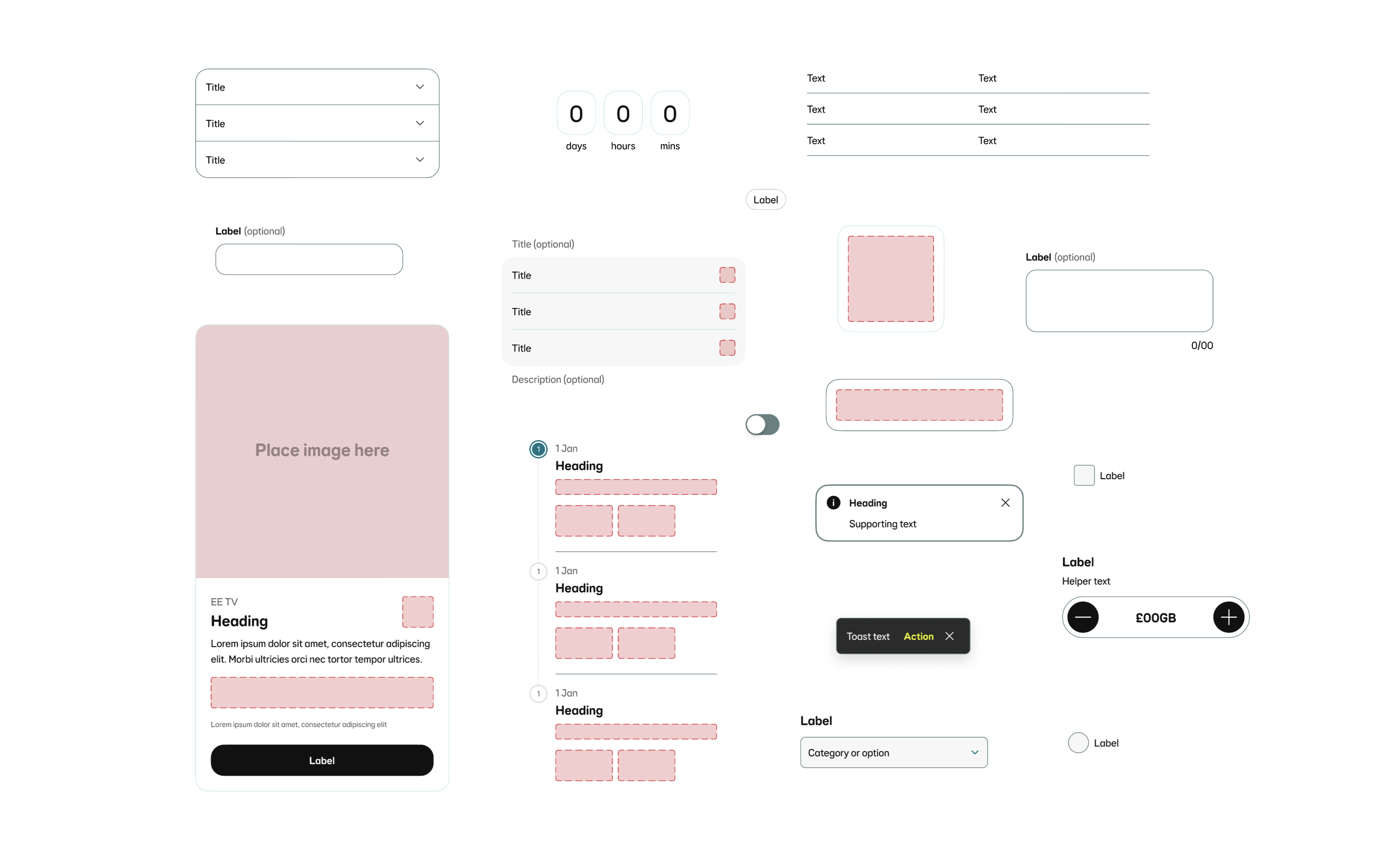
Chip?: Source/Black alpha/01. Currently part of the Inputs and selections group of components. Could this be an opportunity to align with the other components and use an interactive tokens?
-
Text input: Interactive/Subdued. Used for input container border.
-
Multi-line text input: Interactive/Subdued. Used for input container border.
-
Radio button: Interactive/Subdued. Used for radio container border.
-
Select field: Interactive/Subdued. Used for input container border.
-
Select panel: Interactive/Subdued. Used for outer container border.
-
Switch: Interactive/Subdued. Used as the fill when selected to ‘off’.
Investigating the proposed colour
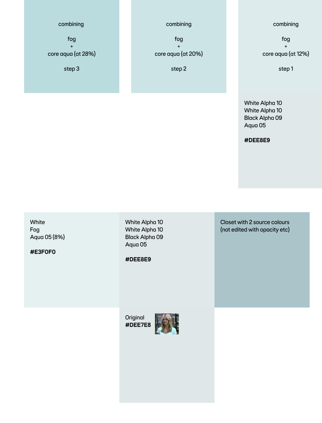
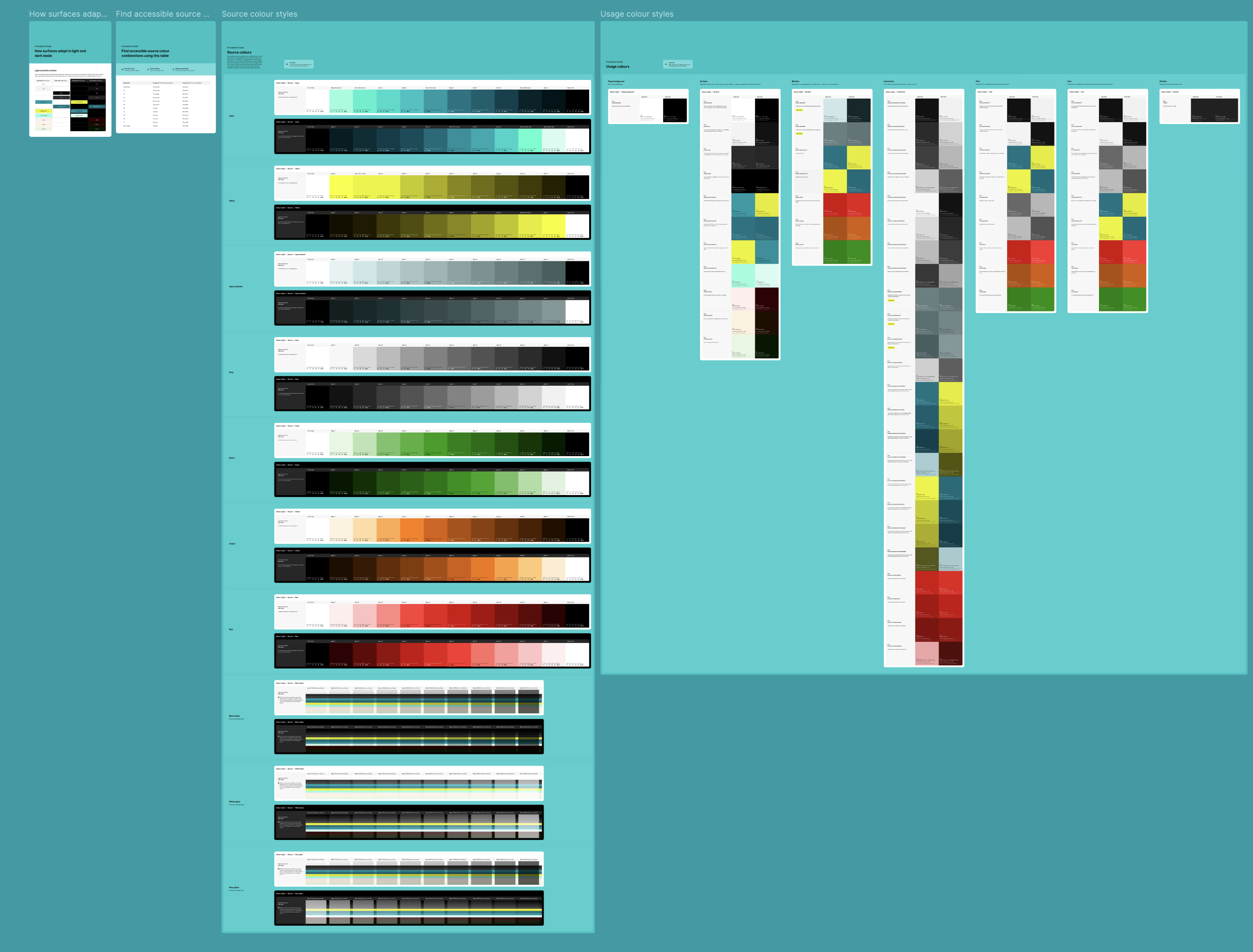
The proposed colour that had been put forward by brand and the agency is a blend of our ‘Fog’ surface colour (Source/Grey/01) and Primary brand colour (Source/Aqua/05).
Information on the specific blend wasn’t available to us, so we had to get as close to #DEE7E8 as we could ourselves.
However this was an opportunity to refine it and propose a more appropriate colour to be used in all of our digital journy’s on web and app.

Our primary brand colour: Aqua
User research has indicated that our customers do not get much value from logging in to the member centre whilst in a course of provision. They have indicated that information is poorly formatted and irrelevant, and does not inform them of key queries they would have in such a scenario.
A build measure learn canvass was set up and identified opportunity to improve the solution.
Design exploration
Refininement
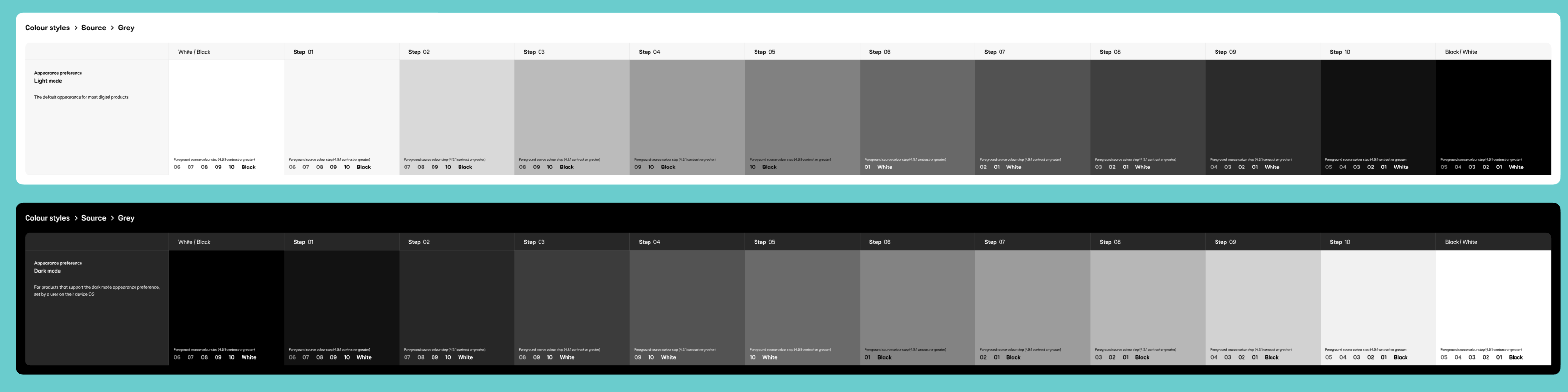
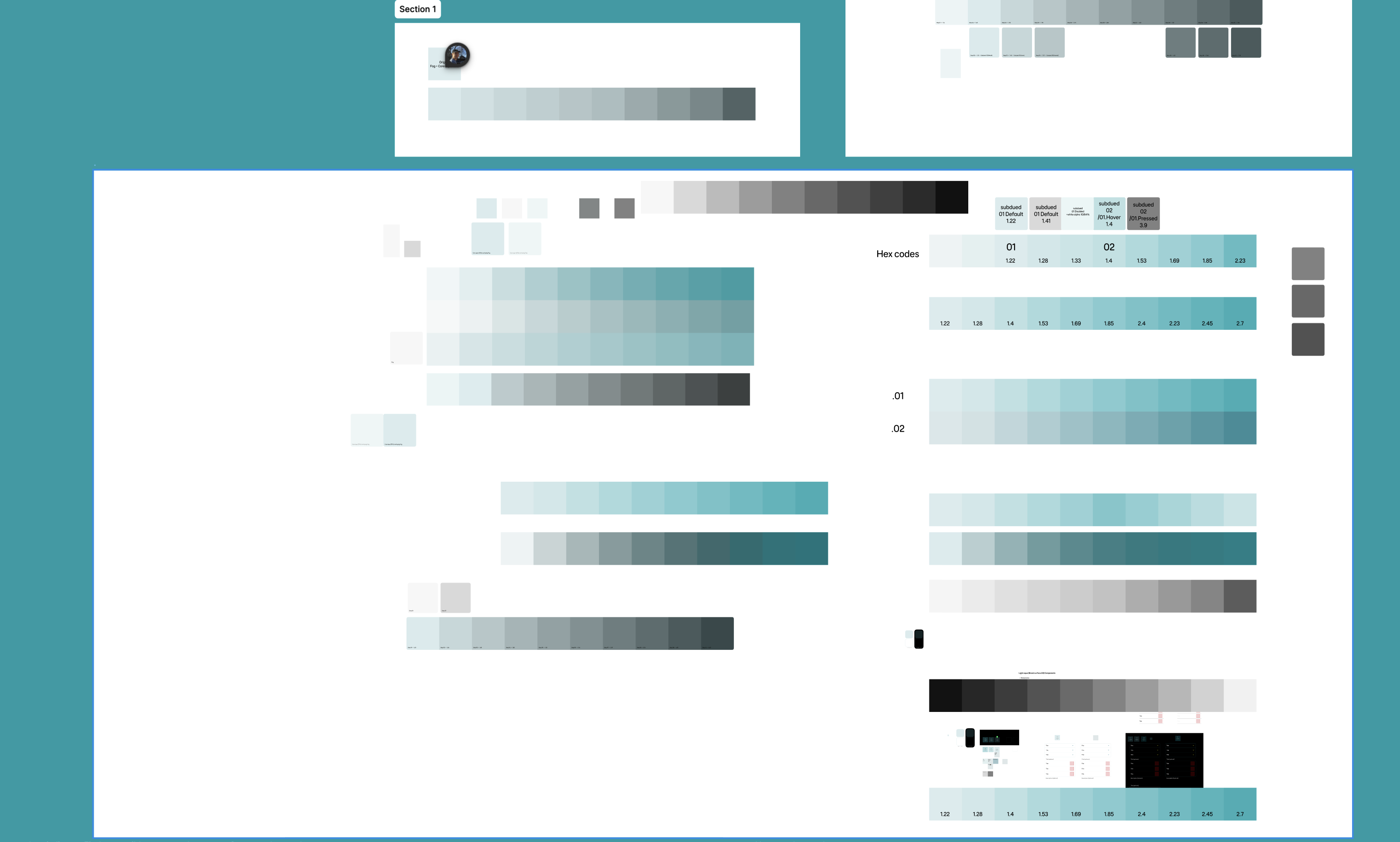
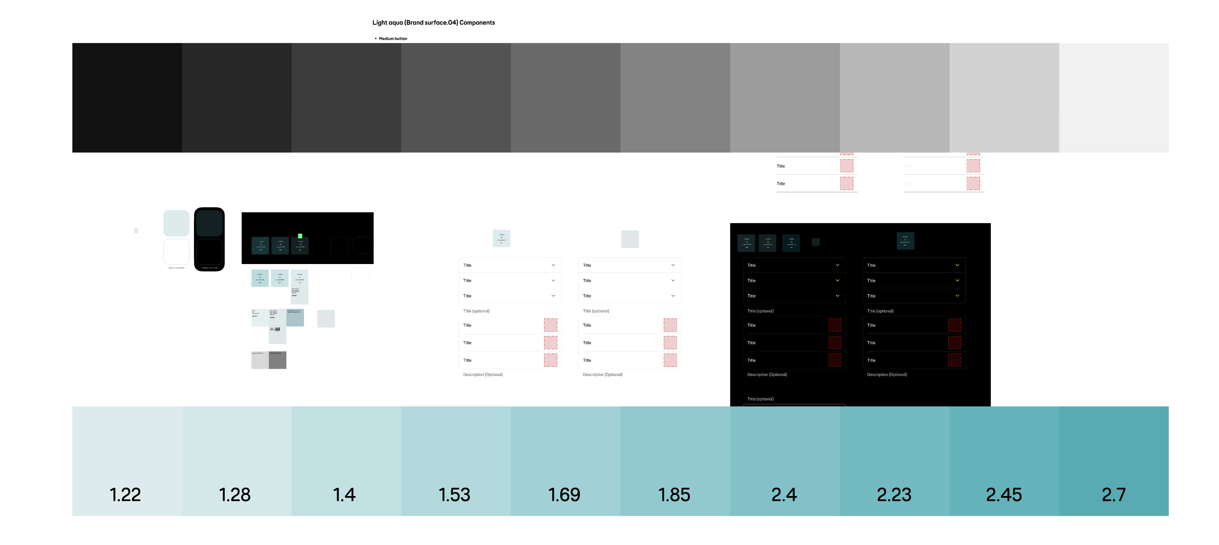
So far we had been focussing too much on the proposed colour, which meant the 10 step colour palette was looking too light/bright. This did not leave much room for different shades in lightness-darkness.
Next we took the approach of matching these aqua subdued steps to their grey steps. Matching their contrast ratios like for like.
Finding the balance and brand sign off
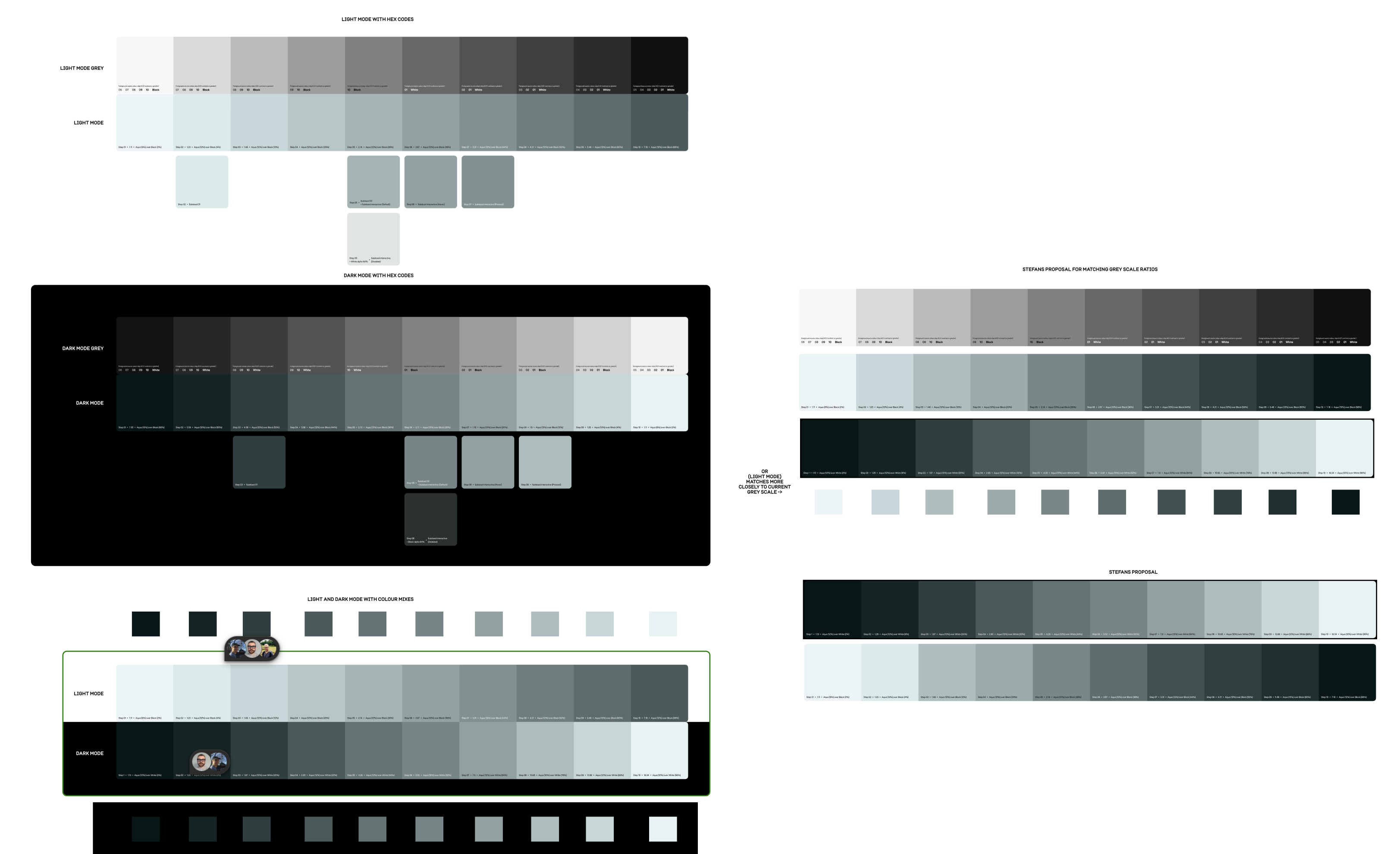
We found a way of calculating the 10 steps in a more intentional way. The calculations involved mixing two of our existing colour tokens and changing their opacities to multiple of 4’s where possible.
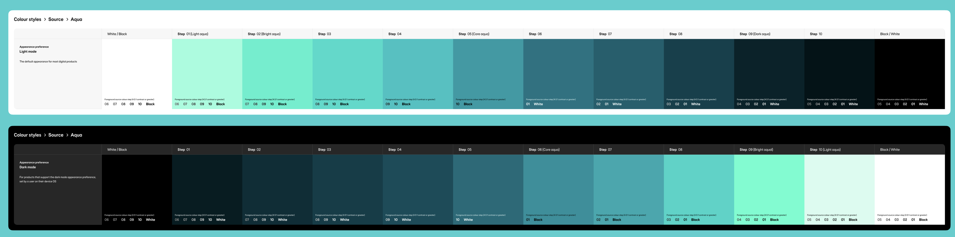
Light mode
-
Primary aqua (Source/Aqua/05/Light mode) set to 16% steps 2-10. Step 1 being the outlier was set to 8% as 16% was still far too bright to be at the lightest end of the palette.
-
Black alpha from 2%, 4%, 12%, 20%, 28%, 36%, 44%, 52%, 60% and 68%.
-
With these two colours I overlayed onto our Surface/Default/Light mode (Source/White/Light mode) #FFFFFF.
Dark mode
-
Primary aqua (Source/Aqua/06/Dark mode) set to 16% steps 2-10. Step 1 being the outlier was set to 8% as 16% was still far too bright to be at the lightest end of the palette.
-
White alpha from 8%, 8%, 12%, 16%, 24%, 28%, 36%, 44%, 52% and 60%.
-
With these two colours I overlayed onto our Surface/Default/Dark mode (Source/Black/Dark mode) #000000.
When it came to getting sign off from brand, I made a straight forward presentation highlighting the changes made to the original colour they presented us with.
This included the changes made to meet accessibility standards and bringing the aqua hue in a bit more. I also showed off some components before and after the proposed changes.
The brand team gave the green light on the new colour palette and usage colours and we got ready to hand over to dev and create coms for the design community.
Dev hand off and going live
A 10 step subdued aqua colour palette named aqua-subdued, was handed off to dev through Tokens Studio. I uploaded the light and dark mode palettes and replaced all the useage tokens (in through the Figma plugin and sent the merge request to React and Flutter. This automatically
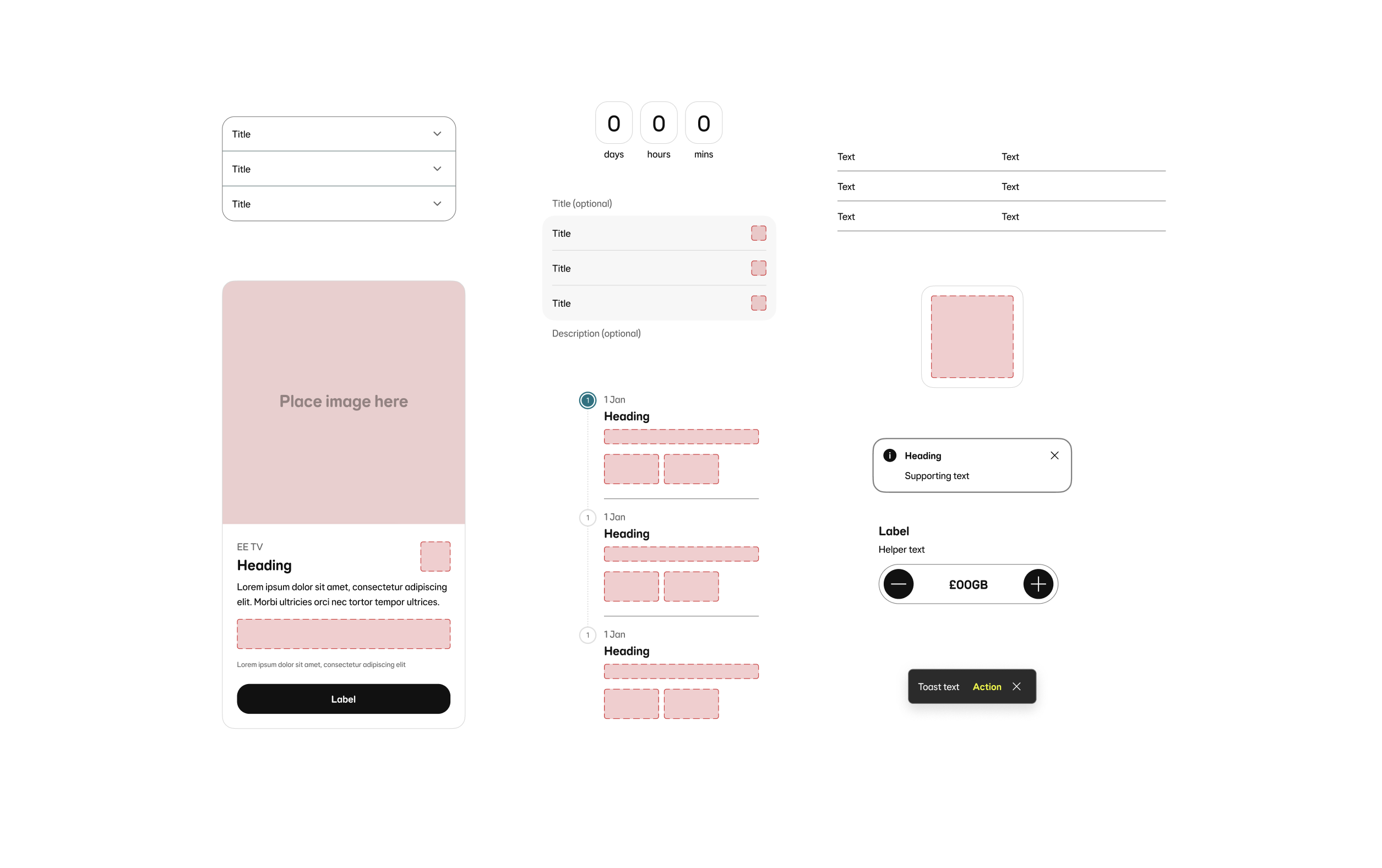
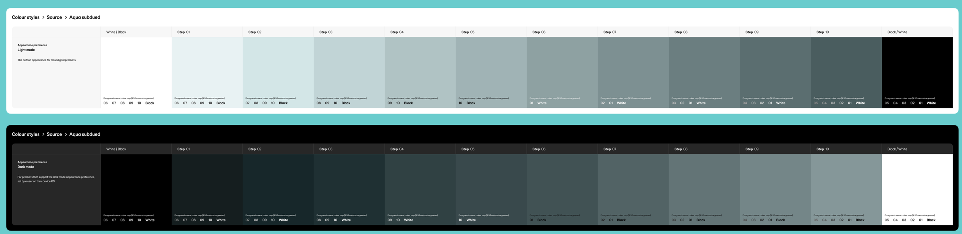
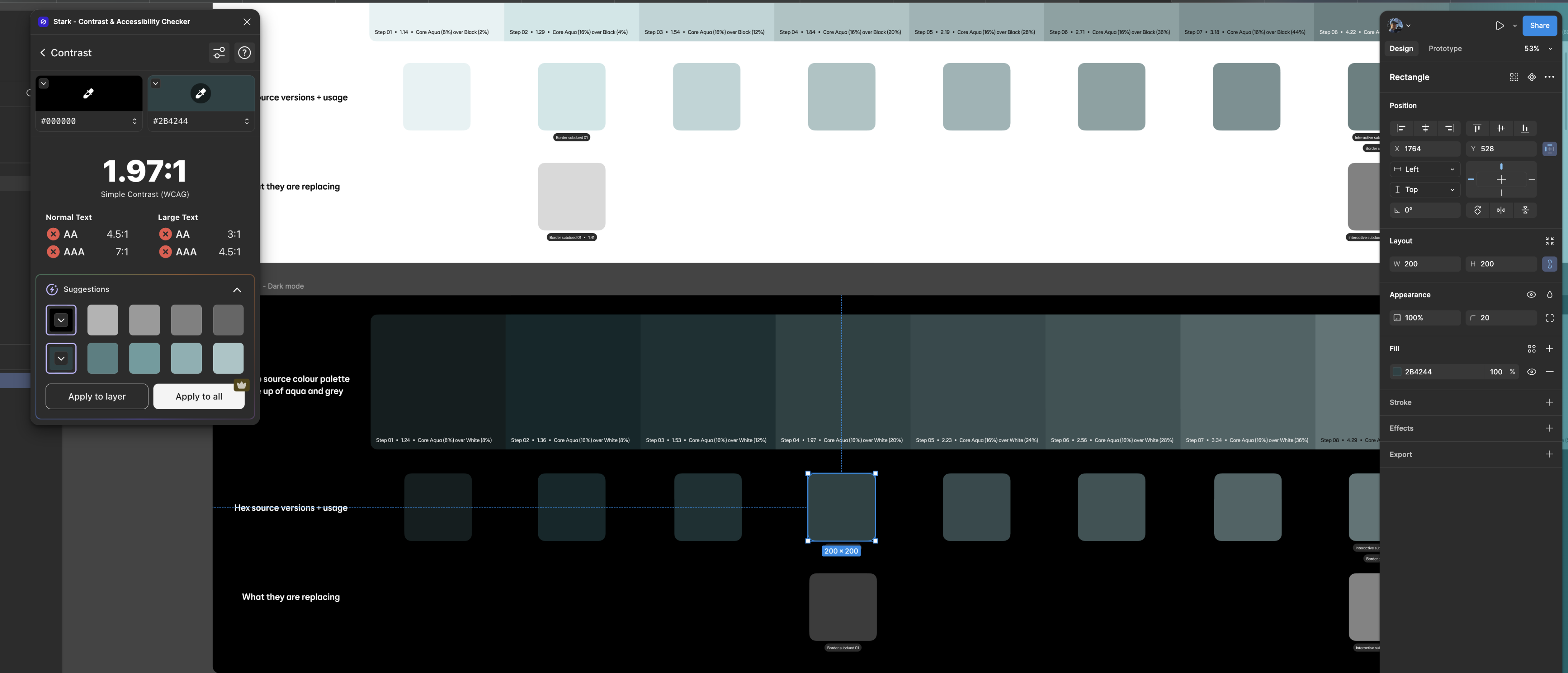
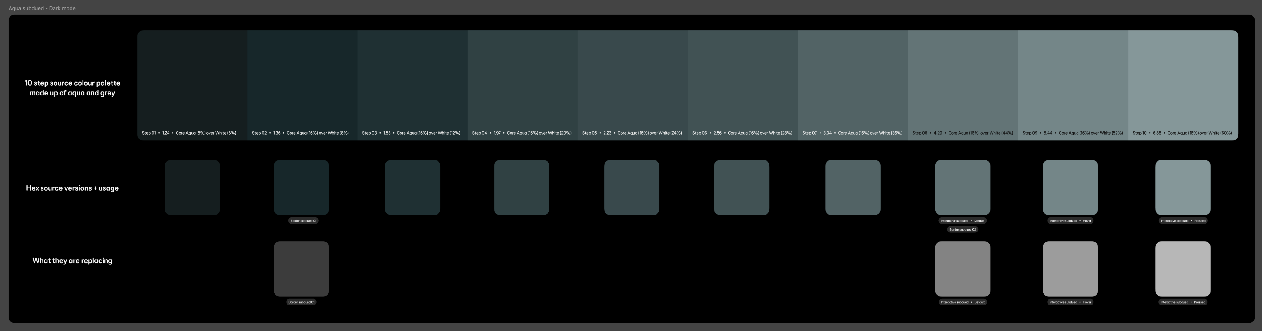
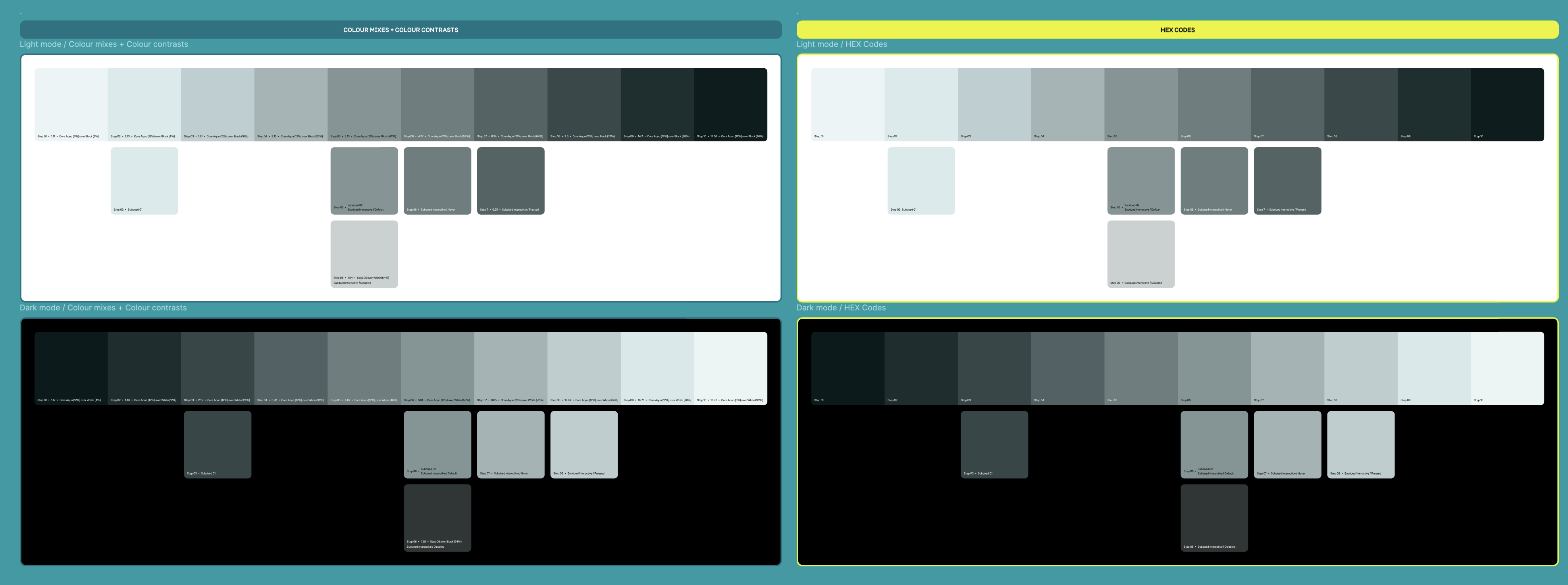
The palette ranges from light (step 1) to dark (step 10) and is structured as design tokens in Tokens Studio for Figma. Each colour step is named consistently (e.g. aqua-subdued.1, aqua-subdued.2, ..., aqua-subdued.10) and includes metadata like HEX values, type (color), and optional usage notes (e.g. for backgrounds, text, or buttons). The tokens have been contrast-checked to meet WCAG AA/AAA standards. Steps 3–5 are ideal for light backgrounds, steps 6–8 for UI components like buttons or cards, and steps 9–10 for text or borders on light backgrounds. The full token set is exported via Tokens Studio in JSON format (tokens-aqua-subdued.json) for easy integration into your codebase using tools like Style Dictionary, CSS variables, or Tailwind config. Designers and developers can sync directly through Tokens Studio for ongoing updates.
Things that didn’t go to plan
A 10 step subdued aqua colour palette named aqua-subdued, was handed off to dev through Tokens Studio. I uploaded the light and dark mode palettes and replaced all the useage tokens (in through the Figma plugin and sent the merge request to React and Flutter. This automatically
The palette ranges from light (step 1) to dark (step 10) and is structured as design tokens in Tokens Studio for Figma. Each colour step is named consistently (e.g. aqua-subdued.1, aqua-subdued.2, ..., aqua-subdued.10) and includes metadata like HEX values, type (color), and optional usage notes (e.g. for backgrounds, text, or buttons). The tokens have been contrast-checked to meet WCAG AA/AAA standards. Steps 3–5 are ideal for light backgrounds, steps 6–8 for UI components like buttons or cards, and steps 9–10 for text or borders on light backgrounds. The full token set is exported via Tokens Studio in JSON format (tokens-aqua-subdued.json) for easy integration into your codebase using tools like Style Dictionary, CSS variables, or Tailwind config. Designers and developers can sync directly through Tokens Studio for ongoing updates.


Design System
Brand
Introducing aqua subdued to the EE design system
Based on updated brand direction, a new subdued aqua colour palette has been added to the design system.
My role
Lead Product Designer
The team
-
Product Manager
-
Brand
-
Accessibility Specialist
-
Principal Product Designer
-
Third Party Design Agency
-
React (Web) and Flutter (App) Engineers
Background
As part of an evolving brand direction focused on a more refined and modern visual identity, the design team was tasked with introducing a new subdued aqua color palette into the existing design system. This initiative aimed to align digital products with updated brand aesthetics while maintaining accessibility and consistency across platforms. The new palette was carefully integrated to complement existing color schemes, support a wide range of UI components, and ensure a cohesive user experience in line with the brand’s refreshed visual language.
Project goals
01
Propencity to call
We have only been briefed to introduce one new colour. However to make it more scalable and funtional we need tp
02
Update all our components that use subdued interactive and subdued border tokens
The ask from brand was that this new colour should be used sparingly. It should only replace compnents that currentlt
03
Customer staisfaction
Currently the proposed colour does not meet our accessibility standards for UI elements (3:1). This must meet contrast.
04
Customer staisfaction
As this was going to be a big change for our design system, we needed to clearly communicate this update to our design community (our users). And any guidance that goes along with it.
Discovery
Identifying what components use Border/Subdued/01 + 02
Components that currently use Border/Subdued/01 and Border/Subdued/02 tokens:
-
Accordion: Border/Subdued/02. Used for dividers and to encapsulate Accordion group.
-
Banner notification (information variant): Border/Subdued/01.
-
Card (contained variant): Border/Subdued/01. As Card contains interactive elements such as Button and Icon button, the outer border does not need to meet contrast.
-
Countdown: Border/Subdued/01. Used for the borders of the
-
List tile (and List tile group): Border/Subdued/01. Used for dividers.
-
Progress stepper (vertical): Border/Subdued/02. Used as optional dividers to separate content when sections are heavily populated next to each other.
-
Quantity selector (border variant): Border/Subdued/02. Quantity selector already contains two interactive elements - Icon button.
-
Table: Border/Subdued/02. Used for rows and columns borders.
-
Tiles: Border/Subdued/01. If contains interactive elements. If the tile is entirely interactive then a interactive token needs to be used.
-
Toast notification: Border/Subdued/02. Used for container border. Does not need to be interactive as it contains an action.
Indentifying what components use Interactive/Subdued (Default, Hover, Pressed and Disabled)
Components that currently use Interactive/Subdued/Default, Hover, Pressed and Disabled tokens:
-
Card (contained/fully interactive variant: Interactive/Subdued. Used for outer container border.
-
Checkbox: Interactive/Subdued. Used for checkbox container border.
-
Chip?: Source/Black alpha/01. Currently part of the Inputs and selections group of components. Could this be an opportunity to align with the other components and use an interactive tokens?
-
Text input: Interactive/Subdued. Used for input container border.
-
Multi-line text input: Interactive/Subdued. Used for input container border.
-
Radio button: Interactive/Subdued. Used for radio container border.
-
Select field: Interactive/Subdued. Used for input container border.
-
Select panel: Interactive/Subdued. Used for outer container border.
-
Switch: Interactive/Subdued. Used as the fill when selected to ‘off’.
Investigating the proposed colour
The proposed colour that had been put forward by brand and the agency is a blend of our ‘Fog’ surface colour (Source/Grey/01) and Primary brand colour (Source/Aqua/05).
Information on the specific blend wasn’t available to us, so we had to get as close to #DEE7E8 as we could ourselves.
However this was an opportunity to refine it and propose a more appropriate colour to be used in all of our digital journy’s on web and app.
Our primary brand colour: Aqua
User research has indicated that our customers do not get much value from logging in to the member centre whilst in a course of provision. They have indicated that information is poorly formatted and irrelevant, and does not inform them of key queries they would have in such a scenario.
A build measure learn canvass was set up and identified opportunity to improve the solution.
Design exploration
Refininement
So far we had been focussing too much on the proposed colour, which meant the 10 step colour palette was looking too light/bright. This did not leave much room for different shades in lightness-darkness.
Next we took the approach of matching these aqua subdued steps to their grey steps. Matching their contrast ratios like for like.
Finding the balance and brand sign off
We found a way of calculating the 10 steps in a more intentional way. The calculations involved mixing two of our existing colour tokens and changing their opacities to multiple of 4’s where possible.
Light mode
-
Primary aqua (Source/Aqua/05/Light mode) set to 16% steps 2-10. Step 1 being the outlier was set to 8% as 16% was still far too bright to be at the lightest end of the palette.
-
Black alpha from 2%, 4%, 12%, 20%, 28%, 36%, 44%, 52%, 60% and 68%.
-
With these two colours I overlayed onto our Surface/Default/Light mode (Source/White/Light mode) #FFFFFF.
Dark mode
-
Primary aqua (Source/Aqua/06/Dark mode) set to 16% steps 2-10. Step 1 being the outlier was set to 8% as 16% was still far too bright to be at the lightest end of the palette.
-
White alpha from 8%, 8%, 12%, 16%, 24%, 28%, 36%, 44%, 52% and 60%.
-
With these two colours I overlayed onto our Surface/Default/Dark mode (Source/Black/Dark mode) #000000.
When it came to getting sign off from brand, I made a straight forward presentation highlighting the changes made to the original colour they presented us with.
This included the changes made to meet accessibility standards and bringing the aqua hue in a bit more. I also showed off some components before and after the proposed changes.
The brand team gave the green light on the new colour palette and usage colours and we got ready to hand over to dev and create coms for the design community.
Dev hand off and going live
A 10 step subdued aqua colour palette named aqua-subdued, was handed off to dev through Tokens Studio. I uploaded the light and dark mode palettes and replaced all the useage tokens (in through the Figma plugin and sent the merge request to React and Flutter. This automatically
The palette ranges from light (step 1) to dark (step 10) and is structured as design tokens in Tokens Studio for Figma. Each colour step is named consistently (e.g. aqua-subdued.1, aqua-subdued.2, ..., aqua-subdued.10) and includes metadata like HEX values, type (color), and optional usage notes (e.g. for backgrounds, text, or buttons). The tokens have been contrast-checked to meet WCAG AA/AAA standards. Steps 3–5 are ideal for light backgrounds, steps 6–8 for UI components like buttons or cards, and steps 9–10 for text or borders on light backgrounds. The full token set is exported via Tokens Studio in JSON format (tokens-aqua-subdued.json) for easy integration into your codebase using tools like Style Dictionary, CSS variables, or Tailwind config. Designers and developers can sync directly through Tokens Studio for ongoing updates.
Things that didn’t go to plan
A 10 step subdued aqua colour palette named aqua-subdued, was handed off to dev through Tokens Studio. I uploaded the light and dark mode palettes and replaced all the useage tokens (in through the Figma plugin and sent the merge request to React and Flutter. This automatically
The palette ranges from light (step 1) to dark (step 10) and is structured as design tokens in Tokens Studio for Figma. Each colour step is named consistently (e.g. aqua-subdued.1, aqua-subdued.2, ..., aqua-subdued.10) and includes metadata like HEX values, type (color), and optional usage notes (e.g. for backgrounds, text, or buttons). The tokens have been contrast-checked to meet WCAG AA/AAA standards. Steps 3–5 are ideal for light backgrounds, steps 6–8 for UI components like buttons or cards, and steps 9–10 for text or borders on light backgrounds. The full token set is exported via Tokens Studio in JSON format (tokens-aqua-subdued.json) for easy integration into your codebase using tools like Style Dictionary, CSS variables, or Tailwind config. Designers and developers can sync directly through Tokens Studio for ongoing updates.


Design System
Brand
Introducing aqua subdued to the EE design system
Based on updated brand direction, a new subdued aqua colour palette has been added to the design system.
My role
Lead Product Designer
The team
-
Product Manager
-
Brand
-
Accessibility Specialist
-
Principal Product Designer
-
Third Party Design Agency
-
React (Web) and Flutter (App) Engineers
Background
As part of an evolving brand direction focused on a more refined and modern visual identity, the design team was tasked with introducing a new subdued aqua color palette into the existing design system. This initiative aimed to align digital products with updated brand aesthetics while maintaining accessibility and consistency across platforms. The new palette was carefully integrated to complement existing color schemes, support a wide range of UI components, and ensure a cohesive user experience in line with the brand’s refreshed visual language.
Project goals
01
Propencity to call
We have only been briefed to introduce one new colour. However to make it more scalable and funtional we need tp
02
Update all our components that use subdued interactive and subdued border tokens
The ask from brand was that this new colour should be used sparingly. It should only replace compnents that currentlt
03
Customer staisfaction
Currently the proposed colour does not meet our accessibility standards for UI elements (3:1). This must meet contrast.
04
Customer staisfaction
As this was going to be a big change for our design system, we needed to clearly communicate this update to our design community (our users). And any guidance that goes along with it.
Discovery
Identifying what components use Border/Subdued/01 + 02
Components that currently use Border/Subdued/01 and Border/Subdued/02 tokens:
-
Accordion: Border/Subdued/02. Used for dividers and to encapsulate Accordion group.
-
Banner notification (information variant): Border/Subdued/01.
-
Card (contained variant): Border/Subdued/01. As Card contains interactive elements such as Button and Icon button, the outer border does not need to meet contrast.
-
Countdown: Border/Subdued/01. Used for the borders of the
-
List tile (and List tile group): Border/Subdued/01. Used for dividers.
-
Progress stepper (vertical): Border/Subdued/02. Used as optional dividers to separate content when sections are heavily populated next to each other.
-
Quantity selector (border variant): Border/Subdued/02. Quantity selector already contains two interactive elements - Icon button.
-
Table: Border/Subdued/02. Used for rows and columns borders.
-
Tiles: Border/Subdued/01. If contains interactive elements. If the tile is entirely interactive then a interactive token needs to be used.
-
Toast notification: Border/Subdued/02. Used for container border. Does not need to be interactive as it contains an action.
Indentifying what components use Interactive/Subdued (Default, Hover, Pressed and Disabled)
Components that currently use Interactive/Subdued/Default, Hover, Pressed and Disabled tokens:
-
Card (contained/fully interactive variant: Interactive/Subdued. Used for outer container border.
-
Checkbox: Interactive/Subdued. Used for checkbox container border.
-
Chip?: Source/Black alpha/01. Currently part of the Inputs and selections group of components. Could this be an opportunity to align with the other components and use an interactive tokens?
-
Text input: Interactive/Subdued. Used for input container border.
-
Multi-line text input: Interactive/Subdued. Used for input container border.
-
Radio button: Interactive/Subdued. Used for radio container border.
-
Select field: Interactive/Subdued. Used for input container border.
-
Select panel: Interactive/Subdued. Used for outer container border.
-
Switch: Interactive/Subdued. Used as the fill when selected to ‘off’.
Investigating the proposed colour
The proposed colour that had been put forward by brand and the agency is a blend of our ‘Fog’ surface colour (Source/Grey/01) and Primary brand colour (Source/Aqua/05).
Information on the specific blend wasn’t available to us, so we had to get as close to #DEE7E8 as we could ourselves.
However this was an opportunity to refine it and propose a more appropriate colour to be used in all of our digital journy’s on web and app.
Our primary brand colour: Aqua
User research has indicated that our customers do not get much value from logging in to the member centre whilst in a course of provision. They have indicated that information is poorly formatted and irrelevant, and does not inform them of key queries they would have in such a scenario.
A build measure learn canvass was set up and identified opportunity to improve the solution.
Design exploration
Finding the balance and brand sign off
We found a way of calculating the 10 steps in a more intentional way. The calculations involved mixing two of our existing colour tokens and changing their opacities to multiple of 4’s where possible.
Light mode
-
Primary aqua (Source/Aqua/05/Light mode) set to 16% steps 2-10. Step 1 being the outlier was set to 8% as 16% was still far too bright to be at the lightest end of the palette.
-
Black alpha from 2%, 4%, 12%, 20%, 28%, 36%, 44%, 52%, 60% and 68%.
-
With these two colours I overlayed onto our Surface/Default/Light mode (Source/White/Light mode) #FFFFFF.
Dark mode
-
Primary aqua (Source/Aqua/06/Dark mode) set to 16% steps 2-10. Step 1 being the outlier was set to 8% as 16% was still far too bright to be at the lightest end of the palette.
-
White alpha from 8%, 8%, 12%, 16%, 24%, 28%, 36%, 44%, 52% and 60%.
-
With these two colours I overlayed onto our Surface/Default/Dark mode (Source/Black/Dark mode) #000000.
When it came to getting sign off from brand, I made a straight forward presentation highlighting the changes made to the original colour they presented us with.
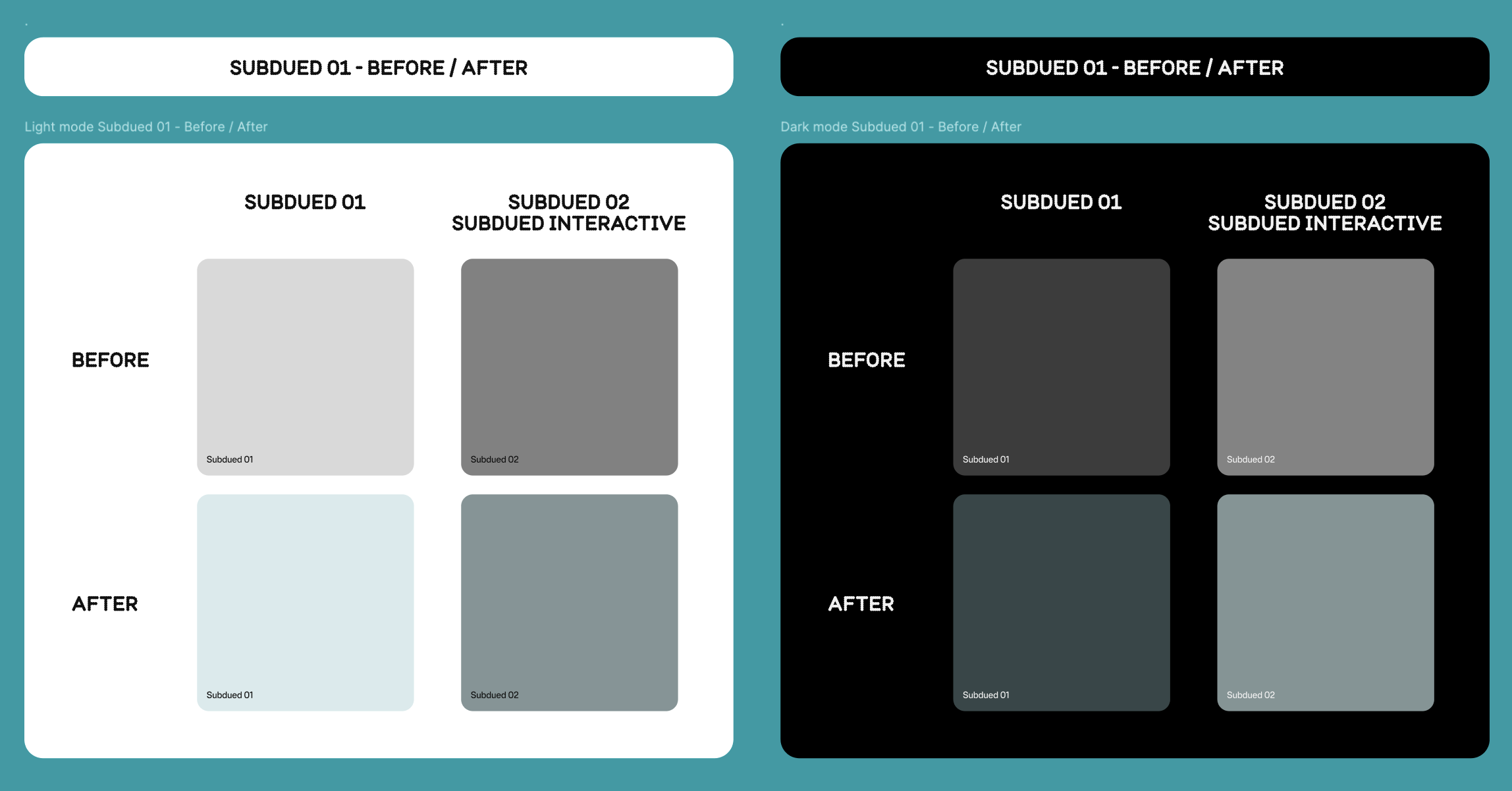
This included the changes made to meet accessibility standards and bringing the aqua hue in a bit more. I also showed off some components before and after the proposed changes.
The brand team gave the green light on the new colour palette and usage colours and we got ready to hand over to dev and create coms for the design community.
Refininement
So far we had been focussing too much on the proposed colour, which meant the 10 step colour palette was looking too light/bright. This did not leave much room for different shades in lightness-darkness.
Next we took the approach of matching these aqua subdued steps to their grey steps. Matching their contrast ratios like for like.
Dev hand off and going live
A 10 step subdued aqua colour palette named aqua-subdued, was handed off to dev through Tokens Studio. I uploaded the light and dark mode palettes and replaced all the useage tokens (in through the Figma plugin and sent the merge request to React and Flutter. This automatically
The palette ranges from light (step 1) to dark (step 10) and is structured as design tokens in Tokens Studio for Figma. Each colour step is named consistently (e.g. aqua-subdued.1, aqua-subdued.2, ..., aqua-subdued.10) and includes metadata like HEX values, type (color), and optional usage notes (e.g. for backgrounds, text, or buttons). The tokens have been contrast-checked to meet WCAG AA/AAA standards. Steps 3–5 are ideal for light backgrounds, steps 6–8 for UI components like buttons or cards, and steps 9–10 for text or borders on light backgrounds. The full token set is exported via Tokens Studio in JSON format (tokens-aqua-subdued.json) for easy integration into your codebase using tools like Style Dictionary, CSS variables, or Tailwind config. Designers and developers can sync directly through Tokens Studio for ongoing updates.
Things that didn’t go to plan
A 10 step subdued aqua colour palette named aqua-subdued, was handed off to dev through Tokens Studio. I uploaded the light and dark mode palettes and replaced all the useage tokens (in through the Figma plugin and sent the merge request to React and Flutter. This automatically
The palette ranges from light (step 1) to dark (step 10) and is structured as design tokens in Tokens Studio for Figma. Each colour step is named consistently (e.g. aqua-subdued.1, aqua-subdued.2, ..., aqua-subdued.10) and includes metadata like HEX values, type (color), and optional usage notes (e.g. for backgrounds, text, or buttons). The tokens have been contrast-checked to meet WCAG AA/AAA standards. Steps 3–5 are ideal for light backgrounds, steps 6–8 for UI components like buttons or cards, and steps 9–10 for text or borders on light backgrounds. The full token set is exported via Tokens Studio in JSON format (tokens-aqua-subdued.json) for easy integration into your codebase using tools like Style Dictionary, CSS variables, or Tailwind config. Designers and developers can sync directly through Tokens Studio for ongoing updates.
Design System
Brand
Introducing aqua subdued to the EE design system
Based on updated brand direction, a new subdued aqua colour palette has been added to the design system.
My role
Lead Product Designer
The team
-
Product Manager
-
Brand
-
Accessibility Specialist
-
Principal Product Designer
-
Third Party Design Agency
-
React (Web) and Flutter (App) Engineers
Background
As part of an evolving brand direction focused on a more refined and modern visual identity, the design team was tasked with introducing a new aqua subdued colour palette into our existing design system.
The new colour would be restricted to be used as a replacement for our subdued border and subdued interactive colour tokens which currently use our grey scale palette. This does not mean we would be deprecating our grey palette.
The initiative was inspired by a vision deck presented by a third-party design agency, which outlined a future facing aesthetic and proposed colour directions aligned with the brand’s strategic goals. The subdued aqua tones were selected for their subtle nod to our primary brand colour (aqua) and ability to elevate the digital experience.
Project goals
01
Introduce a 10 step colour palette for light and dark mode
We have only been briefed to introduce one new colour. However to make it more scalable and functional we need to make a 10 step colour palette so that we can be more flexible and add different shades to meet contrast on whatever surface it sits on.
Currently we only have one shade to go off and that has only been created for light mode, so we will also need to create a 10 step palette for dark mode too. This must meet contrast standards and reflect the new brand hue as the one in light mode.
02
Update all our components that use subdued interactive and subdued border tokens
The ask from brand was that this new colour should be used sparingly, and should only replace components that currently use subdued colour tokens which are currently using a grey scale colour pallete.
03
Accessibility
Currently the proposed colour does not meet our accessibility standards for UI elements (3:1). This must meet contrast.
04
Communication
As this was going to be a big change for our design system, we needed to clearly communicate this update to our design community (our users). And any guidance that goes along with it.
Discovery
Identifying what components use Border/Subdued/01 + 02
Components that currently use Border/Subdued/01 and Border/Subdued/02 tokens:
-
Accordion: Border/Subdued/02. Used for dividers and to encapsulate Accordion group.
-
Banner notification (information variant): Border/Subdued/01.
-
Card (contained variant): Border/Subdued/01. As Card contains interactive elements such as Button and Icon button, the outer border does not need to meet contrast.
-
Countdown: Border/Subdued/01. Used for the borders of the
-
List tile (and List tile group): Border/Subdued/01. Used for dividers.
-
Progress stepper (vertical): Border/Subdued/02. Used as optional dividers to separate content when sections are heavily populated next to each other.
-
Quantity selector (border variant): Border/Subdued/02. Quantity selector already contains two interactive elements - Icon button.
-
Table: Border/Subdued/02. Used for rows and columns borders.
-
Tiles: Border/Subdued/01. If contains interactive elements. If the tile is entirely interactive then a interactive token needs to be used.
-
Toast notification: Border/Subdued/02. Used for container border. Does not need to be interactive as it contains an action.
Identifying what components use Interactive/Subdued/Default, Hover, Pressed and Disabled)
Components that currently use Interactive/Subdued/Default, Hover, Pressed and Disabled tokens:
-
Card (contained/fully interactive variant: Interactive/Subdued. Used for outer container border.
-
Checkbox: Interactive/Subdued. Used for checkbox container border.
-
Chip?: Source/Black alpha/01. Currently part of the Inputs and selections group of components. Could this be an opportunity to align with the other components and use an interactive tokens?
-
Text input: Interactive/Subdued. Used for input container border.
-
Multi-line text input: Interactive/Subdued. Used for input container border.
-
Radio button: Interactive/Subdued. Used for radio container border.
-
Select field: Interactive/Subdued. Used for input container border.
-
Select panel: Interactive/Subdued. Used for outer container border.
-
Switch: Interactive/Subdued. Used as the fill when selected to ‘off’.
Investigating the proposed colour
The proposed colour that had been put forward by brand and the agency is a blend of our ‘Fog’ surface colour (Source/Grey/01) and Primary brand colour (Source/Aqua/05).
Information on the specific blend wasn’t available to us, so we had to get as close to #DEE7E8 as we could ourselves.
However this was an opportunity for us to refine it and propose a more appropriate colour to brand. One with more intention and accessibility in mind.
A big problem we had was that this was the only colour we were provided with, so it was up to us to create a darker shade to be used for interactive elements.
Our primary brand colour: Aqua
User research has indicated that our customers do not get much value from logging in to the member centre whilst in a course of provision. They have indicated that information is poorly formatted and irrelevant, and does not inform them of key queries they would have in such a scenario.
A build measure learn canvass was set up and identified opportunity to improve the solution.
Design exploration
Refinement
So far we had been focussing too much on the proposed colour, which meant the 10 step colour palette was looking too light/bright. This did not leave much room for different shades in lightness-darkness.
Next we took the approach of matching these aqua subdued steps to their grey steps. Matching their contrast ratios like for like.
Finding the balance and brand sign off
We found a way of calculating the 10 steps in a more intentional way. The calculations involved mixing two of our existing colour tokens and changing their opacities to multiple of 4’s where possible.
Light mode
-
Primary aqua (Source/Aqua/05/Light mode) set to 16% steps 2-10. Step 1 being the outlier was set to 8% as 16% was still far too bright to be at the lightest end of the palette.
-
Black alpha from 2%, 4%, 12%, 20%, 28%, 36%, 44%, 52%, 60% and 68%.
-
With these two colours I overlayed onto our Surface/Default/Light mode (Source/White/Light mode) #FFFFFF.
Dark mode
-
Primary aqua (Source/Aqua/06/Dark mode) set to 16% steps 2-10. Step 1 being the outlier was set to 8% as 16% was still far too bright to be at the lightest end of the palette.
-
White alpha from 8%, 8%, 12%, 16%, 24%, 28%, 36%, 44%, 52% and 60%.
-
With these two colours I overlayed onto our Surface/Default/Dark mode (Source/Black/Dark mode) #000000.
When it came to getting sign off from brand, I made a straight forward presentation highlighting the changes made to the original colour they presented us with.
This included the changes made to meet accessibility standards and bringing the aqua hue in a bit more. I also showed off some components before and after the proposed changes.
The brand team gave the green light on the new colour palette and usage colours and we got ready to hand over to dev and create coms for the design community.
Dev hand off and going live
A 10 step aqua subdued colour palette named aqua-subdued, was handed off to dev through the Tokens Studio plugin in Figma. I uploaded the light and dark mode palettes and replaced all the usage tokens that had been using the old grey colours (Border/Subdued/01+02 and Subdued/Interactive).
The merge request was sent to dev through the plugin to be accepted for React and Flutter to be updated across web and app.
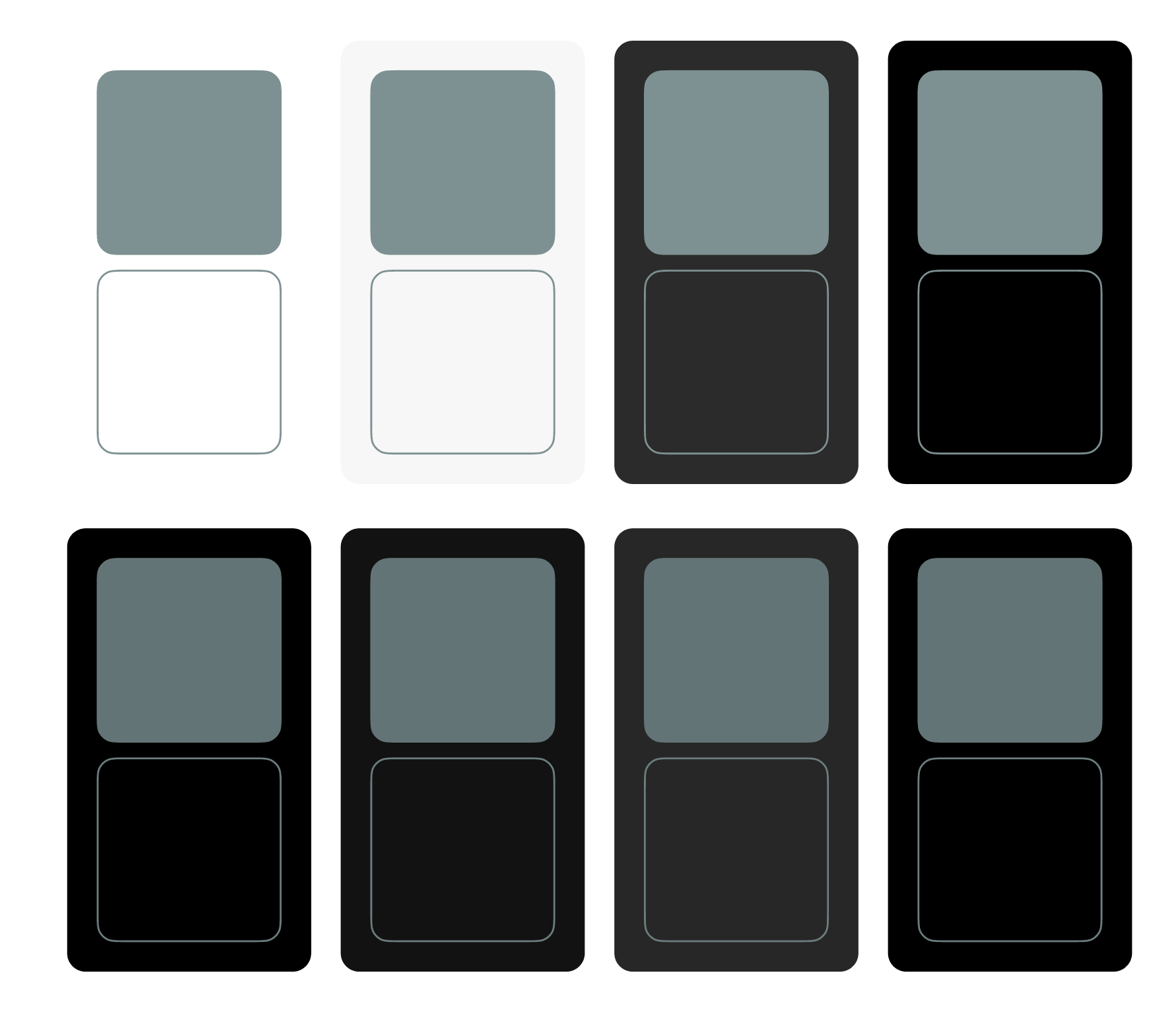
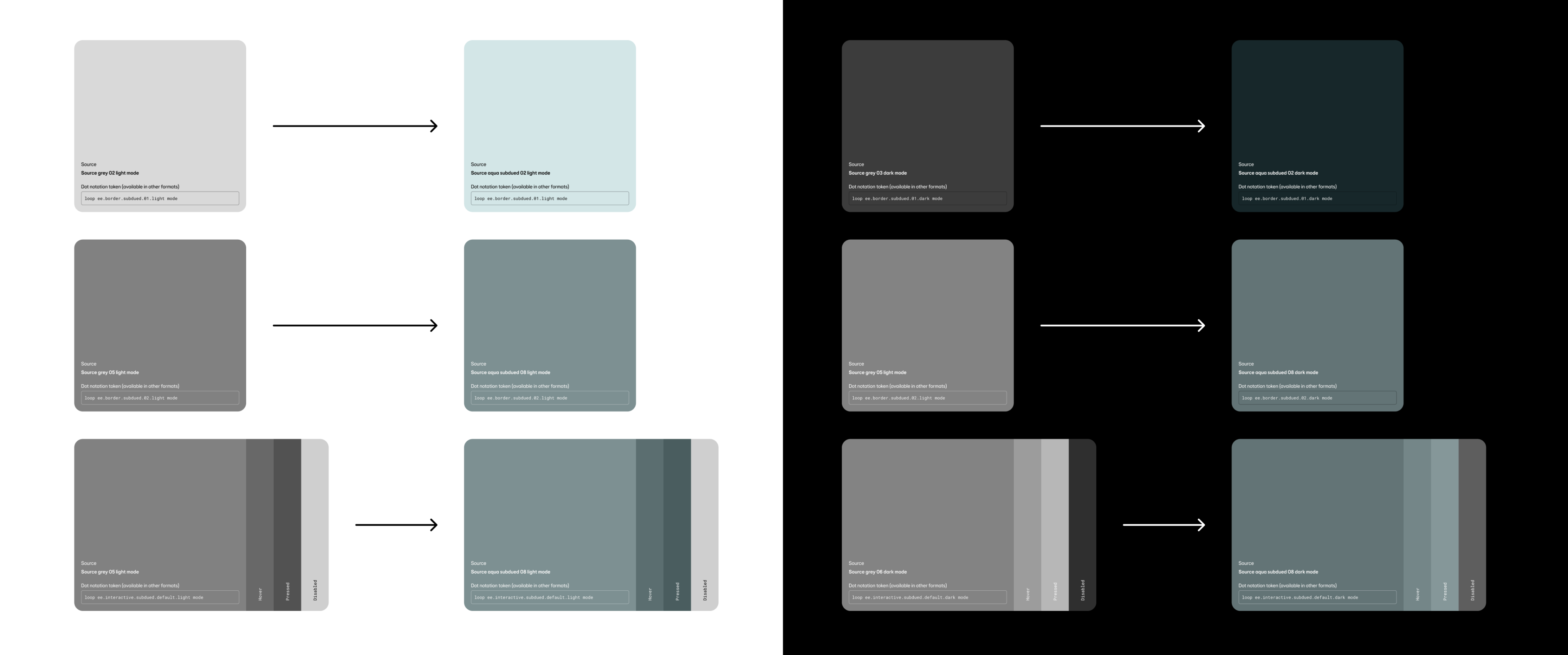
As this was a like for like change in terms of accessibility and contrast, there was no need to deprecate colours or components. Aqua subdued was an additional palette and the usage tokens were just switched out. The new colours were limited to borders and where interactivity is used, so greys remained as text colours etc.
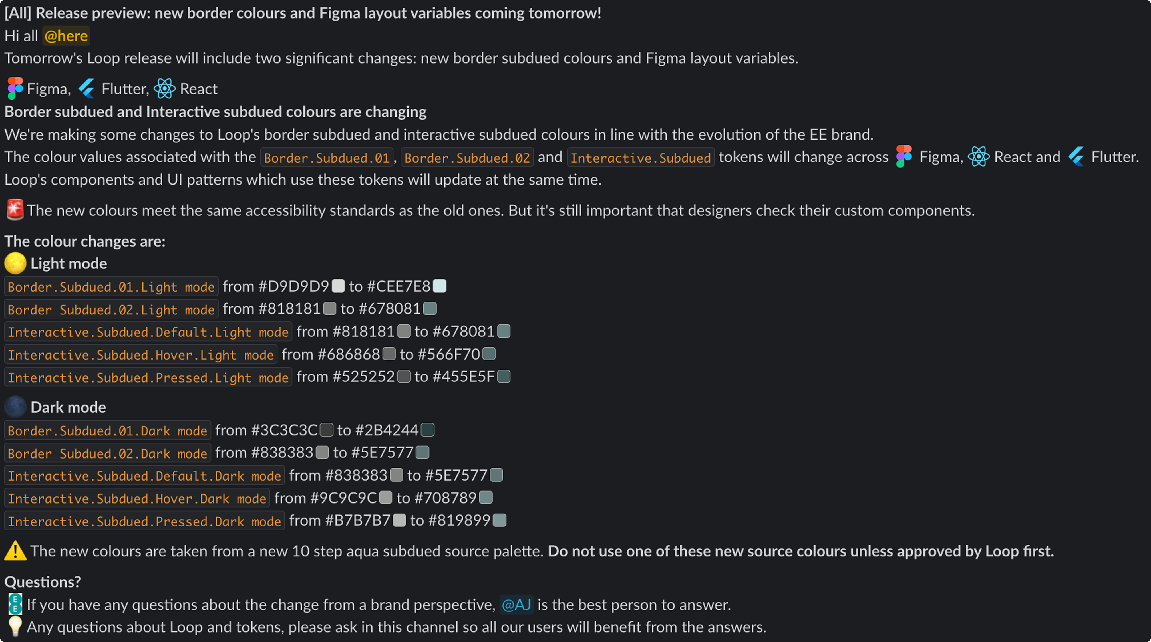
We did create some release notes for our design community through Slack to learn about the changes and ask any questions on the brand direction.
These updates were also shared on our weekly design system office hours call.
Things that didn’t go to plan
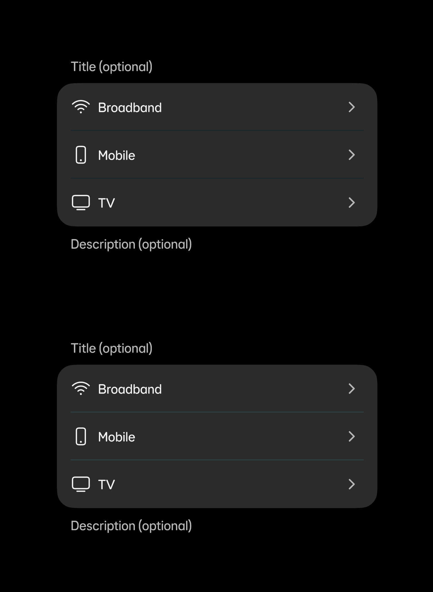
During this project there was something that didn’t go to plan, and that was the use of aqua subdued in Chip.
The Chip component is part of our Inputs and selections component group, meaning its in the same family as Text input, Select panel and Quantity selector etc.
All these components used the new subdued interactive and border colours, but Chip was a component that remained an outlier. I could not adapt this new colour to this component as it is one that is built to sit on all our surfaces.
Unlike Text input and the majority of the components within Inputs and selections which sit on our ‘neutral surfaces’ (on light and on dark - Default, Fog, Coal and Black), Chip could sit on these and our brand and status coloured surfaces.
Aqua subdued worked well on surfaces were there was an absence of colour, however when placed on colourful surfaces, the contrast felt off visually and unintentional.
Chip is a component that still uses our alpha source colours (black alphas for light surfaces and white alphas for dark surfaces) for its border for all states: Default, Hover, Pressed and Disabled. These alphas allow the brand colour sitting behind them to subtly come though and meet contrast.