2021
Product Page Optimisation
Lounge Underwear
Optimising product pages to increase page speed, usability and conversion.

Team
Me - UX Designer
2 Developers
CEO, CBO, CCO
Digital Marketing Team
SEO Manger
Copywriters
Creative Team
E-Commerce Manager
Tools used
Figma + FigJam
ProtoPie
Contentsquare
Hotjar
Google Analytics
Google Optimise
Project status
Launched (On all 11 stores)
The Problem
Our product pages performance is going down. This is due to messy code and design that has lacked testing over the years before me joining the company.

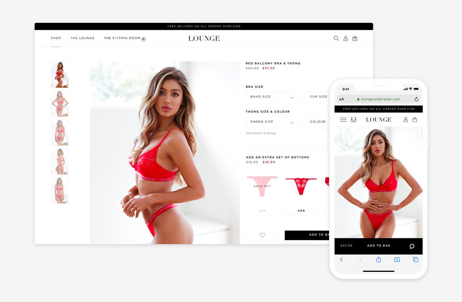
Image: An example of one of our existing Lounge Underwear Product Pages (Desktop & Mobile).
THE GOAL
Optimise and refresh our product pages to engage new and existing customers. Extensive testing is required to find out what converts best and creates an easier shopping experience.
Research
How do our new and existing users feel about our existing product pages.

Images aren't very clear
"The images don't all appear on first fold. I need to manually zoom out in browser to see the whole product."

"There's a lot of bugs and grinds my experience to a holt at times."
Product pages can seem broken sometimes..

Slow!
"At the moment the pages have far too much content on them. Is it all really needed? I just want to shop."

"Upsells don't look all that inspiring and it gets complicated when I want to take advantage of the offer and ass them to my bag."
Upsells
Proposed Solution...
Create a streamlined template for our product pages by trimming the fat and use A/B/MVT testing to get to the source of what works best for out users (both new and existing).
We must challenge our own assumptions and make data led design decisions.

Image: Another example of one of our existing Product Pages (Desktop).
Design Exploration

Image: First high fidelity prototype of product page 2.0. Fun Fact: We A/B tested rounded buttons vs squared and these had a positive effect on conversion.
User Testing

"Titles and things are in capital letters making it all very hard to read etc. Not good for accessibility"
Capital letters are intense
.jpg)
"Adding upsells to the bag is a lot easier and clear to manage. Adding the option to select the size would be better. Rather than assuming its the same size as the set I've selected."
Upsells are a lot more intuitive

"The buy now button on mobile is very far down and almost easy to miss."
Buy Now button

Can I have the option to change the set from Thong to Briefs? Or vice versa.
"Rather than going back to the collection page and finding it. Or just leaving the page at all!"
Design Iteration
Product Pages

Image: Product page interactions on both desktop and mobile.
Things I changed from the last round of user testing for this next version:
-
We tested semi-rounded edges on drop downs over fully rounded styling. This was a lot more popular with our users and were more elegant and on brand
-
Added icons next to the top and bottoms selectors and the option to change bottoms type without leaving the page
-
Introduced the ability to select either thong or briefs without having to leave the page
-
Reordered the hierarchy of the right side
-
Positioned a front and back shot side by side and above the initial fold
-
Removed the hint hint button
-
Placed the Wishlist button over the product images
-
Model selector now offers to ability to view either thong or brief
-
Shrunk the image previews right down into a film strip under the main images
After more testing and design iteration...


I designed the product page to transition from large screen to small screens as easy as possible. I did this by keeping all the forms and information in a column. The only thing that needed to be responsive was the images.
Final Design (However testing never stops)
Product Page (Desktop)
Product page demonstration on desktop.

An example of a standard product page of a top and bottoms set.

Out of Stock. Removed the need for a pop up. This reduced clicks and load times.

Bottoms only product page.

Sticky left side as you scroll.

Product Page (Mobile)

...And don't forget Tablet! ...Even if it is only 1-2% of traffic.

Design Handoff
I worked closely with engineers to validate the design and copy implementation. Along with daily stand ups, we also had weekly demos and would occasionally sit together and cross check implementation with the final designs.
The new experience was launched on the US/International store first. We phased in the implementation one store at a time so that we could monitor its success in more digestable chunks. This involved comparing data such as sign ups and bounce rates to the old version, whilst continuing to optimize and iron out any technical errors/bugs/areas of slow site speed.

Business Impact

After all this testing we are now at a point were the product pages are immensely faster and as a result have improved conversion massively.

Here is the difference in site speed from the old version.

